McLaren is a British auto making company, which was established in 1963 and today the brand’s name is synonymous to high-end sports cars, known and respected for its design and quality.
Meaning and history
McLaren is one of the most popular speed car brands in the world, founded in 1963, the company’s name became synonymous to luxury and racing cars.
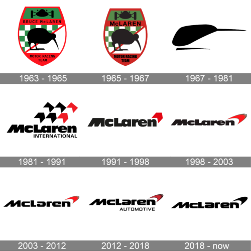
The brand’s visual identity is based on principles of simplicity and style. The first version of the current McLaren logo was designed in 1981 and stayed with the brand until today, being modified during the years.
What is McLaren?
McLaren is the name of a luxury automaker from Great Britain, which was established at the beginning of the 1960s, and has been one of the world’s leaders in the production of sports cars since then. McLaren also has its Formula One Team.
1963 – 1965
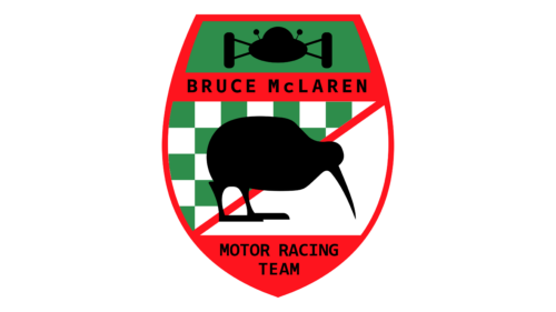
The classic McLaren logo from 1963 has a detailed and traditional design. It features a red shield outlined in black, with a green chequered flag pattern at the top and a red diagonal stripe across the shield. Above the stripe, there is a black silhouette of a kiwi bird, paying homage to the New Zealand heritage of Bruce McLaren, the founder of the company. Below the stripe, the logo includes the words “BRUCE McLAREN MOTOR RACING TEAM” in white capital letters on a black background. The shield is topped with a racing car in silhouette within a green rectangle, also outlined in black, symbolizing the brand’s racing roots.
1965 – 1967
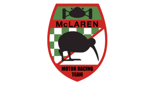
The first McLaren logo was created in 1963 when the company was just founded. The designer, Michael Turner, draw a crest-like emblem in a green red and white color palette with a black silhouette of a kiwi bird. The kiwi image was a tribute to the company’s founder, Bruce McLaren, motherland.
1967 – 1981
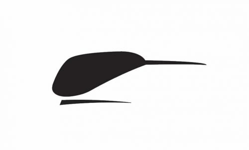
The logo from 1966 features a stylized abstract image of a kiwi bird, which is stylish and modern. The logo gets the name “Speedy Kiwi” and becomes a symbol of the McLaren race team, being used even today.
The black color of the bird looks great on both white and brand’s signature orange backgrounds, evoking a sense of confidence and expertise.
1981 – 1991
The Speedy Kiwi was replaced by a new logo in 1981. A bold and decent wordmark with the brand’s new emblem was designed by Raymond Loewy.
The strict and masculine logo is composed of a black thick wordmark and a stylized tricolor (black-red-white) checkered flag.
According to one of the versions, the emblem was a tribute to the Marlboro sponsorship of the McLaren team.
1991 – 1998
The checkered flag was replaced by one red chevron, which made the logo look more modern and balanced. The color palette wasn’t changed and the typeface was only slightly refined.
1998 – 2003
The sharp-angled chevron was replaced by a smooth swoosh symbol, keeping traditional for the brand color scheme. The swoosh symbolizes the speed mark.
With the bold and soft lines of the wordmark, the logo now looks more harmonized than it was with the previous geometrical emblems.
2003 – 2012
The main element that was changed in 2003 was the typeface.
The lettering features more delicate and elegant lines, with a futuristic style and a sense of moving. The iconic swoosh emblem stays with the brand, as well as its color palette.
2012 – 2018
The last big redesign of the McLaren logo was held in 2012. The most significant change for the brand’s visual identity was about adding a rectangular framing.
The McLaren logo is laconic and modern, it reflects the power of the brand and its progressive approach to manufacturing and design. The simplicity of the McLaren visual identity only adds luxury and style to the brand’s image.
2018 – now
The image shows the modern logo of McLaren, which is a stylized, simple, and modern design. It consists of the word “McLaren” in a unique, custom sans-serif typeface. The lettering is black, giving it a bold and contemporary look. The “L” in McLaren extends to form a swoosh that curves over the top of the entire word, suggesting speed and dynamism. This part of the logo is also known as the “speedmark,” which resembles a stylized version of the number “1,” representing McLaren’s racing heritage.
The Emblem
The iconic McLaren Speedmark, serving as a powerful emblem of McLaren Racing’s illustrious brand, embodies multiple layers of meaning that resonate with both its heritage and its forward-looking vision. At its core, the emblem pays homage to the original Speedy Kiwi emblem, symbolizing the brand’s roots and its connection to the extraordinary life and vision of founder and legendary driver, Bruce McLaren. The emblem’s silhouette, reminiscent of a stylized Kiwi head, weaves together classical techniques with modern innovation, reflecting McLaren’s dedication to pushing the boundaries of automotive excellence.
Another interpretation sees the emblem as a modernized and softened chevron, a nod to the McLaren logo’s evolution during the era of its Marlboro sponsorship in the 1980s. This version symbolizes the unexpected connections between McLaren’s rich motor racing heritage and its ultra-competitive track action today.
McLaren Automotive itself interprets the swoosh as a depiction of the swirling vortices that dance atop the cars’ side-pods, a visual representation of the aerodynamic excellence achieved through extensive testing in McLaren Technology Centre’s state-of-the-art wind tunnel. This emblem not only signifies McLaren’s relentless pursuit of aerodynamic efficiency but also stands as a very special piece of art, embodying the team’s unrivalled heritage and its continuous evolution in the world of high-performance motorsports and automotive innovation.
Font and color
The primary McLaren badge boasts bold, stylized lettering, set in a custom sans-serif typeface that mirrors the sleek, streamlined speedmark of the emblem. The heavy title case characters, with their smooth shapes, draw inspiration from a wide-ranging palette of inspirations, including the classical elegance of Budapest’s architecture and the modern vision embodied in McLaren’s first series-production hybrid supercar. The closest fonts that echo the unique character of the McLaren insignia are Snasm Heavy and Strelka Ultra, though with nuanced modifications that introduce a new approach to logo design.
The color palette of McLaren’s visual identity has evolved significantly, reflecting the brand’s journey from its inception. Until 2012, it was dominated by the striking combination of black and red, a homage to McLaren Racing’s livery unveiled during its partnership with the cigarette brand and Renault engines. However, the last redesign marked a significant shift, suspending the red to elevate black as the primary color, complemented by white lettering. Occasionally, this monochrome scheme is accented with elements of papaya, a nod to McLaren’s heritage and the iconic livery of its racing division. This choice of colors, sometimes set against an anthracite background or highlighted in a light shade of gray, conveys a sense of open-air performance, professionalism, and the cold precision of McLaren’s engineering excellence, transforming the brand’s identity into unique works of art that celebrate McLaren’s extraordinary journey and its commitment to innovation and excellence in the automotive world.
What does the McLaren logo mean?
The logo of the luxury car manufacturer McLaren is called “The Speedmark”.It is an abstract geometric element with arched sides and sharp ends, which is placed in the upper right corner of the badge, above the last letter of the McLaren wordmark. The speedmark has been the symbol of the iconic automaker since 1998, evolving from the red chevron, which was the previous emblem of the brand.
Is McLaren emblem a kiwi?
McLaren used to have a kiwi bird as the hero of its emblem at the very beginning of the company’s history. The logo with the symbolic New Zealand bird on it was designed in 1963, and modified in 1967. The creator of the famous kiwi badge was Michael Turner, a famous Motorsport artist from New Zealand.
Why is the McLaren logo a kiwi?
Today the McLaren logo is a Speedmark, an abstract geometric element, resembling a boomerang. But in the very first years of the company’s history, it used to have a kiwi bird on its emblem. The first badges for McLaren were created by a famous New Zealand artist Michael Turner, who wanted to celebrate his motherland this way.
Is McLaren a Ferrari?
McLaren is not a Ferrari, it is a completely different brand of the racing car, which was established in Great Britain in 1963, and today is owned by the royal family of Bahrain, through the Bahrain Mumtalakat Holding Company.


