Marussia Motors was a Russian automotive company primarily known for producing high-performance sports cars. Founded in 2007 by Nikolay Fomenko and Efim Ostrovsky, the company aimed to make Russia’s mark in the supercar market. Headquartered in Moscow, Marussia Motors gained recognition for its Marussia B1 and B2 models. Unfortunately, despite early promise, the company faced financial difficulties and was officially declared bankrupt in 2014.
Meaning and history
Marussia Motors was initiated in 2007 by Russian entrepreneurs Nikolay Fomenko and Efim Ostrovsky. Their vision was to create Russia’s first series of luxury sports cars that would rival existing European brands. Operating out of Moscow, the company managed to produce two main models, the Marussia B1 and B2, which were showcased at international automotive exhibitions like the Frankfurt Motor Show. Notably, the Marussia B2 sold out its initial run of 500 units rather quickly, making a mark in the automotive world. Despite this initial success, the company faced financial hardships, leading to the cessation of car production in 2014. It tried to diversify by acquiring a stake in the Formula 1 team Virgin Racing, renaming it Marussia F1, but the venture also ended in financial failure. Marussia Motors no longer operates and has been declared bankrupt.
What is Marussia Motors?
Marussia Motors was a Russian car manufacturer founded in 2007, specializing in high-performance sports cars. Headquartered in Moscow, the company gained attention for its Marussia B1 and B2 models. It ceased operations and was declared bankrupt in 2014.
2007 – 2012
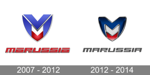
The color palette of the brand corresponds with the national color of the Russian nation. These colors are used to create a large, shiny emblem above the brand name. It features a letter “M” done in blue and two arrows between its vertical lines. As a result, the emblem resembled a shield shape with a pointed bottom and rounded sides. The name itself featured a bold, geometric font similar to GYM Regular font. The red color of the inscription gave the logo a powerful and eye-catching appearance.
2012 – 2014
The brand kept all the shapes and font almost unchanged and worked with other aspects of the logo, mainly the color palette. The blue color got significantly darker, while the arrows acquired a vertical pattern that added texture. The shape itself not only got more rounded but also had more volume. The inscription also changed as it was now done in gray and had a flat appearance that contrasted very well with the emblem above it. The logo turned out more sophisticated, stylish, and modern.


