Mario Kart is a super-popular video game created in 1992 by Japanese developer Nintendo. The first game was developed by Japanese game designer Shigeru Miyamoto. He also created the original Super Mario Bros. game, which made it into the Guinness Book of World Records as the best-selling book in history.
Meaning and history
On August 27, 1992, Super Mario Kart was released on SNES/Super Famicom in Japan, and 5 days later — in the USA. This game was one of the originators of the racing subgenre – karting. The main goal of this game, as in any race, is to finish first by completing five laps while avoiding obstacles on the tracks.
So, the first Mario Kart game (Super Mario Kart) appeared on the 16-bit Super Nintendo Entertainment System in 1992. With an impressive amount of nine million cartridges sold, the game became a sensation and won the hearts of even those who had no interest in racing games before. The concept of the game was simple: eight characters from various popular Nintendo games, including Mario, Donkey Kong, Luigi, and Bowser, took part in a karting championship to compete for first place.
Each of the characters has unique characteristics: Mario and Luigi are the most balanced, they have all the parameters average; Peach and Yoshi have the best acceleration, but the worst turning ability; Bowser and Donkey Kong Jr. are heavyweights: they can push their opponents, they also have the highest top speed, but the worst acceleration; and Toad and Koopa Troopa have the best turning ability, but the worst top speed and are easy to push.
The innovation of the game is the bonuses scattered on the tracks, which give participants various advantages on the tracks and allow them to prevent their rivals from taking the lead. An interesting feature: only backward players can get “strong” weapons. And leaders often get only small defense elements. All this gives a special drive to the game. After all, with the help of additional items, the laggards can change the course of the race and even become leaders.
Since 1992, of course, the game mechanics have grown with new features and nuances, but in each new game, you can still feel the breath of the original, which made the series insanely popular in its time.
What is Mario Kart?
Mario Kart is the name of the video game series, which is considered to be one of the most successful franchises in the history of video games. It is one of the system-sellers of every Nintendo console. The first version of the game was introduced in 1992, and by 2023 seven versions have already been released.
In terms of visual identity, Mario Kart has had its logo redesigned several times throughout history, yet each of the badges had a distinctive geometry, which added a sense of speed and energy to the simple concept.
1992 – 1996
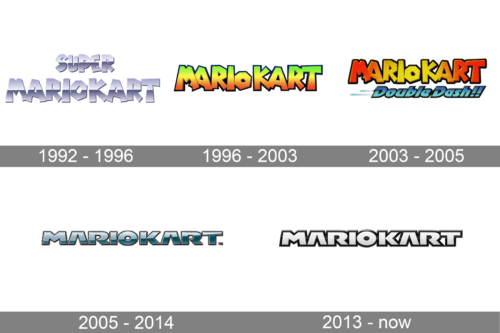
The original Mario Kart logo was created in 1992 and stayed with the franchise for four years. It was a stylized gradient silver lettering, set in two straight horizontal lines, with the bold uppercase characters executed in an angular geometric custom typeface. There were no graphical additions or color accents in the composition.
1996 – 2003
In 1996 the “Super” was removed from the title of the game, and the logo was redesigned accordingly. Now the badge was composed of just one line, which was written in the same typeface as the inscription from the previous version, but in a flat style, with the massive characters drawn in green, yellow and orange gradient shades, with the thick black outline.
2003 – 2005, 2008
Another version of the Mario Kart logo was introduced in 2003. It was fully based on the previous version, but this time the wordmark was executed in a three-dimensional style, with the gradient shades softened. Now the palette was only based on yellow and orange, and the green was completely removed.
2005 – 2014
The redesign of 2005 has introduced a completely new style of the Mario Kart official badge. It was a more geometric and strict typeface, with massive uppercase characters boasting straight lines and cuts. The first version was set in gradient calm blue shades with slight gloss, which added volume to the stable capitals.
2013 – Today
In 2013 the Mario Kart logo was slightly refined, with the style of the typeface kept from the previous version, but the color palette changed. Now the letters have their bodies colored in white or light silver, and the black outline of the characters got bolder, creating a strong contrast and making the lettering bright and eye-catching.
Font and color
The massive and brutal uppercase lettering from the official logo of the Mario Kart video game is set in the DF Gothic typeface, which is known for its distinctive shapes, straight clean cuts and stable characters.
As for the color palette of the Mario Kart visual identity, the latest version is the least colorful. It uses a classic white and black color scheme, which is sometimes switched to light-silver and black.


