Mandalorian is the name of the popular American tv-show. The first season of the series, which saw the light of day in 2019, takes place five years after the events described in “Star Wars: Return of the Jedi,” that is, after the fall of the Empire, but before the First Order emerged on its ruins.
Meaning and history
The popular series “The Mandalorian” has a rather fascinating plot. A grumpy warrior (the Mandalorian himself) works as a mercenary and gives almost all of his savings to his kin, who, once a great race, are now hiding underground and quietly restoring their former glory.
On one particularly expensive mission the formidable former Imperial orders the Mandalorian (who, by the way, never takes off his mask) to deliver a certain creature alive or dead. He begins an uphill struggle with his conscience, realizing the client is not going to do anything good with the child.
The series was launched on Disney+ in 2019 and became super popular in no time, as the Star Wars there is one of those timeless gems, never losing its actuality.
As for the visual identity, the producers decided to follow the concept of minimalism and simplicity, making the logotype the main element of the badge.
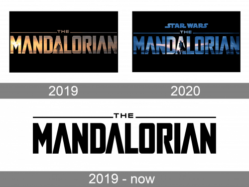
2019 – now
This is the show’s wordmark, and they use it in different color schemes for various media products related to the brand. The only difference is that the second ‘A’ is hollow like the other two. In the season logotypes, it’s a solid triangle.
2019
For the first season of Mandalorian the logo was created in 2019 and featured the name of the project, set in two lines. The first line was for the “The” in small capitals, with two horizontal lines coming out of it to the sides. Under this composition, the enlarged capitalized “Mandalorian” was set in the stylized and slightly narrowed sans-serif typeface, with two letters “A” having their horizontal bars removed, and the central “A” was stylized as a solid triangle, with the silhouette of a warrior on it.
The logotype was executed in gradients of sunset shades and placed on a solid black background. The color palette elevated the futuristic and mysterious plot of the tv-show.
2020
The redesign of 2020 was made for the second season of the series. Not much was changed here, just the color palette was switched from yellowish to blue and purple gradients, and the “Star Wars” logotype was added to the top part of the emblem.
In the new color palette, the logo started looking colder and stronger, with a slight feeling of danger and a fighting spirit.
The figure of the warrior on the middle letter “A” was enlarged and became more visible than the one from the previous version.
Font and color
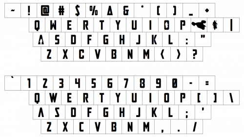
The uppercase “Mandalorian” inscription from the tv-series logo is executed in a stylized sans-serif typeface with massive yet slightly narrowed letters having their borders clean and corners sharp. The closest commercial typeface to the one, used for the Mandalorian visual identity, is, probably, Agency Black, but slightly modified.
As for the color palette of the logo, it is based on the blue and purple gradients, colors of wisdom, mystery, and creativity, which also evoke a sense of reliability and look cold and stable. Contrasting with black, the gradients of the letters create a truly powerful image and make simple shapes look futuristic and sleek.


