Mahindra is a brand of Indian utility-car manufacturer, which was founded in 1945 and today is one of the largest in the region companies of its segment, which was ranked in the top 20 of FortuneIndia 500.
Meaning and history
The company was named after the Indian god, Mahindra, who is considered to be the greatest ruler of the Earth. The choice of the name represents the company is powerful and confident, focused on quality and research and aiming to take the leading positions in the industry.
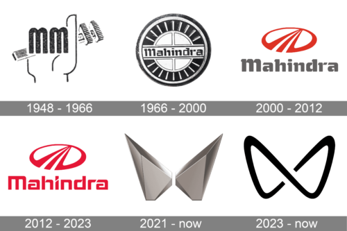
The Mahindra visual identity history is not very rich, as the brand has only one major logo redesign, held in 2012, but still uses its original emblem alongside the new one, depending on the placement.
What is Mahindra?
Mahindra is the name of an Indian automaker, which was established in 1945, and for the first years of its activity was engaged in the production of steel. Today Mahindra is one of the largest and most reputable Asian car brands, which manufactures passenger cars, and SUVs, and started to develop the electric vehicles direction in the 2020s.
1948 – 1966
This logo depicts a stylized hand gripping a tool. The fingers of the hand are creatively represented by two vertical “M” letters. These letters mimic fingers clasping the tool, emphasizing themes of control and intervention in technical processes. The logo’s design conveys a strong mechanical or industrial association that represents a company involved in manufacturing and engineering. The utilization of letters as design elements in the depiction of the hand underscores the brand’s identity in an innovative and memorable way.
1966 – 2000
The very first Mahindra badge was created three years after the foundation of the company, in 1948. It featured a circular black medallion with silver details. The bold title case logotype was written in the center of the badge in black custom font glyphs, crossing a silver solid circle with a cross, and ex closed into a rounded frame, decorated by short silver lines, which made the whole composition look like a steering wheel.
2000 – 2012
The first Mahindra logo was designed in 3 years after the company’s foundation. It was slightly modified during the years but is still in use today alongside the new visual identity.
The logo is composed of a wordmark with an emblem on its top. The wordmark in classic gray is executed in a custom typeface with rounded lines and playful tails. Bold letters of the nameplate reflect the brand’s strength and stability.
The Mahindra emblem is an oval-shaped figure with a stylized letter “M”, composed of three diagonal lines, on it. It resembles a road and evokes a sense of speed and movement. It is a reflection of the brand’s forward-thinking and teamwork philosophy.
The rounded shape of the emblem celebrates harmony and balance, while the stripes of the “M” show the progressive approach of the brand.
2012 – 2023
In 2012 Mahindra created a new modern logo, which is composed of a single wordmark and emblem. The futuristic typeface features strict descent lines and diagonal cut lines of “I” and “A”.
The red color of the nameplate reflects the passion and energy of the brand, its power, and confidence in everything it does.
The new Mahindra logo is minimalist and strong. With the accent on the bright color, it looks brutal and remarkable. The unique typeface with small details, such as open letters “A” and interesting connections of “D” and “H” lines, makes the logo look modern and stylish.
It is a strong visual identity for the utility-vehicles market, which shows the expertise of the brand and its stability.
2021 – now
The 2021 redesign removed the lettering from the Mahindra badge and made a sleek three-dimensional emblem the only element of the logo. Now, it is an abstract composition formed by two mirrored elements in gradient matte silver. The elements’ upper parts are elongated and sharpened, and when placed face-to-face, they form a contour resembling the letter “M.”
2023 – Today
The second logo is a minimalistic and modern design characterized by two symmetrical arcs that converge in the middle to form an abstract ‘M.’ The lines are bold and clean, which gives the logo a sleek and contemporary look. The design is straightforward yet impactful, with the use of black enhancing its boldness and visibility. This logo represents a modern, forward-thinking company where simplicity and clarity are valued. The emblem embodies a sense of balance and precision, the company’s focus on excellence and innovation in its field.
Font and color
The lettering in a custom foot rustic typeface has been a part of the Mahindra visual identity for more than 70 years, although with the latest redesign, the wordmark was completely removed from the badge of the Indian Automaker, and now the silver gradient emblem is its only element. The smooth yellowish silver is the main color of the Mahindra palette. It evokes a sense of excellence and quality, pointing to the company’s professionalism and stability.


