Magneti Marcelo is an Italian brand of automobile accessories manufacturing company, which was established by Fiat and Ercole Marelli in 1919. The brand became famous for its high-tech innovations.
Meaning and history

The Magneti Marelli visual identity was designed in 1919 and stayed with the brand throughout its long history. The text-based Magneti Marelli logo became instantly recognizable all over the world and synonymous with the brand’s products.
The logo is composed of a wordmark, where the two parts are placed one above another in an elliptic form with no framing. The two words share their first and last letter, “M” and “I”.
The inscription in all the capital letters is executed in a bold sans-serif typeface and looks strong and modern.
The Magneti Marelli logo shape resembles an eye and evokes a sense of creative approach and the company’s value of art and design.
What is Magneti Marelli?
Magneti Marelli is a company manufacturer and supplier of original parts for the conveyor belt of famous car marques, including both European and American automobilebrands. Magneti Marelli was established in Italy in 1891 and merged with Fiat in 1919.
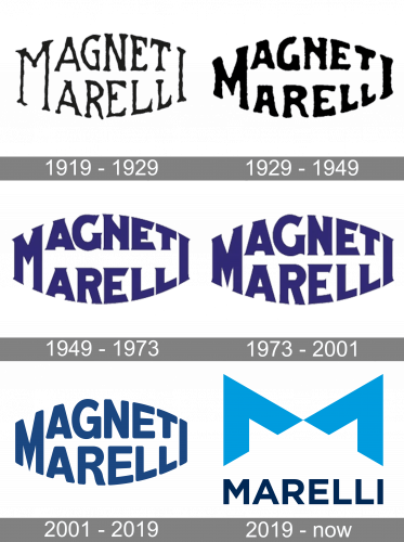
1919 – 1929
The original Magneti Marelli badge, introduced in 1919, featured the iconic lettering in two levels with the upper and bottom borders slightly arched from the center, and the letters “M” and “I” on the sides being shared by both words. The logotype was written in uneven black lines. This version of the badge stayed in use for ten years.
1929 – 1949
The redesign of 1929 kept the original design idea of the Magneti Marelli visual identity, but refined and strengthened the contours of the letters, making them heavier and smoother. The lines were still not very straight and even, but the overall mood and confidence of the badge have increased. The logo was still set in plain black and placed on a white background.
1949 – 1973
In 1949 the Magneti Marelli logo was rewritten in a bold serif font with sharp serifs decorating the bold straight bars of the characters. Another change was about the color palette of the badge, as this was the first time the company adopted a deep and dark shade of blue instead of simple black.
1973 – 2001
In 1973 the contours and color palette of the Magneti Marelli logo was enhanced, with the letters getting more balanced shapes. This was especially noticeable in the enlarged “M”, which got its middle part elongated, making up a narrow triangle pointing down. As for the color palette, the blue became more purple, creating a vivid and interesting shade.
2001 – 2019
The redesign of 2001 has switched the sharp serif typeface of the Magneti Marelli badge into a smooth modern sans-serif, which looked very progressive and professional. The color palette was also slightly changed, getting a calm and pleasant shade of blue, which evoked a sense of reliability and trustworthiness.
2019 – Today

The white and blue color palette of the brand’s logo represents the company as professional and reliable, quality-centered and loyal to its customers. The color combination also creates a feeling of stability and confidence.


