Madonna is the scenic name of the pop-music icon, Louise Ciccone; who was born in 1958 and became famous after the release of her album “Madonna” in 1983. Since then the singer has sold more than 300 million albums across the globe and is considered to be the most famous and influential woman in the music industry.
Meaning and history
There have been dozens of logos created to represent the great woman artist during her intense and outstanding career. Different variations of colors and typefaces, with or without additional graphics, happy, passionate, and sad. Sometimes they changed once a year, sometimes they stayed for longer. But there is some similarity in the logos of each decade, which shows the progress and development of Madonna as a person and an artist.
1983

The very first Madonna logo saw the light in 1983. And frankly speaking, it was one of the most stylish and progressive emblems, ever created for the iconic singer. The insignia featured an uppercase logotype in a clean medium-weight sans-serif typeface with lots of air between the symbols and the lines. The wordmark was executed in black color with only the letter “O” in the middle drawn in red. Everything from the geometry of the lettering and to the color palette of the logo was perfectly balanced and looked professional and powerful.
1984

In 1984 for the “Like a Virgin” album the new logo was introduced. It was a bold black “Madonna” lettering in the lowercase of a custom handwritten serif typeface, with the “Like a Virgin” tagline, also in the lowercase, but in bright blue color and thicker lines. Though the tagline was executed in a smaller size, it was still eye-catching and readable due to its boldness and color.
1986

In 1986 another insignia was created for the music legend. It was an uppercase light blue “Madonna” logotype in a classy and straight serif font with a thin dark blue shadow along some of the vertical bars. The gray lowercase cursive “True blue” in a custom typeface was written in a smaller size, over the main wordmark, and added sophistication and easiness to the whole badge.
1989
The very first era of Madonna’s visual identity can easily be called Red: all the logotypes, creating during the 1980s featured different shades of red color as the main theme. The very first insignia hosted a black all-caps inscription with the letter “O” colored in red. Later it was replaced by a red logotype in a lowercase, executed in a traditional serif typeface. For the “Holiday” single the white lettering was placed on red vertical rectangles, and the “Borderline” logo looked like a Broadway poster with bold display inscription in solid red.
By the end of the 1980s, the light blue color started appearing on the diva’s logos — and the cover of the “True Blue” album from 1986 featured completely blue lettering in all capitals of a bold serif typeface.
1992

For the “Erotica” album, the new logo was designed in 1992. It was a fancy black inscription in a custom cursive with elongated curved tails of the rounded black letters. The wordmark was placed in a very special way, starting as a straight line and with each next letter going upright, thus another curl was created.
1994

With the release of the “Bedtime Stories” album, the new visual identity appeared in 1994. It was a thin uppercase logotype in two levels, with the pink “Madonna” placed above the light blue, with a turquoise shade, “Bedtime Stories”. All capital letters of the insignias were placed very close to each other and some were even overlapping each other’s lines. Though due to the thin light bars of the symbols, the logo did not look heavy.
1998
In the 1990s several more logos were introduced. This was the most successful time period for the singer and all the emblems were executed with a lot of elegance and luxury. The “Erotica” logotype was handwritten and its rounded letters were going up in one line, while the cover of the “Bedtime Stories” showed us another Madonna — minimalist yet bright — with the lightweight lettering in two levels, pink and blue.
2000

The logo created in 2000 was all about wild Wild West style. The saloon badge in gradient brown was outlined in a pink and white ribbon, for more girliness and elegance. On the badge, there were several lines in white and yellow. “Madonna” in bold white capitals with vignettes was arched above a white horse, complemented by several five-pointed stars in muted gold. Under the stars, the bold and extended “Music” in the uppercase of a solid serif font was set, and a small white “Maverick Warner Bros” line in white sans-serif was placed at the very bottom of the badge.
2003

The “American Life” logo was bright and dramatic. The bold stencil inscription in two lines featured a scarlet-red color and torn edges of the letters, which looked messy yet added unique style and recognizability to the whole inscription. It was a powerful and strong visual identity, even though with a slight feeling of danger. But that was exactly what made it all special.
2005

A very vivid disco logo was introduced in 2005 with the release of the “Confessions on a dance floor” album. It was a gradient blue and pink stylized logotype with outlined letters and lots of flood and light on them. The letter “O” was replaced by a stylized disco ball in dark pink and white. The main wordmark was accompanied by a handwritten name of the album in the lowercase, executed in a silver-gray cursive under the right part of the “Madonna” logotype.
2008

For another album, the logo was created in 2008. The first insignia without the name of the singer. It was a rounded sans-serif “Hard Candy” inscription in white capital letters, outlined in thin black and shadowed in light blue, placed diagonally (from the bottom left corner to the upper right one) on a plain white background. Simple, light, and very friendly, just like the tracks on this album.
2012

The logo, created in 2012 was executed in a black and white color palette, with some gray gradients on the capital letters of the “MDNA” logotype. The abbreviation had a link to MDMA, a party accelerator. It was executed in a classy strong serif typeface with all letters in a vertically striped pattern. This geometry and simple yet powerful color palette made the whole badge moving and vivid, with a slight hallucinogenic touch, as if the vertical lines were dancing with the music.
2015

The 2000s were an era of experiments and different designs. We could see the cowboy-style badge with saloon-like lettering, a bloody dripping red inscription from the “American Life” album, released in 2003, and the neon disco pink wordmark from “Confessions on a Dance Floor”.
In the 2010s Madonna goes laconic. Her logos created during this period are all executed in a monochrome palette and have no additional graphics.
2019
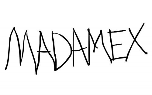
The “Madame X” album, released by the pop-icon in 2019 has a completely different logo — it is a wordmark in two levels, where the singer’s name is placed as a bottom line and executed in a stylized typewriter-style font. The monochrome color palette evokes a sense of power and timeless style.


