![]() Pearl Jam Logo PNG
Pearl Jam Logo PNG
Pearl Jam is the name of a rock-band from the USA, which was created in 1990. The name became famous after the release of it’s first album in 1991. During almost 30 years of its history, Pearl Jam recorded 10 studio albums.
Meaning and history
![]()
The Pearl Jam naming has a funny legend. The band said it was called after Eddie Vedder’s grandmother, Pearl, whose husband was Native American. She cooked a special jam. Eddie did really have a granny Pearl, but the second part of the story is not true.
The band agreed to name itself Pearl and the Jam part was added after the jam-session of Neil Young, the musicians attended to.
The original label of the band was Mookie Blaylock, after the star of NBA of those years, but the band chose to change it in order to avoid any legal problems.
The Pearl Jam logo was always composed of a wordmark, but the style and typeface was changed a few times.
1991 — 1993
![]()
The first Pearl Jam logo features a nameplate in all-caps and monochrome palette. The thick and bold lines of the letters make it look confident and strong. The font used for this logo is similar to Impact.
1993 — 1998
![]()
The second logo was designed in 1998 and was completely different from the first one. It was executed in a custom typeface with soft and founded lines, its all the lowercase letters were colored in deep red. The font used for this narrowed-lettered wordmark is P22 Woodtype. It is an ironic and stylish logo, reflecting the band’s passion for music and energy.
1998 — 2006
![]()
The Pearl Jam logo from 1998 is a traditional nameplate in black letters on a white background. It is executed in all capital letters and thin strict lines of square sans font Eurostile. The logo is light and elegant, yet showing the band’s power in the musical industry.
2006 — 2009
![]()
The unique typeface was used on the Pearl Jam logo from 2006. The white lettering of the wordmark is placed on a dark blue vivid background. Custom lines of “L” and “J” are reflecting each other, which makes these two letters a central element of the visual identity image.
It is a very stylish and modern logo, evoking a sense of creativity and artistic approach, as well as excellence in design and music.
2009 — 2013
![]()
One of the most recognizable logos of Pearl Jam was created in 2009 and first appeared on the cover of their album Backspacer. Each capital letter of the wordmark is placed in a separate circle.
The circles featured orange color and golden framing, when the background and letters were executed in black. That was a strong and bright logo, representing the band’s authority and style.
2013 — Today
![]()
The logo from the tenth Pearl Jam album is minimalist and strict. It features white all-caps lettering on a black background. An example of timeless elegance.
The most famous logo
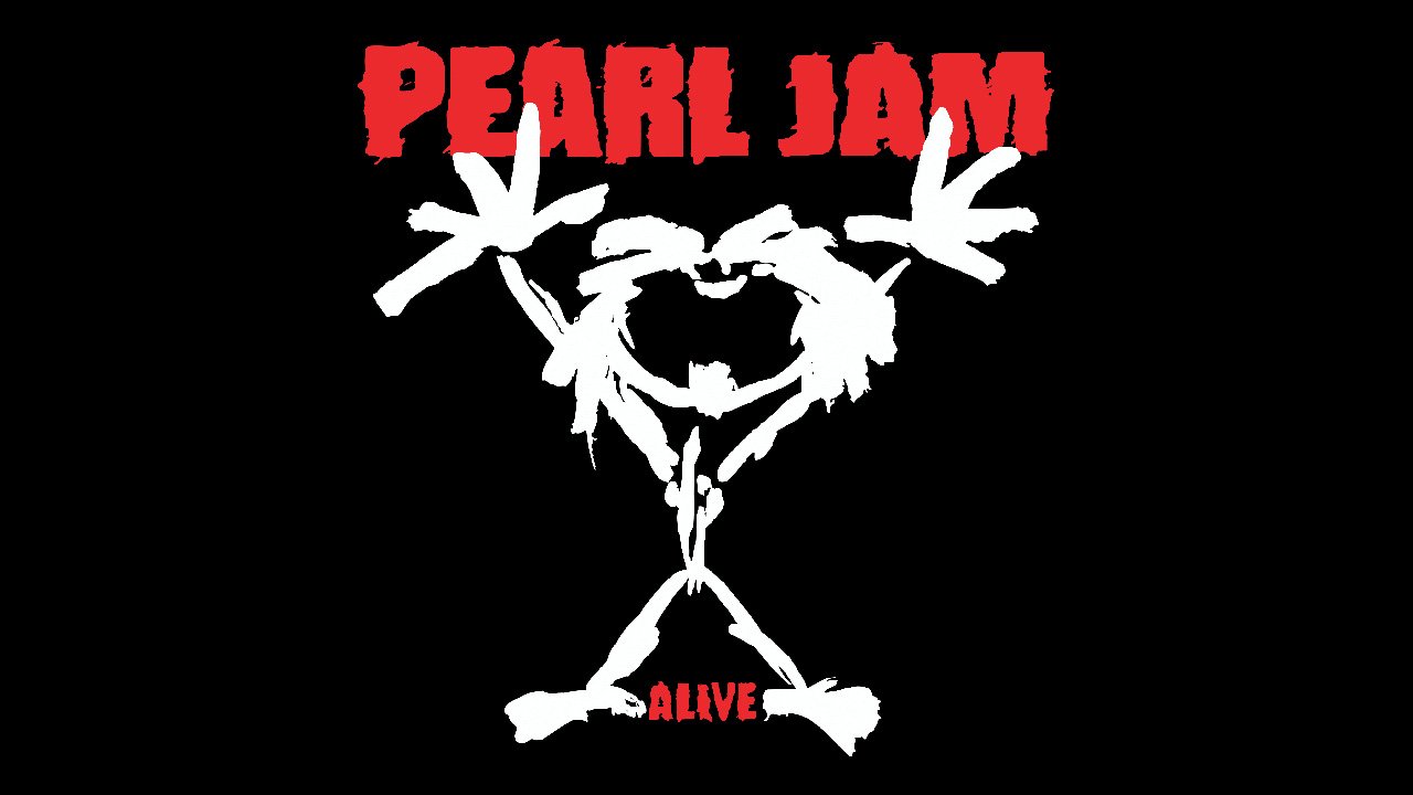
However the most famous Pearl Jam logo was the one that appeared on the cover of their Alive single cover, released in 1991. It features a childish sketch of a man’s figure with his hands up, band’s name above it and the album’s name under the man’s feet. The monochrome palette of the emblem is accompanied by classic red of the lettering.
Font