MacOS, a renowned operating system, is a pivotal product of Apple Inc., a global technology leader founded by Steve Jobs, Steve Wozniak, and Ronald Wayne. Apple, now under the leadership of CEO Tim Cook, specializes in consumer electronics, software, and online services. macOS stands as a testament to Apple’s innovation, primarily developed in Cupertino, California, where the company’s headquarters reside. Apple’s significant market presence spans across continents, with macOS being a key player in various regions including North America, Europe, and Asia. This operating system, known for its advanced security features and user-friendly interface, continues to evolve, maintaining Apple’s reputation for excellence in the tech industry.
Meaning and history
Apple Inc., established on April 1, 1976, by Steve Jobs, Steve Wozniak, and Ronald Wayne, marked a revolution in personal computing with the introduction of macOS, formerly known as Mac OS X. macOS’s journey, originating from NeXT, a company Jobs founded after leaving Apple, reflects Apple’s commitment to innovation. The integration of NeXT’s software expertise with Apple’s hardware prowess gave birth to a series of groundbreaking macOS versions, each bringing novel features and improvements. Notable achievements include the introduction of the Aqua interface, the transition to Intel processors, and more recently, the switch to Apple’s own M1 chips, heralding a new era of performance and efficiency.
Currently, macOS stands as a cornerstone of Apple’s software lineup, powering a vast range of devices from the MacBook series to the high-end Mac Pro. Its evolution mirrors Apple’s growth into a trillion-dollar company, with macOS playing a crucial role in Apple’s ecosystem, alongside iOS, iPadOS, watchOS, and tvOS. The operating system’s integration with iCloud and seamless synchronization with other Apple devices exemplify its strategic role in maintaining Apple’s market dominance and enhancing user experience.
What is macOS?
macOS is the proprietary operating system of Apple Inc., designed specifically for their Mac computer line. It distinguishes itself with a sleek interface, robust security features, and seamless integration with Apple’s ecosystem. As a key component in Apple’s global technology dominance, macOS contributes significantly to shaping the computing experience for millions worldwide.
1984 – 1988
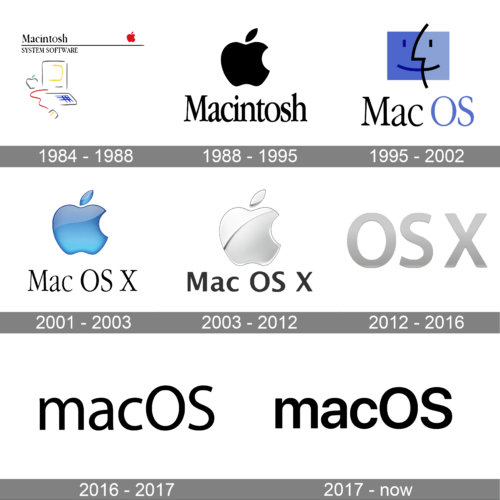
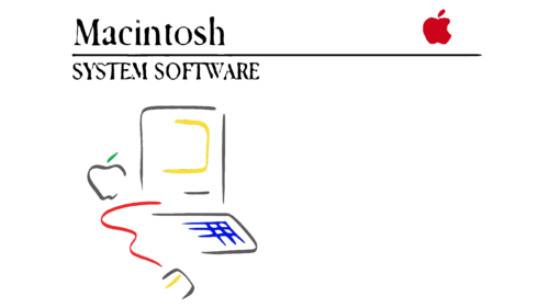
Initially, the operating system’s first logo was displayed on its boot disks, mirroring the debut Mac PC’s design. This logo showcased an outlined computer with a monitor, keyboard, and mouse. A fine horizontal line was included, separating “Macintosh” on the top row from “System Software” on the bottom. On the line’s end was a red apple with a small leaf and a bite mark. Additionally, a monochromatic version of this apple was placed beside the monitor. With each system update, a new version number was added beside the logo text.
1988 – 1995
During this period, the logo was simplified to include just the apple from the original complex design. The apple was enlarged and turned black. Beneath it, “Macintosh” was written in a semi-bold, tall font with small serifs, using lowercase letters except for the initial letter.
1995 – 2002
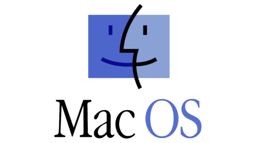
With a rebranding phase, the logo underwent a redesign to reflect the program and computer’s name change. A new, friendly logo was introduced, featuring “Mac OS” in two colors: black for “Mac” and a light ultramarine for “OS.” The emblem’s design, with contrasting colored ‘faces’, symbolized a smiling monitor and user, forming a zigzag-divided rectangle.
2001 – 2006
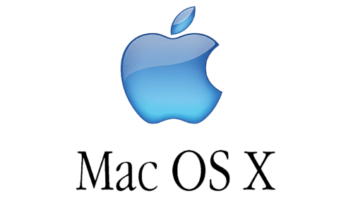
This era’s logo expanded the text to “Mac OS X,” each word in black with small serifs. The previous complex “smiling” rectangle graphic was replaced by a simple, bitten apple. The colors ultramarine and blue were retained, presented in a gradient with light accents.
2003 – 2012
Concurrently, a logo with a large silver-chrome apple was introduced. It retained the volumetric design, with a diagonal curved line atop the apple adding texture. The text’s serifs were removed in favor of a bold, wide grotesque font with shorter letters.
2012 – 2016
The logo transitioned to text-only, featuring the operating system’s name “OS X” in a large, uppercase, silver-gray gradient font, devoid of serifs.
2016 – 2017
A rebranding introduced a new design, still textual, combining “mac” in lowercase and “OS” in uppercase. This design choice maintained the distinctiveness and significance of each part in a semi-bold black font.
2017 – present
The current macOS logo is purely textual with a bold, rounded font. It is devoid of additional elements, featuring flattened, rounded letters. The logo’s evolution has seen a shift from initial graphic-based designs to a predominantly text-based visual identity, with stark black letters on a white background for clear visibility.
Version History
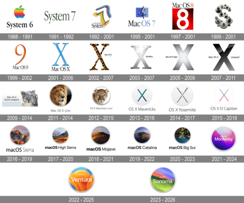
The evolution of macOS logos over the years is a fascinating journey that reflects not only the technological advancements but also the changing aesthetics and branding strategies of Apple Inc. Initially known as Mac OS X, the operating system underwent several rebrandings, eventually becoming known simply as macOS. This progression is mirrored in the transformation of its logos, each symbolizing a new era in Apple’s design philosophy and technological prowess.
The early logos of Mac OS X were characterized by their 3D, skeuomorphic designs, echoing the user interface trends of the time. These designs featured a stylized “X” which was often rendered with glossy effects, shadows, and sometimes, textures inspired by big cats like Cheetah, Puma, and Tiger, denoting different versions of the operating system. This choice not only emphasized the power and agility suggested by these animals but also marked each version with a distinct visual identity. As Apple moved towards a more minimalistic and flat design language, this was reflected in the logos as well. The introduction of macOS Sierra marked a significant shift with a simpler and more modern logo, featuring a flat design with a mountain outline, symbolizing stability, reliability, and a forward-looking approach. This design set the tone for subsequent logos, which continued to embrace minimalism and flat design, focusing on sleekness and simplicity.
The evolution of macOS logos is not just a change in graphics but also a representation of Apple’s journey through the years. Each logo encapsulates the technological advancements, design trends, and branding strategies of its time, making them more than just symbols – they are historical markers in the ever-evolving narrative of one of the world’s most influential tech companies.
System 6 ( 1988 – 1991 )
The image represents the logo for System 6, an earlier version of Apple’s Macintosh operating system, released in 1988. The logo design features the classic Apple rainbow stripes atop a silhouette of the Apple Macintosh profile. The colors are vibrant and distinct, arranged in horizontal bands that follow the shape of the computer silhouette, symbolizing the user-friendly and innovative nature of Apple’s products. The merging of the colorful Apple logo with the computer outline suggests the integration of Apple’s approachable design philosophy with its computing technology.
System 7 ( 1991 – 1992 )
The image is a logo for System 7, released in 1991. It features a three-dimensional number ‘7’ with a colorful design, invoking a sense of depth and dynamism. The ‘7’ is set against a patterned background that could be interpreted as digital or technological, which represents the advanced features and capabilities that System 7 introduced. The use of bold colors and a prominent number highlights the significance of this release as a major step forward in the development of the Macintosh operating system.
Macintosh System 7 ( 1992 – 2001 )
This image to represents a logo for System 7, a variant from 1992. This iteration of the logo maintains the three-dimensional ‘7’, but with a different color palette and textural effects that create a more pronounced sense of depth. The design is eye-catching and futuristic, reflecting the modernization and technological progress embedded in System 7. The creative use of shadow and light on the number ‘7’ gives it a sculpted look, emphasizing the solid and robust nature of the operating system.
MacOS 7 ( 1995 – 2001 )
The logo showcases a stylized interpretation of the iconic Apple logo, characterized by its minimalist facial profile integrated into the Apple silhouette. The blue and purple hues evoke a sense of creativity and innovation, synonymous with the brand’s philosophy. This design likely represents a transitional phase in branding, aiming to humanize technology and make it more approachable and relatable to the consumer. The logo’s simplicity ensures its adaptability across various platforms, maintaining brand recognition while emphasizing user-friendliness and the seamless integration of technology into everyday life.
MacOS 8 ( 1997 – 2001 )
The logo presents a bold and straightforward number ‘8’ against a striking red backdrop with a subtle gradient. The number is stylized with a glossy finish, giving it a three-dimensional effect that suggests a leap towards more advanced and dynamic technology. The choice of red signifies energy and passion, indicating the brand’s commitment to driving the industry forward. This design breaks away from traditional tech aesthetics, focusing instead on a singular, powerful figure that represents a new era of software or a milestone product launch.
MacOS X Server ( 1999 – 2001 )
The image shows a collection of gears arranged in a pattern, which is associated with macOS X Server, the original logo from 1999. The gears represent the intricate workings of a server operating system, highlighting the functionality, reliability, and complex processes it manages. The mechanical imagery robustness and the essential role the server OS plays in managing networks and providing services. This symbolizes the power and efficiency of the macOS X Server, designed to handle demanding server operations with ease.
MacOS 9 ( 1999 – 2002 )
For this logo, a vivid orange color dominates the design, with the number ‘9’ rendered in a sleek, futuristic style that wraps around itself. The use of gradient and shading creates a metallic look, implying a cutting-edge and premium quality. The abstract architectural background adds depth and dimension, hinting at the layers of complexity and sophistication within the technology. This design suggests a forward-thinking approach, signifying the culmination of the 20th century’s technological advancements and a bridge to the next millennium’s innovations.
MacOS X Puma ( 2001 – 2006 )
The image appears to be a creative rendition of the letter ‘X’, reminiscent of the early branding for macOS X from around 2001. The ‘X’ is rendered with a glossy, liquid-like surface over a background of colorful stripes, giving it a vibrant and modern aesthetic. This design conveys a sense of fluidity and flexibility, possibly reflecting the new and transformative features that macOS X introduced at the time, such as its Unix-based foundation and the Aqua user interface.
MacOS X Jaguar ( 2002 – 2007 )
The image features a stylized ‘X’ with a pattern that resembles the fur of a jaguar. The bold patterning and warm tones of the fur suggest a sense of power and agility, perhaps mirroring the operating system’s enhanced performance and speed at the time. The jaguar print, a symbol of grace and strength in the animal kingdom, could be an allegory for the OS’s sleek design and powerful capabilities, highlighting Apple’s focus on creating a robust and responsive computing experience.
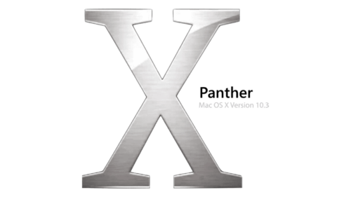
MacOS X Panther ( 2003 – 2007 )
The image features a stylized ‘X’ with a metallic finish, representing macOS X Panther from 2003. The ‘X’ is rendered with a sleek and modern design, reflecting the cutting-edge technology of the time. The reflective surface and the contemporary look of the ‘X’ imply a polished and sophisticated update to the operating system, emphasizing Panther’s new features like Exposé and Finder improvements.
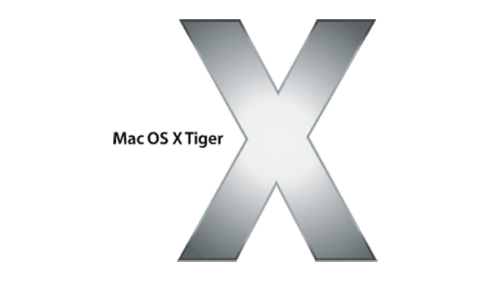
MacOS X Tiger ( 2005 – 2009 )
It depicts the logo for macOS X Tiger, released in 2005. The ‘X’ is styled with a sleek, metallic design against a background with horizontal stripes. The choice of a metal texture for the ‘X’ conveys the solid and reliable performance of Tiger, which introduced significant enhancements like Spotlight search and Dashboard widgets. The simplicity of the design, with its clean lines and modern aesthetic, reflects the straightforward, powerful, and user-friendly nature of the operating system.
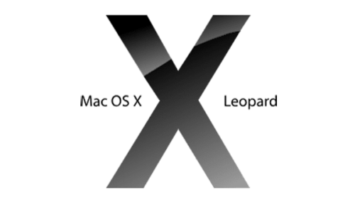
MacOS X Leopard ( 2007 – 2011 )
The image is a minimalist depiction of an ‘X’, signifying macOS X Leopard, released in 2007. The use of grayscale and the play of light and shadow give it a modern and sophisticated look. This design implies the introduction of new features and refinements that Leopard brought, such as an updated interface and improved functionality. The ‘X’ here is depicted with a sense of depth and dimension, hinting at the layered user experience and the depth of innovation that the OS offered.
MacOS X Snow Leopard ( 2009 – 2014 )
The logo represents macOS X Snow Leopard, which was released in 2009. The image portrays a snow leopard’s face with snowflakes dotting its fur, suggesting the natural habitat of this elusive big cat. The snow leopard’s intense gaze and the serene white background reflect the operating system’s focus on performance and efficiency. Snow Leopard was known for being a refinement of the previous version, emphasizing speed and stability over new features, which the calm yet powerful presence of the snow leopard aptly symbolizes.
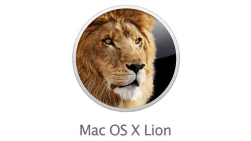
MacOS X Lion ( 2011 – 2014 )
The logo is representing macOS X Lion from 2011. It features a close-up of a lion’s face, capturing the animal’s regal and composed demeanor. The lion’s gaze is directed forward, suggesting focus and clarity. The design symbolizes the strength and power of the operating system, with the lion’s reputation as the ‘king of the jungle’ paralleling Apple’s leadership in innovative software. The circular frame brings a sense of completeness, and the focus on the lion’s face could reflect the user-centric approach of the OS.
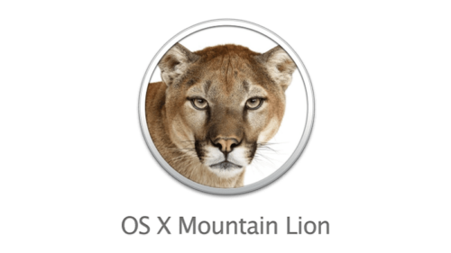
OS X Mountain Lion ( 2012 – 2015 )
The image appears to depict a mountain lion, which represents macOS X Mountain Lion released in 2012. The detailed and realistic portrayal of the mountain lion’s face in a close-up suggests a powerful and focused operating system. The intense and direct gaze of the mountain lion symbolizes the intuitive and sharp performance of the OS, which aims to bring users a refined experience with additional features inspired by iOS, such as the Notification Center and iMessage.
OS X Mavericks ( 2013 – 2016 )
The image is likely related to macOS X Mavericks, released in 2013. It presents a minimalistic ‘X’ against a white background, symbolizing simplicity and clarity. The dual tones of the ‘X’ represent the depth and range of the OS’s capabilities, from basic to advanced functionalities. The design’s simplicity reflects Apple’s design philosophy of clean, accessible, and intuitive user interfaces. The color choice and sparse aesthetic highlight the OS’s move towards a more flat design language, which was part of the trend in user interface design during that period.
OS X Yosemite ( 2014 – 2017 )
The image is associated with macOS X Yosemite, which came out in 2014. The design presents an ‘X’ within a circle, set against a plain background. The ‘X’ here has a subtle gradient, giving it a sense of depth and dimension. Yosemite introduced a major visual overhaul to the Mac interface with a flatter, more modern design, and the logo’s simplicity represents this shift towards a more minimalist and refined user experience. The use of transparency and the thin lines of the ‘X’ echo the aesthetic principles of Yosemite’s user interface, which aimed for clarity and efficiency.
OS X El Capitan ( 2015 – 2018 )
The image seems to be associated with macOS X El Capitan, which was released in 2015. The logo is simple and clean, featuring a stylized ‘X’ with each quadrant filled with different colors representing the varied landscapes of El Capitan in Yosemite National Park. The design is minimalistic, focusing on the intersection of technology and nature. This is a visual metaphor for the OS’s focus on performance and stability, incorporating natural elements into the design to signify a user experience that is both robust and organic. The minimalist approach might also symbolize the OS’s streamlined efficiency and intuitive functionality.
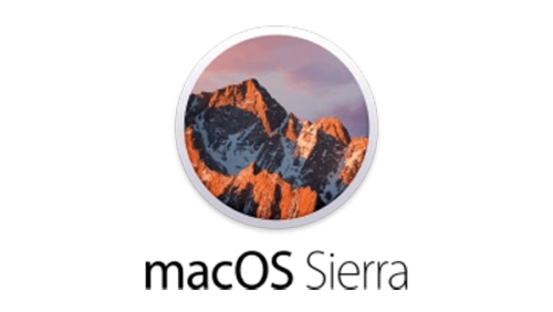
MacOS Sierra ( 2016 – 2019 )
The image seems to depict a rugged mountain peak bathed in the warm glow of the setting or rising sun, reminiscent of macOS Sierra from 2016. The mountain, illuminated with fiery oranges and cool blues, projects strength and resilience. This is a metaphor for the stability and power of the Sierra operating system, which brought Siri to the Mac, along with a multitude of other features that emphasized streamlined connectivity and user-centric design. The circle framing the mountain suggests a focused experience, drawing the user’s attention to the peak performance and majestic capabilities of the software.
MacOS High Sierra ( 2017 – 2020 )
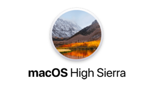
The image portrays a mountainous landscape with autumn foliage reflecting in a still lake, reminiscent of macOS High Sierra from 2017. The majestic mountain, dusted with snow, contrasts with the warm colors of the autumn leaves, suggesting a convergence of different elements and seasons. This imagery symbolizes the robustness and versatility of the operating system, capable of handling diverse tasks with ease. The circle framing this majestic scenery implies a window into a world of enhanced performance and graphical excellence, key features of High Sierra with its introduction of the Apple File System, and improvements in graphics technology.
MacOS Mojave ( 2018 – 2021 )
The image presents a serene desert landscape, likely for macOS Mojave, released in 2018. It captures the quiet majesty of a sand dune at dusk or dawn. The smooth lines and the gradient from warm to cool colors evoke the transitional time of day, suggesting both the end and the beginning of a cycle. This symbolizes the introduction of new features with the Mojave update, such as Dark Mode, which brought a dramatic new look to the operating system. The circular frame places the focus on the dune’s peak, which stands out against the softly lit sky, highlighting the OS’s peak performance and streamlined design.
MacOS Catalina ( 2019 – 2022 )
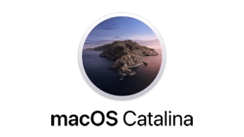
The image presents a solitary island, which could be alluding to macOS Catalina released in 2019. The island stands amidst calm seas, with a twilight sky casting subtle hues of purple and blue. The juxtaposition of the rugged land against the smooth surface of the ocean encapsulates a sense of isolation and self-sufficiency, reflecting an operating system designed to be comprehensive and self-contained. The enclosing circle suggests focus and completeness, mirroring the OS’s ecosystem that is both expansive and enclosed, offering a complete experience within its domain.
MacOS Big Sur ( 2020 – 2023 )
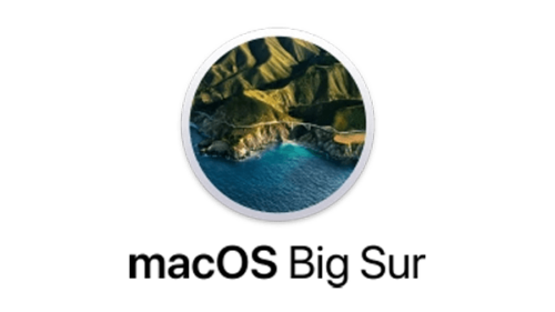
The image depicts a coastal scene, possibly representing macOS Big Sur released in 2020. The coastline forms a serene cove, with jade-colored waters enclosed by rugged cliffs. The topography, bathed in sunlight, showcases the contrasting textures of the landscape, highlighting the interplay between light and shadow. The circular framing of the image focuses the viewer’s attention on the natural beauty and tranquility of the scene, evoking a sense of calm and wonder. This visual metaphor signifies the operating system’s fluidity, stability, and the seamless integration of its features, much like the harmonious elements within the landscape.
MacOS Monterey ( 2021 – 2024 )
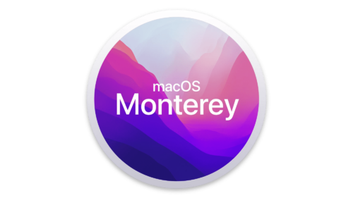
The image is a vibrant and colorful abstraction that is associated with macOS Monterey, released in 2021. The blending of purple, pink, and blue shades conveys a sense of fluidity and dynamism, reflecting the OS’s focus on seamless integration across devices and improved user experience. The text “macOS Monterey” is prominently featured at the center, set against a backdrop that transitions from a deep navy to a lively magenta, encapsulating the idea of exploration and the boundless possibilities within the operating system.
MacOS Ventura ( 2022 – 2025 )
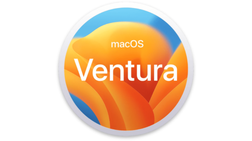
The image likely symbolizes macOS Ventura, possibly the 2022 release. The graphic presents a series of warm, overlapping curves that may be abstract representations of the coastal contours near Ventura, California. The color palette shifts from deep oranges to bright yellows, evoking the vivid warmth of a coastal sunrise or sunset. This imagery could reflect an OS that is both inviting and powerful, with layers of functionality that are both accessible and deep. The design’s fluidity might indicate a seamless user experience, and the circular frame suggests a complete and self-contained system.
MacOS Sonoma ( 2023 – 2026 )
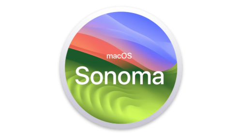
The image might represent macOS Sonoma, presumably a conceptual or future version of Apple’s operating system. The design features layered hills rolling into the distance under a sky streaked with warm hues transitioning to cool tones. It suggests a landscape at the cusp of day and night, symbolizing balance and transition, possibly hinting at an OS that offers a stable platform while introducing new features that enhance user experience. The gradient from green valleys to the sunset sky could represent innovation grounded in a solid foundation, all enclosed within a sleek, modern aesthetic.


