

![]() MAC Logo PNG
MAC Logo PNG
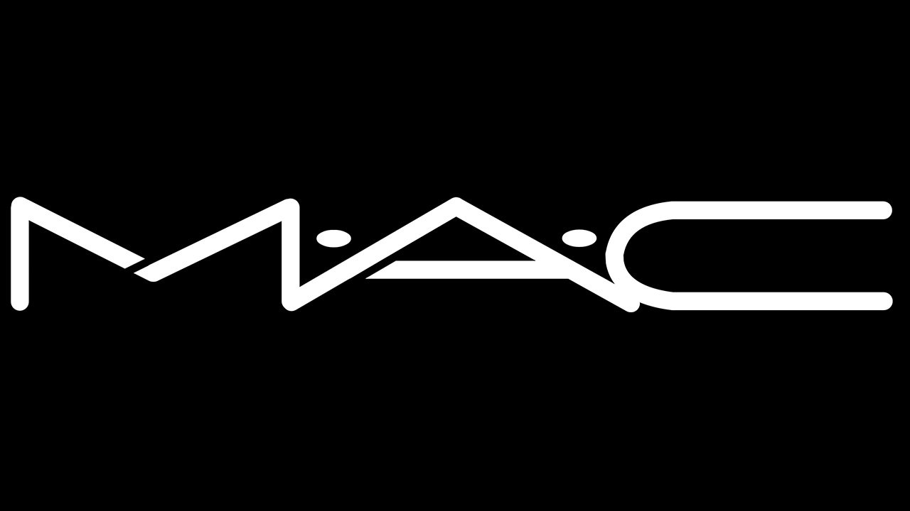
In spite of the fact that the MAC logo is just a black-and-white wordmark, it is highly recognizable and memorable.
Meaning and history
![]()
The history of MAC Cosmetics started in Toronto, Canada, in 1984. It was founded by a photographer and makeup artist Frank Toskan and cosmetic innovator Frank Angelo. Stylized as M·A·C, the cosmetics manufacturer was launched as a brand created “by makeup artists for makeup artists.”
Symbol

The emblem includes the three letters forming the company name divided by two dots. Only one of the letters, the “C,” is solid, while the “M” and “A” both are broken into two parts. In case of the “M,” the thin white gap dividing it into two parts goes almost in the middle of the letter, just a little higher than the angle (to the left). In the case of the “A,” the gap is positioned on the right end of its horizontal bar.
What makes the letters unique, apart from their two-part structure, are their proportions. The glyphs look flattened (or stretched to the sides), due to which they are wider than average and shorter than average. Another distinctive feature is the way the letters stick together: neither “M” and “A” nor “A” and “C” are separated from each other.
The two dots can be seen slightly above the horizontal bar of the letter “A.”
Why does the emblem work?
The M.A.C logo is basically just a wordmark – there’re no pictorial elements or icons of some sort. However, we should point out that the way the dots are placed goes beyond traditional grammar rules about where a full stop should be placed. The only reason why the dots are positioned in the middle of the line is that they look unusual and make the emblem more recognizable.
Font
Since M.A.C is a rather large company, they had their logo developed from scratch rather than used a ready-made font. That said, this typeface isn’t completely unique – it follows the modern preference of rounded, minimalistic shapes, and you can find a couple of similar fonts.
Colors
Although M.A.C has established itself as the color authority, its own logo uses a black-and-white palette. While this approach doesn’t reflect the color diversity M.A.C. products are capable of, it’s simple and effortlessly elegant.
We can add that since the MAC logo is placed on all types of products and packages, the two-color design is probably the most appropriate one. It provides maximum flexibility and is easier to reproduce than if it had been given in many colors.


