Missoni is a luxury fashion house headquartered in Varese, Italy. It is best known for its colorful knitwear items with a distinctive zigzag pattern. The history of the brand started in 1953.
Meaning and history
In 1947, Ottavio Missoni, together with his friend Giorgio, opened a small knitwear company. The firm had three machines on which they made tracksuits for athletes. Since Ottavio was a professional track and field athlete, this line of production was closest to him. A year after the business opened, Missoni’s tracksuits became the uniform of the Italian national track and field team.
During the Olympic Games in England, Ottavio met Rosita Gelmini. The girl’s parents owned a textile factory producing fabrics. In 1953, the young people got married, moved to Lombardia, and established the Missoni company.
Today Missoni is synonymous with Italian fashion and style, and the M Missoni line represents more democratic and affordable collections of the iconic zig-zag patterned knitwear.
What is M Missoni?
M Missoni is the name of a clothing and accessories line of one of the most famous luxury Italian fashion houses, Missoni. Under this brand, the company produces women’s, men’s, and children’s clothing, perfumes, swimwear, shoes, and accessories. The brand was founded in 1953 by Ottavio Missoni and his wife Rosita Gelmini.
1953 — 1998

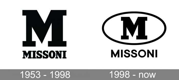
The original M for Missoni logo was created in 1953 and stayed with the famous fashion brand for more than forty years. It was a black and white badge, with only an uppercase logotype and a stylized letter “M” above it. Both parts of the badge were executed in a strict gear metric serif font, had its contours clean and distinct, and the cuts of the bars neat and square. The “M” was enlarged and emboldened, though was drawn in exactly the same typeface as the wordmark under it.
1998 — Today
The line named M Missoni started in 1998. It is produced and distributed by Marzotto. The range offers less expensive items than the main Missoni range. This fact is reflected in the M Missoni logo. It looks somewhat simpler than the primary emblem of the fashion house.
The logo of the M Missoni line features the large “M” inside an ellipse. The letter looks the same as in the primary Missoni logo. The shape of the middle part of the “M” seems to have been inspired by the iconic zigzag pattern.
Below the emblem, the name of the fashion house can be seen. The type is simpler than the bold sans of the primary wordmark.
Font and Color
While the emblem of M Missoni features a heavy “M” in a custom geometric serif font, the main lettering, written under the medallion, is set in the uppercase of a medium-weight sans-serif typeface with clean lines and minimalistic contours of the characters. The closest fonts to the one, used in this insignia, are, probably, BR Hendrix Bold, or Sailec Bold.
As for the color palette of the M Missoni visual identity, it is traditionally based on a combination of black and white, the classic scheme for the luxury fashion segment, which evokes a sense of style, professionalism, and progressiveness. The M Missoni brand is known for the bright patterns and textures of the fabrics, so the monochrome badge balances the colorful garments of the label.


