Lucky Me is a noodle brand of Monde Nissin Corporation of the Philippines, established in 1989. In 2021, the brand went public and set a record in the Philippines for the amount of money raised.
Meaning and history
Monde Nissin was founded in 1979 as a cookie manufacturer. The business was started by the father of the current owners of the company, Hidayat Darmono. Within 10 years of its founding, Monde Nissin decided to create a brand of instant noodles, Lucky Me.
Today, Lucky Me! noodles are the best-selling noodles in the Philippines, accounting for about 70 percent of the market. Monde Nissin’s noodle revenue is more than a billion dollars a year. The brand produces several lines of products with beef, pork, and chicken flavors
What is Lucky Me?
Lucky Me is the name of a Filipino brand of instant noodles, which was founded in the late 1980s. Today, the company is one of the Asian market leaders in this segment. Lucky Me produces noodles in different flavors and successfully exports them all over the world.
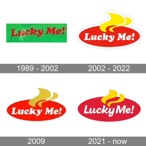
In terms of visual identity, Lucky Me has been a pretty consistent brand, with a minimum amount of redesigns, and a stable style and color palette, which has only been slightly refined in 2021.
1989 – 2002
The original Lucky Me! logo, created for the instant noodles brand in 1989, has stayed in use by the company for more than a decade. It was a bold red lettering written against a solid bright-green background without any graphical elements or framing. The combination of colors was very intense, hence there was no need for any additions.
2002 – 2022
The redesign of 2002 has adopted a new composition and color palette for the Lucky Me logo. The only thing, that left almost unchanged was the style of the lettering — with bold and smooth cursive characters. Now the badge comprised a solid red horizontally-stretched oval with a white inscription on it, and two massive yellow waving elements set vertically on the top part of the logo.
2009 (unused)
In 2009 the company slightly darkened up the color palette of the logo, keeping the contours and style of all elements untouched. The yellow waves became calmer and the contrast between the elements was now as bright as on the previous version. This logo was designed but never used by the brand.
2021 – Today
The redesign of 2021 was done for the IPO of the Lucky Me brand. The company has introduced the refined version of its logo as a sign of the new era for Lucky Me. The concept remained the same — a red oval with white lettering and yellow steam, but the contours of all elements have been refined and strengthened, with the color palette intensified and the typeface of the lettering modernized.
Font and color
The bold yet elegant lettering from the primary Lucky Me logo is set in the title case of a modern cursive typeface. The closest fonts to the one, used in this insignia, are, probably, Malvie Regular or Beach Bar Bold, with some minor modifications of the characters’ contours.
As for the color palette of the Lucky Me visual identity, it is based on deep shades of red and yellow, which evoke a sense of warmth and comfort, and the clean white of the wordmark, which makes the badge look more stable and professional.


