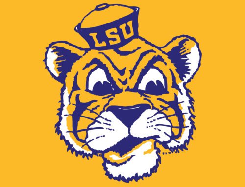
Louisiana State University’s football program is known as the LSU Tigers, or the Fighting Tigers. In addition to the regular LSU logo, the Fighting Tigers may use two more secondary emblems.
Meaning and history
The LSU visual identity history is a perfect graphical interpretation of the club’s progress and evolution, as its first logo was introduced in 1955, and lets its main symbol and color palette until its last redesign in 2014, but in a more confident and modern shape.
1955 – 1967
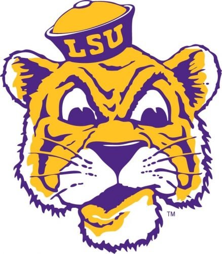
The original logo for Louisiana State University’s club was introduced in 1955 and featured a bright and funny portrait of a tiger with a small hat, where the “LSU” lettering was written. The animal’s image was executed in yellow and purple color combination, which evokes a sense of joy, happiness, and energy. This palette stays with the team today, showing its value of history and constancy.
1967 – 1972
The redesign of 1967 brought a more detailed and realistic image of a tiger to the LSU’s emblem. The dangerous animal’s portrait was placed above the stylized bold wordmark and framed with a thin purple line. The logo started looking more professional and strong, reflecting the fighting spirit of the club.
1972 – 1980
In 1972 the logo was simplified to just the tiger’s portrait, with the framing and lettering being removed. The new image depicted an animal with its mouth open, looking like the tiger is ready to jump and conquer. This emblem, executed in the same yellow and purple palette, stayed with LSU for eight years.
1980 – 1990
The only version with a different color palette was introduced by the football club in 1980. It was a modern and powerful yellow and black badge with the tiger’s head placed above the massive shadowed lettering set diagonally in the upright direction. The white “Tigers” inscription in all capitals of a square sans-serif typeface was written along the bottom part of the “LSU” nameplate.
1990 – 2002
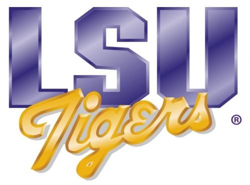
The logo from the 1990s featured just an inscription set in two levels, and using two different styles of lettering. The upper part comprised “LSU” in an extra-bold geometric sans-serif font, executed in light purple gradient color, and looking vivid and shiny. As for the bottom level, it consisted of a cursive “Tigers” in yellow, placed diagonally, and slightly overlapping the upper part of the logo. This was one of the most long-standing LSU badges.
2002 – 2007
The tiger comes back to the club’s visual identity in 2002. Being redrawn in a more modern and confident way, the animal’s image was placed above the outlined and shadowed “LSU” wordmark in an oval purple background with two sharp lines coming out of it to the right. The “Tigers” part of the nameplate was placed under the badge, written in white on a black rectangular banner.
2007 – 2014
The logo was redrawn again in 2007: its dark background was removed, and now the tiger’s head above the customized purple inscription was placed on a white background, is outlined in black. The purple lettering, executed in a smooth yet powerful, sans-serif typeface looks solid and stylish, while the tiger’s head in yellow, black and white represents the character and mood of the team.
2014 – Today
The LSU visual identity was simplified to a single logotype in 2014. The purple wordmark with a yellow outline was taken from the previous logo version and slightly refined. The letters became a bit thicker and stronger, brilliantly representing the team’s essence and fighting spirit.
Font
The clear all-cap sans serif typeface looks unique due to the unusual curves and angles of the letters “S” and “U”.
Color
The official colors for LSU are purple (Pantone PMS 268C), gold (Pantone PMS 123C), black, and 50% Gray (Pantone PMS Cool Gray 8C). The University’s athletic logos include only two of the official colors, purple and gold. Also, there are white elements.
LSU basketball
LSU basketball teams compete in the Southeastern Conference. The men’s team is coached by Will Wade, while the head coach of Lady Tigers is Nikki Fargas. Their home arena is Pete Maravich Assembly Center.
The team has made four final four appearances, nine Sweet Sixteen appearances, and has competed in SEC Championships ten times. Also, LSU claims a national championship on the basis of a win in the American Legion Bowl (in 1935), yet this championship is not typically considered to determine a national champion.
LSU baseball
LSU Tigers compete in NCAA Division I college baseball. They play in the West Division of the Southeastern Conference. It is ranked seventh all-time winningest college baseball program in the US. The Tigers boast eighteen College World Series appearances and six national championships.
Their home arena is Alex Box Stadium, Skip Bertman Field. As of 2019, they are coached by Paul Mainieri, who has been with them during fourteen seasons.
LSU Colors
PURPLE
HEX COLOR: #461D7C;
RGB: (70, 29, 124)
CMYK:(82, 98, 0, 12)
PANTONE: PMS 268 C
GOLD
HEX CODE: #FDD023;
RGB: (253, 208, 35)
CMYK: (0, 19, 89, 0)
PANTONE: PMS 123 C
What is the LSU logo?
The logo of the Louisiana State University, known as LSU, is composed of a bold stylized abbreviation, set in the uppercase of a fancy custom sans-serif typeface with the three characters slightly extended horizontally. The “L” on the badge is drawn in a clean geometric way with minimum elements, while the “S” has two angles on its horizontal bar sharp, and two — softened. As for the “U”, it also uses two types of angles — the sharp one on the left, and the rounded one on the right. The badge is executed in a deep shade of purple, the color of wisdom, creativity, and imagination.
What font does LSU use for its logo?
The sleek modern uppercase lettering from the primary badge of the Louisiana State University is set in a custom sans-serif typeface with futuristic contours of the letters. The font, used by the designers of the badge, is Geaux Extended, which has something in common with such types as Friday Clean Extended, or Varitek Expanded Black, but with some major modifications.


