LOONA, a South Korean girl group formed by Blockberry Creative, stands out with its unique “Girl of the Month” pre-debut project. Starting in October 2016, each of the 12 members was revealed individually, each releasing a solo single and music video. Their diverse music styles range from dreamy ballads to upbeat pop, showcasing each member’s distinct talents and personas. The group finally debuted as a whole in August 2018. Their songs often incorporate vivid storytelling and symbolism, resonating with a global fanbase and earning them a reputation as trendsetters in K-pop.
Meaning and history
LOONA, a South Korean girl group under Blockberry Creative, debuted in 2018 with an innovative pre-debut project, “Girl of the Month”. This unique approach, spanning from October 2016 to March 2018, involved unveiling each of the 12 members monthly, each releasing a solo single and music video. This strategy allowed fans to familiarize themselves with each member’s individual style and talents before the group’s official debut.
The members, HeeJin, HyunJin, HaSeul, YeoJin, ViVi, Kim Lip, JinSoul, Choerry, Yves, Chuu, Go Won, and Olivia Hye, showcased a range of music styles, from elegant ballads to dynamic pop tracks. The group was divided into three sub-units: LOONA 1/3, Odd Eye Circle, and yyxy, each with a distinct musical and conceptual focus.
LOONA’s official debut as a full group came in August 2018 with the mini-album “+ +”, led by the title track “Hi High”. Their music, often laden with intricate storytelling and symbolism, has garnered a dedicated international fanbase, known as “Orbits”. The group is noted for their diverse concepts, which range from whimsical to edgy, and their music videos are renowned for their high production values and artistic depth.
Over the years, LOONA has released several albums, including “[X X]”, “[#]”, and “[12:00]”, each contributing to their growing discography and evolving sound. Their experimental approach to music and aesthetics has set them apart in the K-pop industry, earning them accolades and a significant global following.
Despite facing challenges such as member hiatuses and legal issues with their management company, LOONA has continued to thrive, showcasing their resilience and versatility. Their journey, marked by a unique pre-debut process and a commitment to artistic expression, has established them as a significant and influential force in the world of K-pop.
What is LOONA?
LOONA emerges as a vibrant ensemble from South Korea, sculpted by Blockberry Creative. Their trailblazing pre-debut tactic spotlighted each member with individual single releases, a novel concept in the music realm. The eclectic blend of their musical versatility and the depth of their visual narratives distinguish them within the bustling K-pop sphere, garnering a devoted international following.
2018 – Today
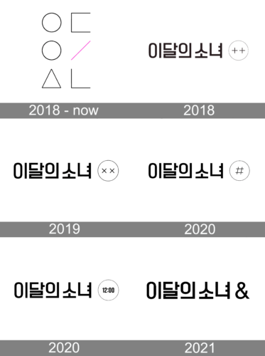
The logo is a minimalist yet symbolic representation, associated with a specific entity or brand. It features geometric shapes. A diagonal pink slash intersects the arrangement, adding a dash of color to an otherwise monochromatic scheme. This abstract composition suggest harmony and balance, with the pink slash introducing a dynamic or disruptive element. The shapes are evenly spaced, suggesting a meticulous attention to structure and form.
2018
The logo in view, featuring Hangul characters alongside the emblem “++” within a circle, serves as the visual representation for the debut mini album “[+ +]” by the group. The simplicity of the design—a monochromatic palette and unadorned geometric shapes—highlights the album’s name while symbolizing a sense of beginning or addition. This minimalist approach, where the symbol becomes part of the album’s title, suggests a fusion of ideas or sounds, an apt metaphor for a debut that brings together individual talents into a cohesive whole. The stark contrast and clear font convey a sense of boldness and freshness, setting the stage for the group’s initial foray into the music scene.
2019
In this iteration of the logo, the graphic within the circle has shifted from two plus signs to two ‘X’ marks. The rest of the logo remains unchanged, maintaining the strong presence of the Hangul characters, which signifies consistency in the entity’s identity or core values. This subtle yet significant alteration in the logo could represent an evolution or a new direction for the brand or group it symbolizes.
2020
The latest variation of the logo maintains the Hangul text while introducing a hash symbol inside the circle, replacing the previous ‘X’ marks. This hash or number sign is globally recognized as a symbol for categorization in digital spaces, suggesting a connection to social media trends or data organization. The consistent font style of the Korean characters alongside the evolving symbol indicates a blend of steady identity with adaptable branding.
2020
This logo retains the Hangul script of its predecessors but makes a notable change in the circle’s content, now reading “12:00.” The simple black font against the white background continues to convey a modern, clean aesthetic.
2021
The logo for LOONA’s fourth mini album, “[&],” presents a clear evolution in the sequence of their album iconography. Here, the emblematic circle is absent, with the ampersand “&” taking a stand-alone position. This typographic character, representing conjunction, suggests collaboration, unity, or the addition of new elements or ideas. The Hangul characters remain consistent, providing a visual anchor and continuity for the group’s identity. The ampersand’s bold presence next to the Korean script creates a striking visual balance, symbolizing the blending of traditional and modern influences that may be reflected in the album’s content.


