

![]() Lille Olympique Logo PNG
Lille Olympique Logo PNG
Lille Olympique is the name of a French football club that was established in 1944 and got nicknames “Les Dogues”. Today the club is one of the most successful ones in Ligue 1 and has Christophe Galtier as the head coach.
Meaning and history
![]()
The visual identity history of the famous French football club can be split into two periods — from 1944 to 1981, and from the 1980s until today. Two completely dif-ferent symbols were in use by the club during these time periods, but the color palette has always been more or less the same — the club has been jumping from French tricolor to just red and white.
Another common thing for almost all the logo versions is the wordmark. The “LOSC” letters, standing for “Lille Olympique Sporting Club” were present on all the emblems except for the very first one.
1944 — 1946
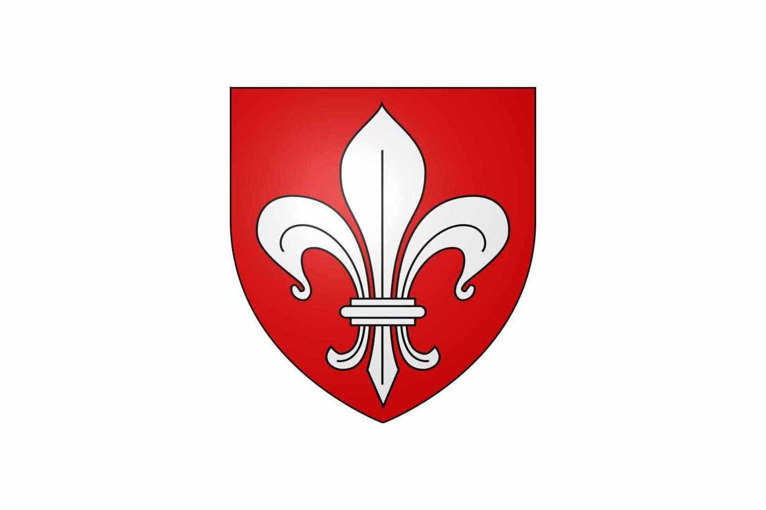
The initial logo for the Lille football club was introduced in 1944 and featured a bold red shield with a white Fleur-de-Lys symbol in a delicate black outline. A very “French” heraldic emblem was adopted as the club’s symbol since the day of its establishment and stayed for almost forty years.
1946 — 1955
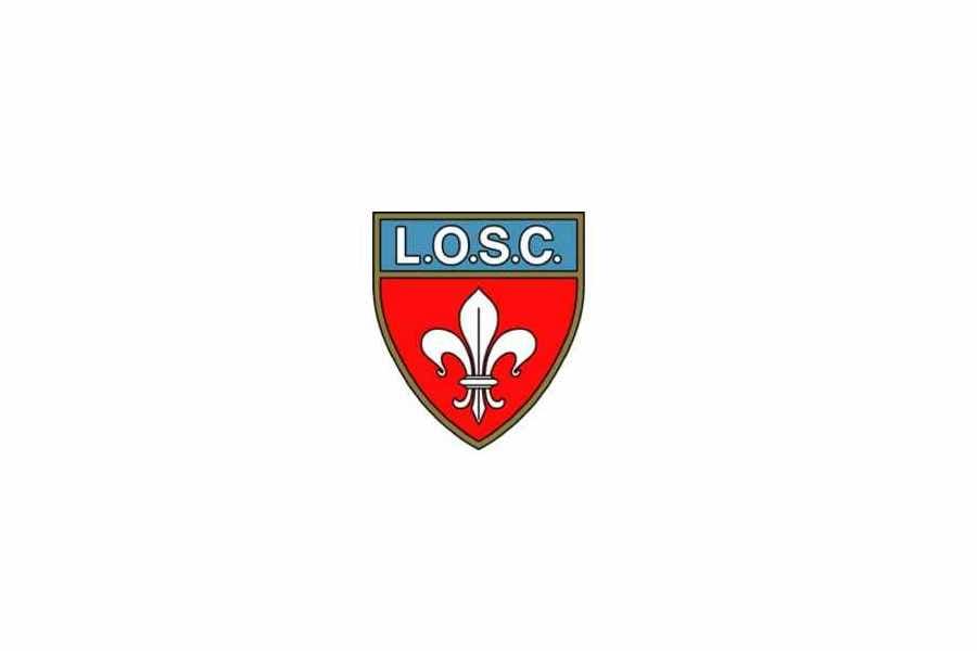
In 1946 the logo was slightly modified — the “L. O. S. C.” Wordmark was placed on the top part of the shield, which was now colored light blue. The letters were colored white and executed in a bold sans-serif typeface, each letter and dot was outlined in black. Another change — the emblem gained a calm gold outline, making it look more sleek and distinct.
1955 — 1974
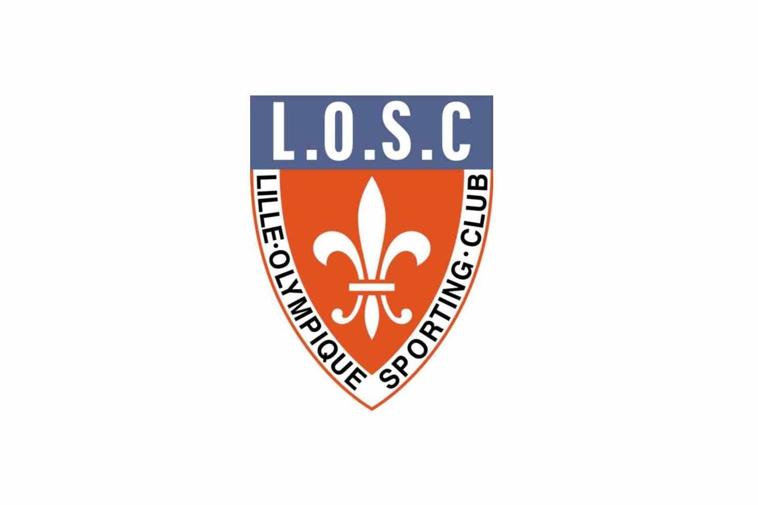
The redesign of 1955 changed the color palette of the emblem and added a full wordmark around its perimeter. The intense red was replaced by a coral shade, and the blue part of the crest was now in light purple. The contours were also modified and the shield became narrower and higher.
The “Lille-Olympique Sporting-Club” inscription in black was executed in a clean sans-serif typeface and placed on a white framing of the emblem, making it look more elegant and calm.
1974 — 1981
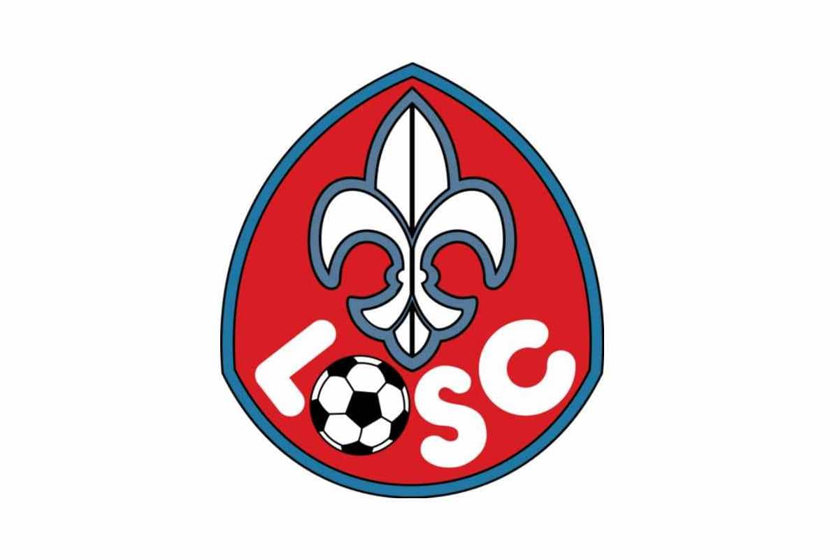
The last version with the Fleur-de-Lys was introduced in 1974. It was a bright emblem evoking a friendly feeling and reflecting the passion and energy of the club. The shield in this version was turned upside-down and now the pointed part was on top.
The intense red color came back to the logo, bringing while and blue with it. The flower symbol was white and featured black details with a thick blue outline.
The “LOSC” lettering without any dots was arched along the bottom part of the shield and executed in an ExtraBold rounded sans-serif font with the letter “O” replaced by a black and white football.
It was a cool and eye-catching emblem, which has put a dot in the Fleur-de-Lys symbolically for Lille Olympique.
1981 — 1989
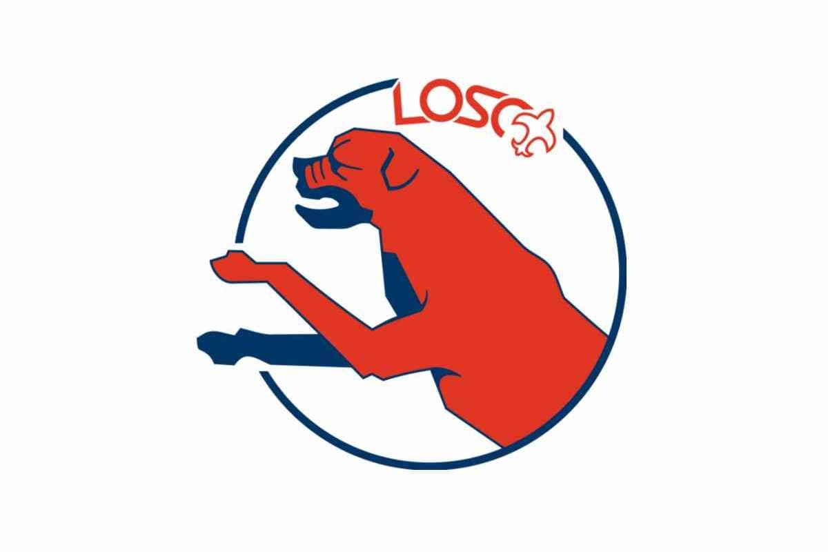
The red bulldog became the symbol of the club in 1981 and stays with them today. The dog with blue details was enclosed in a thin blue circular frame and placed on a white background.
The “LOSC” lettering in the red custom font was placed on a frame with the stylized fleur-de-Lys.
1989 — 1997
The bulldog got turned to the right in 1989. All the blue details except for the circular frame were removed, but the dog gained two sleek and sharp lines behind its back, resembling wings and symbolizing speed and freedom. The wordmark, built in two levels, was placed under the emblem.
The “LOSC” part with no dots was executed in italicized ExtraBold sans-serif typeface, in a light blue color, and the “Lille Metropole” in gray was placed under it, in delicate clean lines.
1997 — 2002
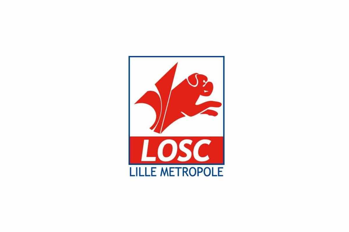
The “winged” bulldog was placed inside a square in 1997. The main part of the in-scription, “LOSC”, was put inside the emblem, right under the dog, on a red rectan-gular background. Under the square “Lille Metropole” in all capitals of a traditional sans-serif was written.
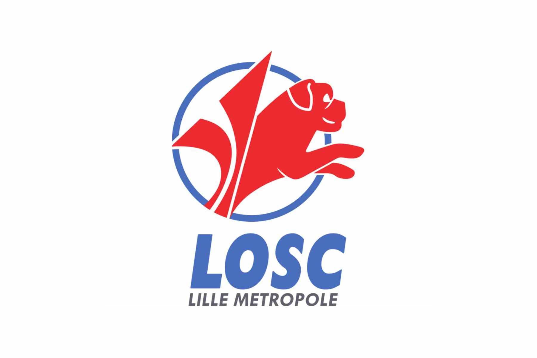
2002 — 2012
A completely new style of the emblem was created for the club in 2002. The red bulldog was redrawn in a more modern and sleek way and placed above the red “LOSC” wordmark in a double white and blue outline. The “Lille Metropole” tagline was colored blue and had a red delicate fleur-de-lys symbol separating the words.
The whole emblem was framed in an arched swoosh-like line, representing energy and movement.
2012 — 2018
The emblem of 2012 is the most elegant and sleek among all the Lille Olympique logo versions. It boasts an elongated crest, composed of two parts — blue on the right and red on the left. On the blue part there is a delicate fleur-de-lys, and on the red — and iconic bulldog, which overlaps the left part, forming kind of a red flame.
The lettering above the shield featured arched “Lille” in a serif font, and bold gradient red “LOSC” in the same style, but with thicker lines.
2018 — Today
![]()
The redesign of 2018 brought a more aggressive image to the club’s visual identity. The bulldog’s profile in white, placed on a red and blue background, is faced right and looks strong and dangerous. The image is enclosed in a pentagon, with clean straight sides and pointed angles.
The “LOSC” lettering in the masculine font is placed on the bottom part of the emblem and has a small and elegant fleur-de-lys symbol above it.
Lille Olympique Colors
RED
PANTONE: PMS 485 C
HEX: #E01E13
RGB: (224, 30, 19)
CMYK: (6, 99, 100, 1)
BLUE
PANTONE: PMS 2119 C
HEX: #24216A
RGB: (36, 33, 106)
CMYK: (100, 100, 27, 16)
WHITE
HEX: #FFFFFF
RGB: (255, 255, 255)
CMYK: (0, 0, 0, 0)


