Lifebuoy is a soap brand that belongs to Unilever plc, a British consumer goods giant headquartered in London, the UK. Lifebuoy was introduced in the UK by Lever Brothers. It was known as the Royal Disinfectant Soap and was based on carbolic acid, which was discovered by William Hesketh Lever in his search for an effective and cheap soap formula. His project brought him the title of Lord Leverhulme due to his contribution to the health of the nation.
Meaning and history
Taking into consideration that the soap was introduced in 1894, the Lifebuoy logo is bound to have seen multiple modifications. And yet, in spite of all the updates, it has always had a visual link with the name.
We can single out at least two recurrent motifs connected with this theme: the color red and the round (or oval) shape, both of which come from an actual lifebuoy.
The reason behind this name and the visual concept was that back then, the soap hygienic properties weren’t as universally recognized as now and the soap wasn’t as cheap. So, in a way, the brand had to hammer the message home that soap can save your life.
What is Lifebuoy
One of the oldest soap brands, Lifebuoy is now marketed by Unilever. Originally, the product was based on carbolic acid and contained phenol, but the current version has a different formula.
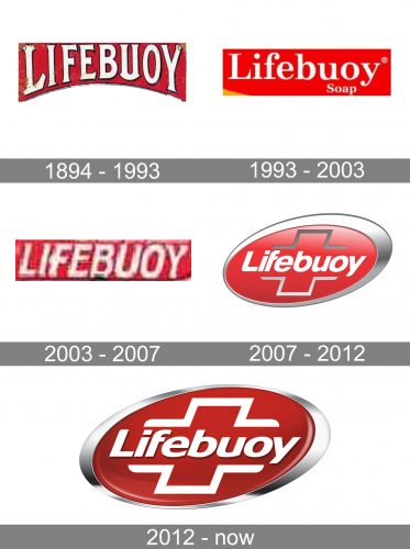
1894 – 1993
During the first hundred years of the existence of the soap brand, its package underwent a huge number of alterations. Rarely did people realize at the turn of the previous century how important a consistent logo is.
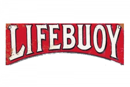
Anyway, the examples of the old package and advertising present interesting material for analysis. For instance, a 1902 ad features the name of the brand written across an actual lifebuoy. An old magazine ad showcases a bar of soap inside a lifebuoy. The name of the brand is already given in white letters on the red background.
In many ads, we can see a package, where the wordmark is slightly arched and is set in a serif type. Still, there are also examples where the letters are aligned properly and feature a sans serif font.
1993 – 2003
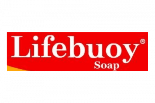
To preserve the brand’s heritage, the wordmark is given in white over the red background. However, the type is new. It is a rather generic serif font with a pronounced retro touch. It’s not arched like in the older Lifebuoy logo.
2003 – 2007
Here, the wordmark is capitalized and features more contemporary and unique typography. Firstly, there’s a creative approach to the serifs – they are small and have unusual shapes. Also, you can notice minor decorative elements here and there, for instance, the longer lower bar on the “F” or the curve at the upper left-hand end of the “Y.”
2007 – 2012
This one looks by far more modern and dynamic, partly due to the italicized sans serif type. What’s more important, the medical and lifebuoy themes are more pronounced here. The latter comes from the silver ellipsoid going round the wordmark and resembling an orbit. The medical theme, which supports the characteristic apothecary smell of the product, is reflected in the red cross behind the lettering.
2012 – present
Subtle adjustments have been introduced making the Lifebuoy logo more straightforward. The silver outline of the cross was replaced by a white one. Some of the rounded elements of the wordmark were replaced by angular ones (note, for instance, the lower left-hand corners of the “L” or the “B”).
Colors and font
In spite of the fact that the company has always tried to emphasize the brand’s heritage, they eventually replaced the retro serif type with a modern sans. The red color that has been used in the majority of the versions of the logo comes from the actual lifebuoy.


