The colors featured on the university’s official palette are red (hex: #990000), white, and blue (hex: #0A254E). All of them can be seen on the current Liberty Flames logo. In addition to these three colors, there is also a light shade of red.
Meaning and history
Founded within the folds of Liberty University’s establishment in 1971, the Liberty Flames emerged as a beacon of athletic prowess in Lynchburg, Virginia. The university, renowned for its evangelical Christian ethos, laid the cornerstone for what would become a distinguished chapter in NCAA sports history.
The trajectory of Liberty Flames is marked by a series of commendable achievements, especially in key sports like football and basketball. In football, the Flames have carved a niche in the NCAA Division I Football Bowl Subdivision, showcasing a blend of strategic gameplay and athletic finesse. Their basketball team, too, has etched its name in the annals of the NCAA Tournament history, proving their mettle through multiple appearances and strong performances. These accomplishments not only highlight their competitive spirit but also reflect a commitment to excellence that transcends the sports arena.
Presently, the Liberty Flames stand as a testament to a legacy of athletic excellence and unwavering spirit. Their ongoing endeavors in the NCAA landscape symbolize a fusion of past glories and a relentless pursuit of future triumphs. This steadfast focus on sporting brilliance mirrors the university’s mission to foster holistic development, sculpting individuals who excel in both their athletic and academic pursuits.
What is Liberty Flames?
Representing Liberty University, the Liberty Flames are a dynamic and multifaceted force in NCAA sports. With a spectrum of athletic teams, they embody excellence and a relentless competitive spirit, marking their distinct identity in collegiate sports.
1979 – 1980
The 1979 logo depicts a blue outline of an eagle with a torch in one of its paws. The torch is also blue, save for the flame, which is outlined in red. There is a fair bit of nuance to the bird, although it’s still pretty minimalistic in style.
1980 – 1984
The next logo also depicts an eagle, but in a full red silhouette, shaped vaguely like the letter ‘F’. As such, they arranged it in a diving position. The rest of the letters in ‘Flames’ followed on the left, in a similar, rough and paint-like style.
1984 – 1985
This design was a stylistic red flame with white tongues and a bold ring of the same color in its heart. Inside this ring, there was a red outline of a bird’s head, written against the white background.
1985 – 2000
The old logo introduced in 1985 featured brighter shades of blue and red. Similar to the current logo, it sported a stylized bird. However, it looked by far more abstract in comparison with the current one. In fact, it was just an outline. The lettering, vice versa, was longer and included the words “Liberty University.”
2000 – 2003
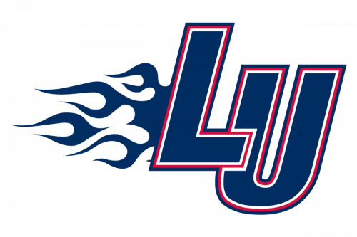
In 2000, they adopted an acronym ‘LU’ in two big and narrow letters of dark blue with three layers of outline: white, red and black. The letter ‘U’ is lowered slightly, compared to the other character. There are also minimalistic flames coming out of the side of the first letter.
2003 – 2013

The following emblem, which was adopted in 2003, looked more professional. It was not just an abstract bird but had style and character (which was very aggressive and determined). The bird was white with a red outline, while the lettering “Liberty Flames” was given in blue.
2013 – Today
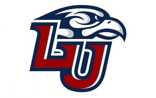
Eventually, in 2013, the team upgraded their emblem once again.
While the shape of the bird has been apparently inspired by that of the 2004 logo, it now looked more refined. The designer has replaced the red elements by dark blue and added some grey. Due to the contrast between red and grey, the design has got some dimension.
Also, the bird on the previous emblem is broader in comparison with the current Liberty Flames logo. The longer lettering was replaced by just the initials: “L” and “U.” The glyphs were red with white strokes and the blue outline.
Liberty Flames basketball
The men’s basketball team, which was fielded in 1972, has achieved the postseason three times in its NCAA Division I history. The first coach was Dan Manley, while the current head coach is Ritchie McKay. Their home arena is the Vines Center, the team belongs to the Atlantic Sun Conference.
In the 2005 NCAA Division I Women’s Tournament, Lady Flames headed by Katie Feenstra made the Sweet Sixteen.
Liberty Flames football
The man’s team is known for being Big South Conference Champions in 2007 and 2008. The team headed by Hugh Freeze uses Williams Stadium as its home arena.
Liberty Flames baseball
Interestingly, four players who used to be part of the university’s baseball program later competed in Major League Baseball. The foundation of the baseball team dates back to 1974. The list of achievements includes three appearances in NAIA Baseball World Series. Also, the team appeared in the NCAA Division I Baseball Championship Tournament three times.
Liberty Flames Colors
BLUE
PANTONE: 294 XGC
HEX COLOR: #002D62;
RGB: (0, 45, 98)
CMYK: (100, 89, 34, 25)
RED
PANTONE: 1795 C
HEX COLOR: #C41230;
RGB: (196, 18, 48)
CMYK: (16, 100, 87, 6)
WHITE
PANTONE: P 1-1 C
HEX COLOR: #FFFFFF;
RGB: (255, 255, 255)
CMYK: (0, 0, 0, 0)
GREY
PANTONE: COOL GRAY 3 C
HEX COLOR: #C6C8CA;
RGB: (198, 200, 202)
CMYK: (22, 16, 16, 0)


