Lenskart is an Indian manufacturer of eyewear, located in New Delhi and founded in 2010. The list of their products consists of high-quality eye lenses and eyeglasses, as well as products for glasses cleaning and repairing. This is one of the largest glasses producers in India, having 900+ units in 40 cities of India and making 300000 glasses every month. Most of their stores operate both online and offline. The company partners with many foreign investors, such as Japanese Softbank, for example.
Meaning and history
Lenskart was established in 2010 by Peyush Bansal, a specialist formerly working in Microsoft. Alongside his partners Amit Chaudhary and Sumeet Kapahi, he’s made a market research and founded out that there were not many large producers in the Indian eyeglasses market. After this, he launched Valyoo Technologies, the Lenskart’s parent company, and Lenscart itself. For the following years, it grew from an e-commerce store to a large manufacturer operating both online and offline across the whole India.
What is Lenskart?
Lenskart is an Indian brand of optical products, founded in 2010 by Peyush Bansa and based in New Delhi. This is one of the most successful and largest eyewear startups in India, having around 1000 points of presence spread across 40 cities of India. More than 300000 glasses and other products are produced by 5000+ employees in Lenskart factories monthly. In 2022, the company also entered the Japanese market by buying an eyewear brand named Owndays.
2010 – 2013
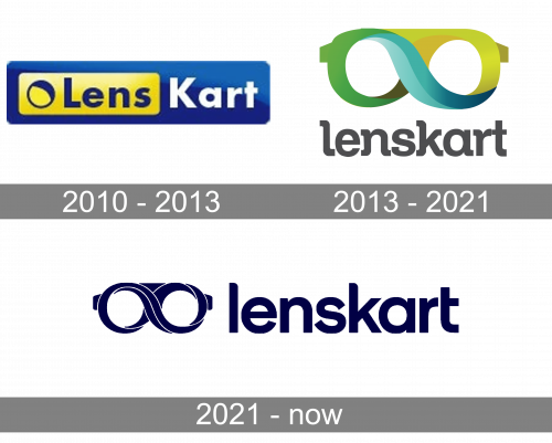
The very first logo was created for Lens Kart in 2010 and stayed untouched for more than three years. It was a voluminous horizontally stretched rectangular banner in solid blue, with the smaller yellow rectangle placed in its left part. The yellow element featured a gradient background with the heavy blue sans-serif “‘Lens” lettering placed on the right from a delicate minimalistic emblem, composed of a blue ring with an emboldened upper-right part. As for the “Kart”, it was written in bold white characters over the blue background on the rectangular badge.
2013 – 2021
The brand logotype of Lenscart is a signature featuring glasses, shown from the front side. Their spectacle frame is designed in such a way, so it formed an infinity sign, colored green to the left, blue at the center, and yellow to the right. Below it, we can see the name. It was written in a gray typeface with rounded serifs and small intervals between lowercase letters.
2021 – today
The new redesign of Lenskart’s corporate logotype depicts the familiar glasses. Their frame forms an infinity sign using some lines. To the right, the brand designers wrote the brand’s nameplate. Now the whole logotype has a monochrome palette.
Font
The typeface of the nameplate in the 2019 logotype reflects a sans-serif appearance with lowercase letters, which have small gaps in between. The ‘l’ character has a slight incline at the top. The ‘k’ letter has the same incline of the vertical bar and sharp endings of the diagonal bars. The ‘r’, ‘a’, and ‘t’ characters also have shortened endings of their tails. The ‘e’, and ‘n’, symbols don’t have any special attributes.
Color
The color palette of the Lenskart logo changed twice since 2010. At first, the glasses were colorful, and their painting consisted of yellow, green, and blue shades. The name was ash gray. The second logotype was composed of a simple deep blue and white palette, whereas the blue was used for the glasses and the name, while white stood for some lines drawn on the spectacle frame of the glasses to show an infinity sign. In the cases if there is the background, its color can be black or white.


