Magnavox is an electronics company, a subsidiary of Dutch electronics corporation Philips.
For the first three decades of its history, the Magnavox logo was based on a visual metaphor that represented the product’s quality and name in a fun and original way. Yet, eventually, they had to get rid of the metaphor because of the modern design trends.
Meaning and history
Peter L Jensen and Edwin Pridham established their Commercial Wireless and Development company in 1911 in Napa, California. By 1915, they were already working on their first invention, the loudspeaker, which later received the name Magnavox (“great voice” from Latin).
1917 – 1919
The Commercial Wireless and Development company merged with The Sonora Phonograph Distributor Company.
One of the earliest existing examples of the Magnavox logo dates back to 1917.
In the very center of the design, you can see the moving iron speaker, which was the earliest type of electric loudspeaker. Out of the widest part of the loudspeaker, the lion’s head can be seen. The mouth is open to show he’s roaring. If this image could talk, it would say: “The Magnavox loudspeakers are as loud as the lion’s roar.”
The name of the brand can be seen below the lion’s head. It features a rather legible serif type with italicized letters.
The elements described above are placed inside an ellipse resembling a retro-style decoration. On each side of the ellipse, there is a seated male figure. Both look like Ancient Romans, due to their clothing and athletic bodies. The Romans appear to be surprised at the lion’s roar and are listening carefully. The full name of the brand, “The Magnavox company,” in a traditional serif type is placed below.
The combination of modern and historic elements made the logo unique and also added a touch of intelligent humor.
1919 – 1944
Business is not always about humor, however, so the company had to get rid of some of the “fun” elements. At least, the next logo already didn’t include the Romans and the old-fashioned elliptical “pendant.”
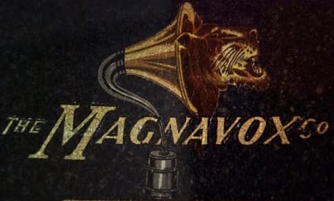
The lion’s head roaring out of the moving iron speaker was preserved, although it had been redrawn. The name of the brand featured a lighter typeface, which preserved the serifs and italics. The words “The” and “Co” were added at the beginning and the end, respectively.
On the whole, the logo grew more minimalist without losing much of its meaning. Also, it adopted a luxurious palette combining multiple gold shades and nuances with black.
In this form, the emblem was used until 1944. We should point out, however, that there were several variations, where a different typeface or palette could be used. Additional elements (the laurel leaves) could appear. Even the image could be redrawn with slightly different accents. Yet, the overall structure and style remained intact.
1944 – 1953

As time and technology were going forward at a fast pace, the moving iron speaker started to look dated. So, the company had to let the iconic picture disappear from the logo.
The new logo was all about the wordmark, which now featured a plain sans serif type. It was bold and not italicized. There were no dramatic differences in the widths of the strokes, except for the “g.” It was the most interesting letter – the shape of its long tail ending with a dot seemed to have been inspired by the moving iron speaker. In this way, the letter absorbed the meaning of its predecessor.
1953 – 1954

The “tail” of the “g” was shortened. There was also an extended version, where the company’s history was showed using pictograms (the oscilloscope wave, the masks inspired by the radio-theater, the harp, and the lion).
1960 – 1976

The wordmark was simplified once again losing its unusual “g.”
1976 – Today
The company capitalized all the letters and made them look as simple as possible. The current Magnavox logo is either red on the black background or white on the red background.


