LeapFrog is a renowned educational entertainment company primarily known for its electronic learning products for children. Founded in 1995 by Mike Wood, it revolutionized the market with its innovative technology-based educational toys. LeapFrog Enterprises, Inc. holds a significant position in merging education and technology seamlessly. With headquarters in Emeryville, California, the company extends its reach globally, serving numerous countries and diversifying its product range. Their dedication to creating engaging learning experiences has earned them trust among parents and educators alike, establishing them as leaders in their field.
Meaning and history
LeapFrog, an influential player in the realm of educational entertainment, was brought to life in 1995 by its founder, Mike Wood. Under his visionary guidance, the company broke new ground by merging cutting-edge technology with robust educational content, resulting in a line of pioneering electronic learning toys. Among its accolades, LeapFrog has been recognized for producing tools that enhance literacy and numeracy skills among young learners, cementing its reputation as an innovator in its niche. Fast-forward to the present day, LeapFrog continues to dominate the edutainment market, holding its headquarters in Emeryville, California, and has broadened its horizons with an ever-expanding global reach and diversified product offerings.
What is LeapFrog?
LeapFrog is an educational entertainment company founded in 1995 by Mike Wood. It specializes in creating electronic learning products and interactive toys for children, combining technology with educational content to foster learning and development. Headquartered in Emeryville, California, the company enjoys a prominent reputation in the edutainment sector.
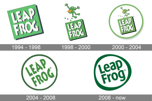
1994 – 1998
This striking design employs a dimensional perspective, bringing depth and dynamism to the “Leap Frog” moniker. A vibrant, botanical green canvas showcases bold white lettering with subtle shadows, enhancing the visual appeal. The tilted square frame lends a modern touch, making the emblem stand out in a contemporary manner. The composition resonates with notions of innovation and forward-thinking, echoing the brand’s commitment to interactive learning and growth.
1998 – 2000
A joyous amalgamation of playful imagery and crisp design. The logo portrays a cheerful green frog, mid-leap, above the brand’s name, leaving a trail of round impressions. The amphibian, with its adorable expression, striped shirt, and waving limbs, adds whimsy and fun. Set against a sharp green backdrop, the white bold letters stand out, emphasizing the brand’s name. The whole composition exudes energy, excitement, and a love for learning.
2000 – 2004
Boasting a brilliant blend of vibrancy and charm, this emblem captures the heart of the “Leap Frog” identity. The spirited green frog, playfully leaping above the brand’s name, is a nod to both the brand’s moniker and its ethos of fun-filled learning. The verdant hues symbolize growth and progression. A circular, dual-toned frame encompasses the dynamic duo of the leaping frog and bold typography, embodying unity and continuity in the brand’s mission to make learning enjoyable.
2004 – 2008
A simple yet effective design, this logo elegantly encapsulates the brand’s name within a delicate circular frame. The harmonious green hue exudes freshness and growth, while the bold white letters pop against this verdant backdrop. The design’s symmetry and balance symbolize stability and reliability, reflecting the brand’s dedication to quality educational products. The registered trademark symbol subtly underscores the brand’s established reputation in the market.
2008 – Today
Stepping into the world of branding, the “Leap Frog” logo exudes a profound sense of simplicity, growth, and a journey toward enlightenment. Encased within a meticulously crafted circular boundary, the design reflects universality and inclusiveness. Circles, throughout human history, have symbolized unity, infinity, and perfection, and in this context, it encapsulate the brand’s commitment to creating an unending journey of exploration and learning.
Emerald green, the predominant color in the logo, evokes a myriad of emotions and thoughts. It speaks of the natural world, of fresh beginnings, and of vibrant life. The choice of this hue aligns perfectly with the essence of a frog, suggesting leaps of progress and boundless energy. Set against this backdrop, the stark white typography stands out, offering a balance that’s both harmonious and eye-catching. The words “Leap Frog”, stylistically written, underscore the brand’s identity. The clever intertwining of the ‘L’ and ‘F’ adds a layer of intrigue, making it not just a name, but a story in itself.
Accompanying the name is the registered trademark symbol, a subtle nod to the brand’s authenticity and its established space in the market. This diminutive element, though small in stature, plays a crucial role in conveying trust and reliability. In essence, the “Leap Frog” logo is not just a representation; it is a narrative of growth, trust, and the joys of learning, presented with both elegance and flair.


