Lazada is the name of the leading e-commerce platform in Southeast Asia, which was established in 2012. Already in 2016, Lazada became the regional flagship of Alibaba Group and thus relies on Alibaba’s best-in-class technology infrastructure. The marketplace offers thousands of deals from the sellers from all the controls of the region, in all the possible categories and price ranges.
Meaning and history
For many Asian countries, Lazada has already become the number one destination for online shopping. Individuals and large companies alike can sell on Lazada – there are no restrictions, although there are minor bureaucratic difficulties in opening a seller’s account. But for the average consumer, Lazada is a great place to shop from home. In cooperation with courier services LEX-Express and Kerry, purchased goods on Lazada are delivered to your doorstep.
What is Lazada?
Lazada is one of the largest e-commerce platforms in Asia, which was established in Singapore in 2012. Today the online store offers a wide range of goods in all possible categories and successfully operates in most contoured of Southeast Asia. The company is owned by the Chinese giant Alibaba Group.
2012 – 2014
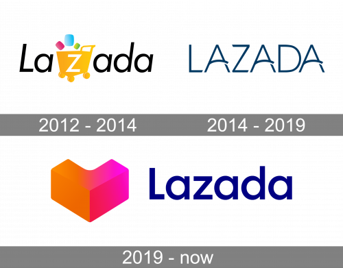
The very first Lazada logo was created in 2012 and featured a bright playful emblem inscribed into a simple and modest logotype. The logotype was set in the title case of a traditional full-shaped sans-serif typeface, with the letters in medium-thickness lines slightly slanted to the right. The letter “Z” was set in white on a bright yellow shopping cart, with three softened rectangular figures flying out of it. The figures were drawn in pink, blue, and green, and were meant to represent the variety of goods, available for sale on the platform.
2014 – 2019
The major redesign of 2014 introduced a completely new sleek Lazada badge, which only contained an uppercase inscription, with no graphical additions or decorations. The logotype was set in dark sea-blue color, with the capital letters written in a custom sans-serif typeface. The horizontal bars of the letters “A” were arched and overlapped the right vertical bars. The corners of “L” and “Z” were softened, while the ends of the lines were cut diagonally, which added style and sharpness to the badge.
2019 – Today
In 2019 the Lazada logo gets redesigned again. This time the rebranding was held by the Superunion design bureau. It was a warm and delightful geometric emblem set on the left from the simple yet strong sans-serif typeface in dark blue. The lettering was set in the title case and looked very stable, adding a touch of professionalism to a fancy and playful emblem, which depicted a stylized heart in a gradient pink-to-orange color palette.
Font and color
The bold and strict Lazada lettering on the logo of the company is set in the title case of a solid and distinct sans-serif font with full-shaped letters, thick lines, and straight cuts. The typeface used for the Lazada wordmark is very similar to such popular fonts as Futura Maxi Pro Demi, Harmonía Sans Std Semi Bold, and Moskau Grotesk Medium.
As for the color palette of the Lazada visual identity, it is a vivid combination of a dark blue color for the lettering parts and orange to bright-pink gradients for the emblem. The juicy shades of the graphical element on the logo evoke a sense of energy and passion, while the blue of the logotype represents stability and professionalism.


