Las Estrellas is the name of a Mexican TV-channel, which was established in 1951 and is owned by Televisa, one of the largest multimedia companies in Latin America. Today the channel is available not only in Mexico but all over the globe, via paid subscription.
Meaning and history
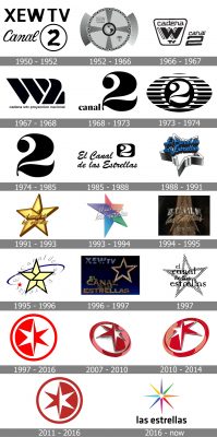
Las Estrellas is a channel with a long and intense history, and its visual identity, which had twenty redesigns throughout the years, is a graphical representation of the channel’s progress and growth. Being the second TV-channel in Mexico, for a pretty long period Las Estrellas used a logo, based on “2”, but starting in 1988, the star became the main element of the channel’s visual identity concept.
1950 – 1952
Created as XEW-TV, the channel got its first emblem designed in 1950. It was a monochrome badge with a two-leveled inscription on it. The upper line contained “XEW TV” in all capitals of a bold sans-serif typeface, and the bottom one — “Canal” in a delicate cursive and the “2” enclosed in a circle.
1952 – 1966
The redesign of 1952 introduced a more complicated emblem, based on graphics. It was a circle in a frame formed by thin lines and stars, with small sans-serif lettering placed on two of four of the segments, made up by separating the circle. On both sides of the emblem, there were gradient color bars, with their borders arched.
1966 – 1967
In 1966 a simplified badge was used by the channel. It was a “Cadena” lettering placed above a bold stylized “W” and enclosed in a trapezoid frame with its elongated side on top. The “Canal 2” wordmark was set in the right from the frame, executed in the same typeface as “Cadena”, but italicized.
1967 – 1968
The logo, introduced in 1967, looked very progressive and stylish. It was an extra-bold “W2” symbol, son posed if smooth black lines separated by thin white ones. The “Cadena WTV Proyección Nacional” wordmark was set in the lowercase under the main logo, underlining it and adding a touch of professionalism.
1968 – 1973
The redesign of 1968 made the number “2” the main part of the channel’s visual identity. It was a very simple yet elegant badge with the small lowercase “Canal” lettering placed on the left from the enlarged smooth “2”. Both parts were drawn in black and set on a white background.
1973 – 1974
The next logo, designed in 1972, only had a “2”, without any additional lettering. It was drawn in white and placed on a solid black dot inside a horizontally oriented oval with a striped black-and-white pattern.
1974 – 1985
In 1974 a bold black number “2” on a white background become the channel’s official logo. It has no ornaments or framing, and this minimalist approach made it look exquisite and sharp.
1985 — 1988
The channel was renamed El Canal de las Estrellas in 1985, and the logo was redesigned in the same year. The new composition featured an iconic “2” drawn in white on a black square with rounded angles, placed in the right from a cursive inscription, set in two lines and written in bold black.
1988 – 1991
The color first appeared on the Las Estrellas visual identity in 1988. It was a gradient blue script lettering placed on a background with a massive five-pointed star executed in monochrome with light gray gradients. It was an elegant and ornate badge, which looked completely different from all the previous logos of the channel.
1991 – 1993
The redesign of 1991 brought a new style and color palette to the visual identity of the Mexican tv-channel. It was a gold five-pointed star in a brown outline with a script lowercase lettering over it. The inscription was executed in the same color palette as the main element, the star.
1993 – 1994
In 1993 the star was redrawn and now featured a bright and delightful color palette, composed of purple, pink, orange, green, and blue. The main element of the logo was slightly turned to the right and had a thin elegant inscription in white on it. The lettering was still set in the lowercase but got its contours and shapes refined and widened.
1994 – 1995
A three-dimensional emblem for the channel was introduced in 1994. The new color palette contained gradient gold and black shades, which added a chic and elegant feeling to the overall composition. The wordmark was now executed in two different styles — with the “El Canal De” in all capitals of a straight serif font and “Las Estrellas” in fancy cursive.
1995 – 1996
In 1995 the logo became flat again. The new star featured a light yellow and black color scheme; and the lettering was now placed around the emblem in light gray, with a red star replacing the dot.
1996 – 1997
The logo, used by the channel in 1996, boasted a spelling gold star and a massive three-dimensional inscription in bold capitals of a sans-serif typeface, drawn also in gold, but with a more matte surface.
1997
For a few months in 1997, the channel used a monochrome minimalist logo, composed of a bold contoured five-pointed star overlapped by a lover case inscription in four levels.
1997 – 2016
The channel changed its name to Canal de la Estrellas and its logo to a red and white circular badge in 1997. No lettering was placed on the new badge, but it still looked professional and sleek with a six-pointed star enclosed in a circular frame. The logo was designed by Pablo Rovalo.
2007 – 2010
In 2007 the logo was made three-dimensional, turned in ¾, and redrawn with some gradient shades and dark shadow accents. The white elements of the badge were made metallic, so the emblem started resembling a medal.
2007 – 2014
The contours of a three-dimensional “coin” logo were refined and cleaned by 2010. The metallic shades got replaced by white ones, but this didn’t make the emblem boring or dull, on the contrary, it became sleeker and fresher.
2011 – 2016
In 2011 metallic shades came back to the Canal de las Estrellas visual identity, and more gloss was added to the surface of the badge. All the main elements were kept as they were on the previous badges.
2016 – Today
The rebranding of 2016 brought not only a shortened, Las Estrellas, name to the channel, t also a modern a colorful design of its logo. The new badge featured a stylized eight-pointed star, formed by eight sharp lines of different colors, and a lowercase sans-serif lettering written under the image in black.
Font and color
The stylish and fancy Las Estrellas lettering is executed in a modern and slightly narrowed sans-serif typeface, which looks very similar to such fonts as Sinews Sans Pro Medium and Ranelte Normal Bold with their unique shapes of the letters and elegant contours.
The refreshed color palette of the channel’s logo is a representation of very varied and high-quality content, along with the happy and friendly mood of Las Estrellas and their focus on the users’ interests.


