Laneige is a prominent South Korean beauty and skincare brand, celebrated for its advanced water science technology that hydrates and revitalizes the skin. Currently, the brand has a strong foothold in both Asian and global markets, extending its reach to Europe, North America, and beyond. Owned by the AmorePacific Group, one of Asia’s largest cosmetics conglomerates, Laneige continues to introduce innovative products, from its signature Water Sleeping Mask to various makeup items. Its commitment to research and quality cements its position as a leader in the beauty industry.
Meaning and history
Laneige, established in 1994, is a premium cosmetic brand under the South Korean conglomerate AmorePacific Group. From its inception, Laneige has anchored its identity on the unique concept of “water science” technology, which utilizes the hydrating and moisturizing properties of water to enhance skin health and beauty.
In the late 1990s, Laneige began its global expansion, introducing its products to neighboring Asian countries. It wasn’t long before Laneige’s quality and innovation resonated with consumers beyond South Korea. The brand’s research-centric approach led to the development of its signature product, the Water Sleeping Mask, which quickly gained iconic status in the beauty world.
The 2000s witnessed further expansion, with Laneige entering more diverse markets, including China, Southeast Asia, and later Europe and North America. Each market entry was accompanied by meticulous research on regional skin types and preferences, ensuring that Laneige products catered to local needs.
Ownership of Laneige has remained consistent since its foundation, as a subsidiary of the AmorePacific Group. This backing provided the brand with substantial resources for research and development, leading to breakthroughs like the Water Bank series.
Production-wise, Laneige has always maintained stringent quality standards. Their facilities, leveraging cutting-edge technology, ensure that products are both effective and safe. The brand’s commitment to sustainability has also grown over the years, with eco-friendly initiatives in packaging and production.
Today, Laneige stands as a testament to innovation, quality, and global appeal in the beauty industry, with a history rich in achievements and advancements.
2000 – 2002
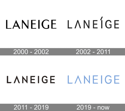
The word “LANEIGE” in a bold, jet-black font. Each character is uppercase, exuding a sense of assertiveness. Notably, the “A” is designed with a distinct apex formation, creating a triangular upper section. The “G” features a semi-circular cut-out, rendering it a unique touch. The remaining characters are clear-cut and geometric, adding to the logo’s overall modern and refined vibe.
2002 – 2011
The letter “A” is missing a horizontal bar, while the “I” stands out due to its pronounced acute accent. The letter “G” especially stands out with its stylized elongated tail. The entire typography exudes a contemporary and chic feel.
2011 – 2019
Compared to its previous iteration, the logo has undergone a noticeable transformation, with the most prominent change being the absence of an accent mark above the letter “I.” Additionally, the font has been subtly tweaked to bring a fresh and modern look to the design.
2019 – Today
The image displays the word “LANEIGE” in a soft, light blue hue. The typography is minimalist, with sleek and contemporary uppercase letters. The “A” is stylized with a peak design, giving it a triangular form at the top. The “G” possesses a circular hollow at its lower part, while the other letters maintain a straightforward, yet modern design. The overall impression is one of simplicity and elegance.


