Lana Del Rey is the stage name of Elizabeth Woolridge Grant, an American singer and songwriter. She works in the genre of rock and rock combined with some components of classical music. Her songs are often bear glamour and melancholic features and tragic romance themes. Having started her career in New York in 2005 at the age of twenty, Del Rey gained wide popularity after the release of her single “Video Games” in 2011. Next year, her famous Born to Die brought her international success. As of the present time, more than 16 million discs of Lana del Rey have been successfully sold all over the world.
Meaning and history
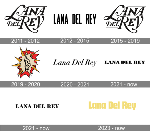
Lana Del Rey does not use any special emblem for the logotype on her records. Her logo is just the wordmark “Lana Del Rey”. On the cover of her early albums back in 2011, Lana’s stage name was written in a strict and upright font resembling the commercial Rospi Retro with its narrow and tall old fashioned letters. In parallel, there was a playful logo that contained only the abbreviation “LDR” written in block letters on the background of images of a cartoon explosion.
2011 – 2012

The very first logo by Lana Del Rey used strict and elegant lines. The letters ‘L’, ‘R’ and ‘Y’ were enlarged and had the dominant position in the whole logo. Also the ‘Del’ word and the bit ‘ana’ (which was separated from the word ‘Lana’) had two lines above and below respectively.
2012 – 2015

The singer’s following logo was introduced in 2012, and it was a simple one-level inscription with a bold sans-serif typeface.
2015 – 2019
For a few years, Lana used her initial logo as a main design.
2019 – 2020
Contrary to all of the previous designs, the 2019 Lana’s logo had a playful style: there was a 3D ‘LDR’ acronym made in beige-and-black color and placed onto a cartoonish explosion of sorts.
2020 – 2021

The 2020 logo depicted the singer name in the italic font with tilted black letters.
2021 – Today

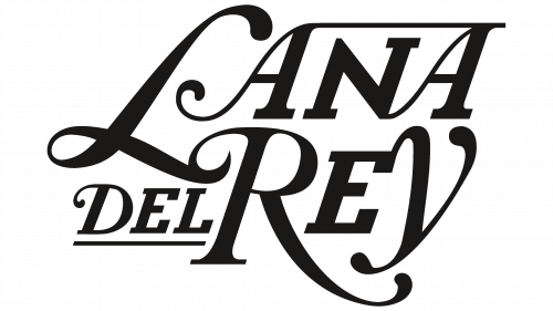
With the release of the disk “Lust for Life” in 2017, a new logotype was designed. This time, the logo had a completely different style. The wordmark looks like based on the elegant font Walbaum Pro 06pt SemiBlod Italic but with substantially modified graphics that give it a much more romantic look. Extended and curved legs of the letters “L” and “R” as well and the descender of the letter “Y” and the fanciful swashes on the capital letters give the wordmark the features of the American pop culture characteristic for the 1950s and 1960s and that is in line with the romantic and melancholic style of the title song of the album and most of the songs that made up the album.
2021 – Today

The redesign of 2021 has introduced a refined version of the previous logo, with the black uppercase serif inscription, but with slightly thinner bars of the letters and more elegant serifs at the ends of the bars. This is a timeless logo, which will always be actual, and can be placed on any background.
2023 – Today
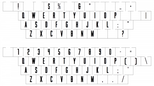
In 2023 Lana Del Ray showed her new insignia, executed in a very tender shade of yellow. The lettering in the title case is set in a smooth and heavy sans-serif font with massive letters featuring very interesting contours with softened angles.


