Lamborghini is the name of one of the most famous European luxury cars manufacturer, which was established in 1963 in Italy. The company produces high-performance cars, which are considered to be one of the fastest and most stylish in the world. The marque is owned by Volkswagen Group.
Meaning and history
Lamborghini is a marque, which values its heritage and identity. Everything in this brand is about legacy, quality, and exquisite style, so its logo, which has never been changed since the day of the company’s foundation. Though there was an additional version, created for the automaker, it was only in use for seven years.
Which animal is featured on the Lamborghini car logo?
The animal depicted on the iconic Lamborghini logo is a bull. The choice was made by the brand’s founder, Ferrucio Lamborghini, as his zodiac was Taurus. The animal also represents strength and determination, reflecting the character of the company.
1952 – 1963
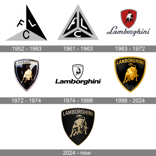
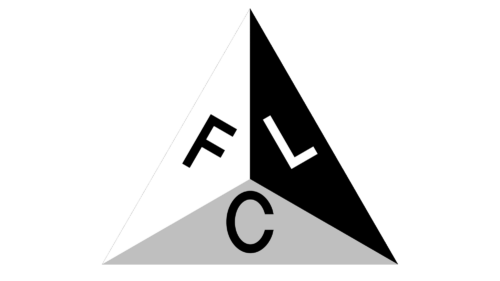
The very first Lamborghini logo was completely different from what the whole world got used to seeing as the luxury brand’s emblem. It was a simple monochrome geometric logo with a minimum of elements. A pyramid, composed of three outlines triangles. Each triangle had the white capital letter in it — F, L, and C. The letters were written in a very simple yet strict and confident sans-serif typeface.
1961 – 1963
The Lamborghini logo, introduced in 1961, has played with the triangular badge from 1952. It was still divided into three segments with three letters, but each of the small triangles was set in black, and framed into thick gray outlines. As for the letters, they were redrawn in a bolder font, with the top angle of the “F” rounded.
1963 – 1972

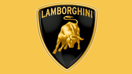
The iconic Lamborghini emblem, which is one of the most recognizable car badges in the world, was introduced in 1963. It depicts a golden bull on a black crest with a gold outline and an elegant sans-serif lettering above the animal’s head.
The bull is not the mascot you are used to seeing on the automobile logos, but it was chosen by Ferrucio Lamborghini, the founder of the brand, whose zodiac was Taurus. He was also a fan of bullfighting, so the bull on the company’s logo is shown in a fighting position.
There was also an additional logotype created for the marque — a custom cursive inscription, which can be seen in black or silver, features sharp thick lines, and evokes an edgy feeling, representing speed and strength.
1972 – 1974
With the redesign of 1972, Lamborghini introduced a prototype of the current visual identity. It was a crest-like black medallion in a gold outline, with the image of a golden bull in the middle, accompanied by a slightly arched gold and black banner, where the logotype in all capitals was placed. This logo stayed with the brand for just two years and was refined in 1974, turning into the iconic badge.
1974 – 1998
In 1974 there was another version of the iconic logo created for the brand. The same crest with the Taurus was executed in monochrome and accompanied by a bold sans-serif wordmark under it. The wordmark boasted a bold italicized font with clean contours and solid letters. The font was very similar to Neue Helvetica Paneuropean 83 Extended Heavy Oblique and looked modern yet laconic.
Though this version did not stay for long, it was only used for seven years, when the luxury car brand was owned by the American Chrysler company. In 1994 the marque comes back to its original logo with an elegant yet bold nameplate.
1998 – 2024
In 1998, the logo, created in the 1970th was elevated to the top. The crest became wider, the Bull — more massive. The golden elements of the logo gained gradients and started looking vivid and realistic, evoking a sense of motion and energy.
As for the lettering, now it was the uppercase inscription in gold thick sand-serif, placed on a black background, above the bill and covered by the golden outline of the crest from the top.
2024 – Today
The redesign of 2024 refined the Lamborghini crest, making it even more sophisticated and sleek. The main difference from the previous version here is the shade of gold. It became soft and calm, with the Taurus contoured, and the glossy gold elements replaced by the black ones. The inscription on top of the shield was rewritten in a thinner sans-serif typeface, as well as the frame of the whole logo, which is now barely seen.
Symbol
The Taurus was chosen as the symbol of the brand – the sign of the zodiac of Ferruccio Lamborghini. However, the creator of the brand with an implication made the choice of a symbol. Too chosen image was close to the logo of the nearest competitor. However, this is a completely different story.
It is wonder that the appearance of the brand of high-speed Lamborghini cars was due to… Ferrari. Namely – imperfection of the technical side of cars of this particular brand caused excitement of the manufacturer of tractors, Lamborghini, to surpass them. Moreover, for a number of technical characteristics – for example, the reliability of the clutch – tractors from Lamborghini really surpassed the products of the cult brand. In fact, ithe arrogance of the founding father of Ferrari, convinced that “the manufacturer of tractors can’t criticize Ferrari” has led to the fact that his eternal antagonist and competitor appeared.
According to the official version of the company, the base, resembling a noble coat of arms, testified to the dignity of the company and the brand, targeting an elite public. As for the main element, it is both the sign of the zodiac, and the image of the head of the pagan pantheon of Ancient Rome – Zeus. After all, as is known, Zeus was in the image of a bull when he had stolen the beauty, Europe. It was just the same how Ferruccio Lamborghini tried to win over Europe.
Emblem
The shape of the emblem during the whole existence of the brand remained practically unchanged. On the shield the central (and only) symbolic element was settled – a raging bull. The figure is settled not classically according to heraldry (the classic is the location of image of the animal in the profile, and not in such a complicated posture as on the logo), but exactly this “irregularity” gives dynamics to the image, the evidence of the desire for innovation. And, of course, the necessary and desirable similarity with the logo of the nearest competitor.
The amusing incident accompanied the first race, in which the Lamborghini car participated. The owner of the brand himself sat behind the wheel to demonstrate the possibilities of his creation. And halfway he decided that it was enough demonstrate, so stopped at a roadside cafe and finished his race with a glass of good wine. With the assumption that his chances to win were quite real.
Font
In the logo, the font does not play the most important role. Moreover, in one of version (minor changes during the decades of the company’s existence took place), the font was not supposed at all. However, in the current version, the font is used. It is located in the upper part of the shield, and differs in classical execution. Refusal of font excesses, according to Ferrucci Lamborghini, was a compulsory condition of the acquisition of favorable attention of the target audience of the brand.
Colour
The colour solution of the Lamborghini logo is very simple. The combination of classical black (aristocratism, dignity, restraint and thus reliability) and gold colour has allowed to underline elite character of a brand and each car created under these brand.
In history, the logo began with a black and white version, continued as black and white-red (black and white was a bull, red – the background), and only at the end of the century acquired the current look.


