Ladbrokes is a brand of a British gambling group, which was founded in 1886. Today the company is a part of GVC holdings and operates across the United Kingdom with yearly revenue of around 1,5 billion pounds.
Meaning and history
Back in 1886 two business partners Pennington and Schwindt organized a company whose main activity was betting on races, and they bet on the horses of Schwindt’s stable, who trained horses and was well versed in their athletic qualities. The partners were engaged in this business in the small town of Ladbrokes in Warwickshire. By the way, William Shakespeare was born in this county.
In 1902 Arthur Bendir joined the partners. His name is associated with two events for the young company – the move to London and the beginning of activities to attract bets from other players.
Throughout its long history, Ladbrokes bookmaker’s office has remained and remains one of the leaders in the betting business. Today Ladbrokes has more than two thousand offices in England, Ireland, and Belgium, and successfully operates online for users from all over the globe.
What is Ladbrokes?
Ladbrokes is This is the name of the oldest betting company in the world, which was founded in Great Britain in the mid-1880s, and was officially registered under the current name in 1902. Today Ladbrokes is not just an old-school betting business, but also a huge online gambling company.
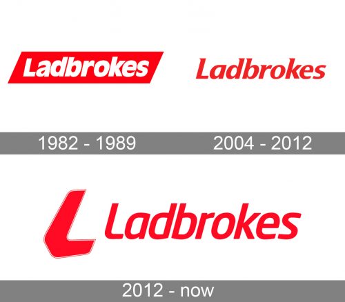
1982 – 1989
 The first logo for Ladbrokes was designed in 1982 and featured a white nameplate, placed into a red parallelogram. All the letters of the wordmark except the first “L” were italicized and written in a bold sans-serif typeface.
2004 – 2012
 In 2004 the colors of the logo were switched and now it was a red inscription on a white background. the font became more elegant and strong.
2012 – Today
Being the number one betting brand in the UK, Ladbrokes boasts a powerful and bright visual identity. During all the company’s history, its logo was text-based and always comprised one color combination — red and white.
The redesign of 2011 brought a new modern typeface with sleek rounded lines and an emblem, which is an L-shaped boomerang symbol.
The Ladbrokes logo is minimalist yet looks confident and powerful due to the right color palette. The red is a commonly known symbol of passion and energy, and these are qualities the brand values most.
Font and Color
The elegant lowercase lettering from the official badge of Ladbrokes, is set in a modern, yet sophisticated sans-serif font with the full-shaped characters slightly slanted to the right. The closest typefaces to the one, used in this insignia, are, probably, Neo Sans Std Medium Italic, or Soho Gothic Pro Medium Italic, with some minor modifications of the contours.
As for the color palette of the Ladbrokes visual identity, it is based on a scarlet-red, a shade of passion and energy, the two qualities the gambling industry is associated with most.


