La Redoute is a renowned French e-commerce company specializing in fashion and home décor. It is owned by the Galeries Lafayette group, a giant in the retail industry. The company offers a wide range of products, including clothing, accessories, footwear, and home furnishings, catering to a diverse customer base. La Redoute primarily operates through its online platform, making its extensive catalog accessible to customers globally. Its headquarters is situated in Roubaix, France, but its operations extend to various international markets, ensuring a significant global presence. La Redoute is celebrated for its stylish and affordable products, which appeal to fashion-conscious individuals and home décor enthusiasts alike. The company’s commitment to quality and customer satisfaction has earned it a loyal customer base and a reputable standing in the retail industry.
Meaning and history
La Redoute was founded in 1837 by Joseph Pollet, a visionary entrepreneur who initially started the business as a wool mill. The company’s early success was driven by Pollet’s innovative approach to textile manufacturing and his dedication to quality. Over the years, La Redoute transitioned from a traditional wool mill to a mail-order catalog business, and eventually, into the digital age as a leading e-commerce platform. Throughout its history, La Redoute has consistently adapted to changing market trends and consumer preferences, which has been a key factor in its longevity and success.
One of La Redoute’s significant achievements includes being one of the pioneers in the mail-order catalog industry in France. This innovation allowed the company to reach customers nationwide, offering them the convenience of shopping from home long before the advent of the internet. In the mid-20th century, La Redoute expanded its product range to include fashion and home décor, solidifying its position as a versatile and comprehensive retailer. The company’s catalogs became a staple in French households, known for their stylish and affordable offerings.
In recent years, La Redoute has embraced the digital revolution, transitioning from traditional mail-order catalogs to a fully-fledged online retail platform. This shift has enabled the company to reach a global audience, offering a seamless and user-friendly shopping experience. Today, La Redoute stands as one of France’s leading online retailers, known for its innovative designs, quality products, and exceptional customer service. The company continues to thrive under the ownership of the Galeries Lafayette group, leveraging its rich heritage and forward-thinking strategies to maintain its competitive edge in the retail industry.
What is La Redoute?
La Redoute is a prominent French e-commerce company specializing in fashion and home décor. Founded in 1837, it has evolved from a wool mill into a leading online retailer. Owned by the Galeries Lafayette group, La Redoute is renowned for its stylish and affordable products, catering to a global customer base through its extensive online platform.
Before 2013
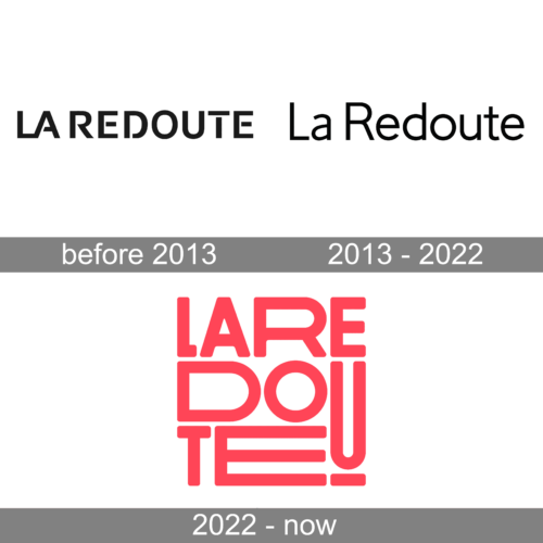
The first logo showcases La Redoute, a renowned French fashion and home decor retailer. This logo is straightforward and minimalist, featuring the brand’s name in a bold, sans-serif typeface. The text is colored in solid black, which conveys a sense of elegance and timelessness. The clean, uppercase letters are evenly spaced, making the logo highly legible and easily recognizable. This design choice reflects the brand’s commitment to simplicity and clarity, ensuring that the logo remains versatile across various mediums and marketing materials.
2013 – 2022
The La Redoute logo is a simple and elegant monochrome wordmark, where only two letters are capitalized. The inscription is executed in a traditional sans-serif typeface with rounded shapes and distinct edges of the letters.
2022 – now
The updated logo of La Redoute presents a fresh and modern look. This logo adopts a more playful and dynamic approach, utilizing a bright red color that exudes energy and vibrancy. The text is arranged in a square format, with each letter taking up its own space, creating a compact and visually engaging design. The letters are rounded and bold, giving the logo a friendly and approachable feel. The red color symbolizes passion and excitement, aligning with the brand’s mission to bring stylish and contemporary fashion and home decor to its customers.


