Laboratoires La Prairie is a skincare brand, which has been part of Beiersdorf since 1991. In addition to the skincare products, it also offers perfumes and an upmarket makeup collection.
Meaning and history
La Prairie is a renowned Swiss luxury skincare company founded in 1978 by Dr. Paul Niehans, a pioneer in cellular therapy. With a focus on advanced skincare technology, La Prairie has established itself as a leader in the industry. The company’s groundbreaking achievements include the development of the exclusive Cellular Complex, a patented formula that rejuvenates and revitalizes the skin at a cellular level. La Prairie is also known for its luxurious ingredients, innovative formulations, and commitment to scientific research. Today, La Prairie continues to create exceptional skincare products, offering a range of treatments, moisturizers, serums, and more. With a global presence and a loyal customer base, La Prairie remains dedicated to providing the highest quality skincare solutions that combine luxury and science for timeless beauty.
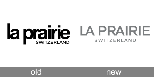
Old Logo
What makes the La Prairie logo distinctive is the way the letters seem to have been squeezed together. There is hardly any breathing space at all between the first three and the last three letters. For instance, the “p,” “r,” and “a” actually partly overlap. The same can be said about the article “la” and the letters “r,” “i,” and “e.”
New Logo
The designer left some space around the “i” in the middle, which saves the wordmark from illegibility.
The glyphs of the word “Switzerland” below have enough breathing space, though, which provides decent legibility even at smaller sizes.


