KYB Corporation is an automotive company headquartered in Tokyo, Japan. The list of products it manufactures includes shock absorbers, air suspensions, hydraulic pumps, and valves, to name just a few. The company’s origins date back to 1919 when Kayaba Research Center was founded by Shiro Kayaba.
Meaning and history
KYB is the largest manufacturer of hydraulic equipment in Japan and one of the world’s largest suppliers of original equipment shock absorbers for car manufacturers.
The history of the company begins in 1919 when a young innovator Siro Kayaba opened his inventive laboratory. The history of Kayaba Industry Co., Ltd. can rightfully be called a starting point in the history of hydraulic technology in Japan.
Since 1988, when the office of KYB Europe GmbH was opened in Dusseldorf, Germany, the company has been successfully developing the production of shock absorbers in Europe and their sales both to conveyors of car manufacturers and to the aftermarket.
Today every 4th automobile rolled off the assembly line is equipped with Kayaba shock absorbers. Kayaba shock absorbers are supplied to conveyors of the leading car manufacturers in the world.
What is KYB?
KYB is a brand of shock absorbers manufactured by Kayaba, named after its founder, SiroKayaba, a prominent mechanic and inventor. The company was established in 1919 in Japan and today has turned into an internationally recognized manufacturer of high-quality products.
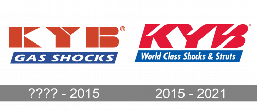
???? – 2015
The older logo was pretty similar in style. It also featured large, heavy red letters. The white gaps were unusual, although their shape was different.
In contrast with the current KYB logo, the characters were not italicized. Below the wordmark, you could see the tagline in white inside a blue parallelepiped (“Gas Shocks”).
2015 – 2021
The current KYB logo is basically just the abbreviation “KYB.” And yet, the typography that has been chosen for the design looks unique and distinctive. Due to this, the logo is memorable and stands out among its competitors.
Generally, the proportions of the letters are average. What is unusual is the white diagonal stroke (or gap) added to each of the glyphs. Due to this, the design gets a dynamic touch, which is only reinforced by the fact that the characters are italicized.
The abbreviation is typically accompanied by a tagline (“Our Precision, Your Advantage” or “World Class Shocks & Struts,” for instance).
Font and Color
The powerfully stylized lettering from the primary KYM logo is set in a futuristic yet soft designer typeface, which has no commercial analogs. However, the font of the insignia has something in common with Sofachrome Italic, but with significant modifications of all contours. As for the bottom level of the lettering, it is set in a more traditional style, with the slanted title case inscription executed in a font, similar to Futura Pro Bold Condensed Oblique.
The color palette of the KYM visual identity elevates the sense of lotion and strength, evokes by the typefaces. It is composed of blue, red, and white, a traditional tricolor symbolizing excellence, quality, and reliability.


