Kraft Foods is the name of one of the biggest American food companies, established in 2012. The company owns many popular food product brands and distributes its items across the globe.
Meaning and history
The Kraft Foods’ visual identity looks strict and monumental. Built around a traditional color palette and distinct shapes, it is a perfect representation of a powerful and influential company.
1926 – 1960
The roots of Kraft Foods go back to the National Dairy Products Corporation established in 1923. Another predecessor is J.L. Kraft and Bros. Company, which was established in 1909 and renamed Kraft Cheese Company in 1924.
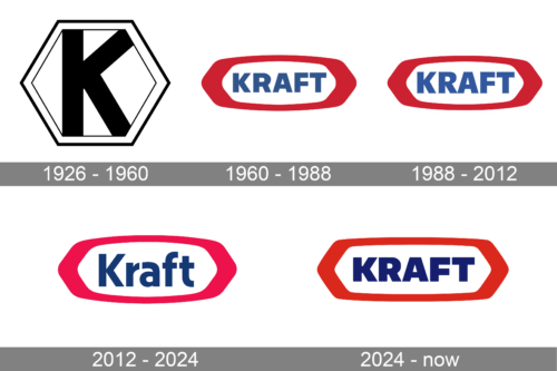
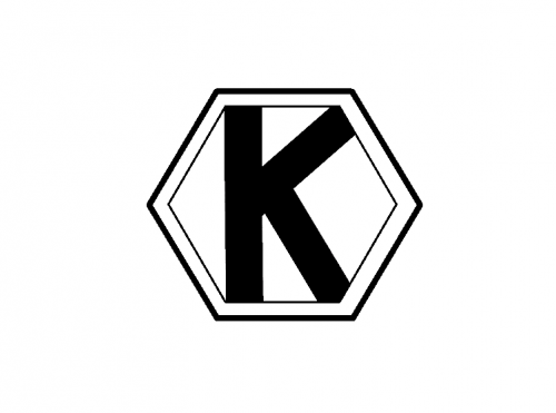
In 1926, it was listed on the Chicago Stock Exchange. Back then, the Kraft Foods logo featured a simple sans serif “K” inside a hexagon with a double outline.
1960 – 1988
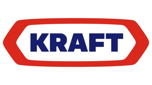
This is when the iconic red and blue design was born. Originally, the name of the brand was given in capital letters. They belonged to an unpretentious, perfectly legible sans (Helvetica).
The wordmark was placed inside a white shape with a thick red border of a rather complex shape. It could be described as a combination of an ellipse and a hexagon.
1988 – 2012
The logo was given a facelift, which resulted in slightly clearer, brighter colors. The glyphs grew slightly more elongated. The most notable alteration could be seen in the “R.”
The company also used a darker version of the same logo.
February 2009
A new corporate logo was introduced (it did not apply to the consumer brand).
As the press release stated, the new design meant to “clearly deliver ‘delicious.’” The red curve symbolized a smile, “the natural reaction to delicious foods and experiences.” The multi-colored shapes to the right represented a “flavor burst.”
The Brand New blog criticized the design for being “just childish” and using the Tekton script.
July 2009
The “smile” grew blue and moved below the first word. The “flavor burst” was now placed behind the “K.” This time, it looked like an eye, which could not be said about the previous version. The tagline was straightened.
Once again, the Brand New blog criticized the update calling it “the logo Titanic.” This time, it stated that the redesign showed that none of the components of the design were meaningful (without actually noting the “eye” theme).
2012 – 2024
The company returned to the old design and gave it a facelift.
The capital letters have been replaced by lowercase ones (except the initial). The type seems to have been inspired by Gotham. The updated font appears softer and more inviting, and it better fits the rounded elements of the red shape in which it is placed.
The new logo marked an important event in corporate history. Kraft Foods Group was officially spun off from Kraft Foods, Inc., which in its turn, was renamed Mondelēz International.
2024 – Today
The logo keeps the same color palette and overall design language, but the font is more dynamic, with varying weights within the letters, giving it a more modern and approachable feel. The use of all capital letters in “KRAFT” suggests strength and stability, qualities desirable in a food company. The updated styling in the logo represents a balance between tradition and contemporary appeal, maintaining the brand’s established identity while also staying current with design trends.
Kraft Heinz
In 2015, Kraft merged with The H. J. Heinz Company, so it became part of The Kraft Heinz Company. Its current logo features similar colors. The word “Kraft” is even given in the same type as in the main Kraft Foods Group logo. Yet, the red border has disappeared, and the word “Heinz” in a different script has been added.


