Konica Minolta, Inc. is a technology company headquartered in Marunouchi, Chiyoda, Tokyo, Japan. It has offices in around 50 countries.
Meaning and history
Konica Minolta Holding was formed not long ago, in 2003. This was a significant event because two well-known Japanese manufacturers of photographic equipment merged, Konica and Minolta.
The holding has its pronounced specialization. It produces products that are not designed for the mass market. In particular, we are talking about medical equipment, office equipment – for example, printers, multifunctional devices, copiers, fax machines, and we are also talking about measuring instruments, various optics of industrial importance, and so on.
There was also a time in the history of the company when its portfolio included other products: cameras, photographic paper, photographic film, and other similar materials. In 2006, however, the company decided to stop manufacturing cameras.
As for the visual identity of the company, it was also a result of a merger, although the new badge has more from the Minolta logo than from the Konica one.
What is Konica Minolta?
Konica Minolta is the name of a Japanese manufacturer of electronics for medical, graphical, and office equipment, optical devices, and measuring instruments. The company was established in 2003 and acquired by Sony in 2006. Today Konica Minolta is one of the world’s leaders in its segment.
1937
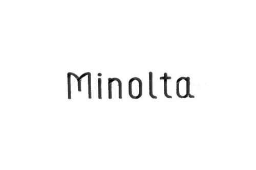
The original Minolta logo featured the brand’s name in an unpretentious, yet unique script. The uneven strokes and shapes implied that the word had been written by hand, which added personal touch.
1957
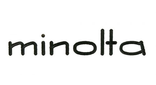
While this wordmark was similar in style, the shape of the glyphs was different. Now, all the letters were lowercased and grew flatter. They also became more even and less individual.
1978
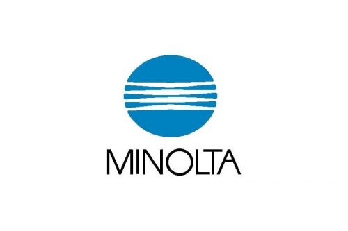
This is the first time when a blue roundel (so-called globe mark) appeared on the logo. The word “Minolta” below now featured a more generic sans. The type was pretty light. The distance between the “L,” “T,” and “A” was very small. This approach made the design more compact and added a unique touch.
1981
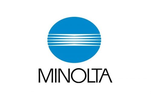
The white lines on the globe mark grew somewhat thinner, while the wordmark grew slightly larger.
2003
In 2003, the company merged with Konica to form Konica Minolta. The new Konica Minolta logo has added a gradient to the globe mark. Also, it has introduced a new, distinctive type, which symbolizes “the fresh surprises that we offer to customers,” as Konica Minolta’s official website explains.

The globe mark represents the Earth and reflects the company’s “infinite expansion.” The oval shape symbolizes “reliability and security” the company offers to its clients, while also representing the “wide-ranging technological expertise.” The white lines seen on the globe are actually light beams. They stand for the company’s know-how in the field of imaging.
Font and Color
The fancy uppercase lettering from the primary badge of Konica Minolta is set in a modern sans-serif typeface with some custom details in the characters. The closest fonts to the one, used in this insignia, are, probably, Yankee Doodle Boy JNL or Texicali Art S Medium, but with significant modifications of the contours.
As for the color palette of the Konica Minolta visual identity, it is based on gradient shades of blue, white, and black, a combination, that evokes a sense of stability, security, and professionalism. This color scheme represents stability and confidence, making the company look trustworthy and responsible.


