Knorr is a condiment and food brand, established in 1838 in Germany. The label is mostly known for its instant soups and bouillons, which are distributed worldwide. The brand is a part of the Unilever Group.
Meaning and history
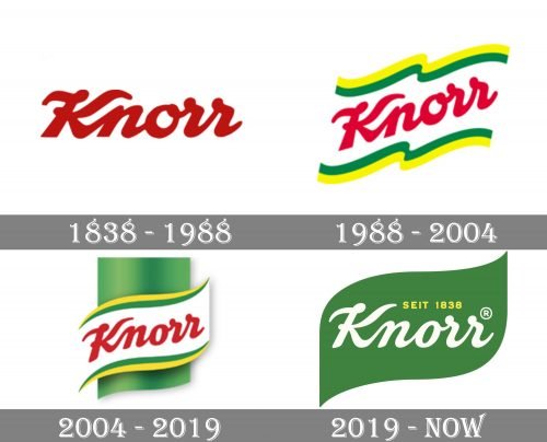
The original Knorr logo was designed in 1838 based on the signature of the company’s founder, Carl Knorr. Its bold smooth cursive lettering is the main part of the current brand’s logo and has never left the Knorr visual identity.
The brand was introduced in 1838 by Carl Heinrich Theodor Knorr. The company is based in Heilbronn, Germany.
1838
The original Knorr logo already featured the iconic “handwritten” script. You immediately recognize the familiar “K” with the curves on both the top ends.
The owners opted for a handwritten effect because they wanted to convey the images of homemade food and the recipes that housewives wrote in their cooking books.
1988
The wordmark was rotated around 30 degrees counter-clockwise, which provided an illusion of positive dynamics. Behind the wordmark, a white flag with yellow and green trim appeared.
2004
While the script was slightly tweaked, the modifications could be hardly noticed unless you compared the two versions side-by-side.
The “flag” design grew more minimalist. The most obvious alterations can be spotted in the link between the “K” and “N,” as well as in the “O.” A green stem appeared behind the flag, which conveyed the “natural” concept.
2019 – Today
The “natural” concept is now represented by the leaf shape, which has replaced the flag design. The red lettering has been colored white. The writing “Since 1838” in small yellow letters appeared above.
We should mention, though, that the 2004 Knorr logo is still used in some markets.


