

![]() Brandt Zwieback Logo PNG
Brandt Zwieback Logo PNG
Brandt Zwieback is the shortened name of Brandt Zwieback-Schokoladen GmbH, known also simply as Brandt, the German company, known for the production of sweet snacks, including zwiebacks and chocolates. Founded in 1912, today the brand has its snackcs distributed internationally.
Meaning and history
![]()
Brandt Zwieback, the company, named after its founder, Carl Brandt, has stayed independent since 1912, until today. It is a pretty small production, which is very well-known not only in Germany but all over Central and Eastern Europe, as a manufacturer of zwiebacks, sweet crispy taste, which are loved in those regions. Apart from zwiebacks, the brand also produced chocolates and small sweet snacks.
What is Brandt Zwieback?
Brandt Zwieback is the name of the food products manufacturer from Germany, which was established in 1912, and named after its founder, Carl Brandt. The brand is specialized in the production of chocolates, and zwieback, which is a crispy sweet bread, popular in Eastern Europe.
In terms of visual identity, the company has been loyal to its bright and lively orange and white color palette, which brilliantly reflects the mood and the purpose of the brand, with the main aim to make the customers happy.
???? – 2005
![]()
The early version of the Brandt Zwieback logo was set in a shape of an ornate cookie with lots of curves around the central part with the stylized letter “B” enclosed into a spiral. The badge was set in white and orange, with orange used for the shadow, which made up a very voluminous image. This version of the badge was used by the brand until 2005.
2005 – Today
![]()
The redesign has brought a completely different idea to the Brandt logo. The badge, created in 2005, is still used by the brand today and featured a solid orange banner with the portrait of a little boy, drawn over a white roundel on top of the logo, and a white script lettering under it.
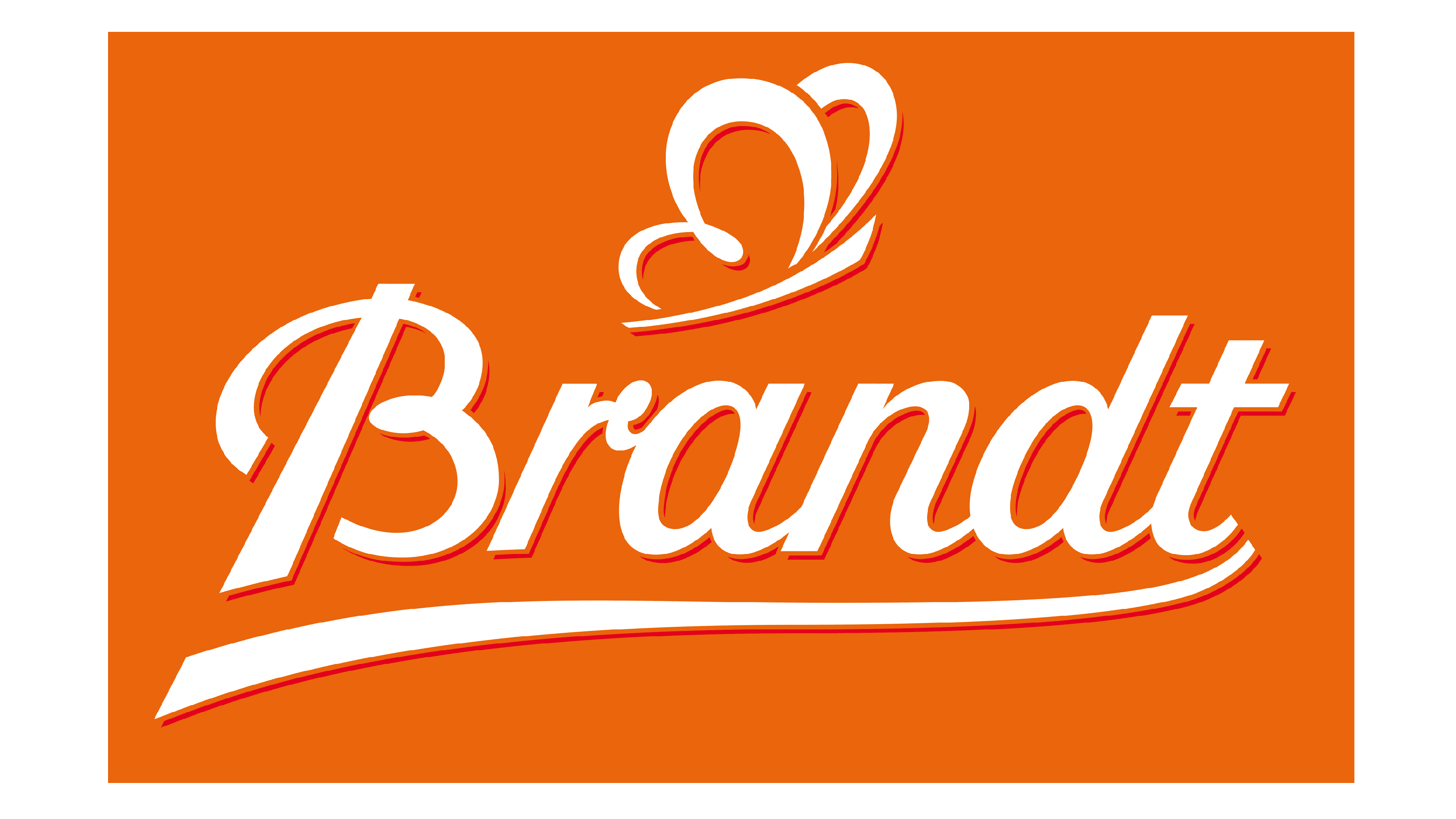
2013 – Today
![]()
Another version of the logo, used by the German brand today, was created in 2013. It is based on the wordmark from the previous badge, but here it is set in orange against a plain white background. In some versions, the inscription is drawn with white accents, adding motion and volume, in towers — in plain orange lines. The lettering is accompanied by a stylized butterfly, which has its wings drawn as the letter “B”.
Font and color
The smooth and elegant script lettering from the primary Brandt Zwieback logo is set in a fancy and smooth typeface, which looks very friendly and welcoming. The closest typefaces to the one, used in this insignia, are, probably, Corner Deli Sr, or Buinton, with some visible modifications of the corners.
As for the color palette of the Brandt Zwieback visual identity, it is based on the combination of orange and white, making up a very kind and soft image, and evoking a sense of caress and love, at the same time representing joy and happiness.


