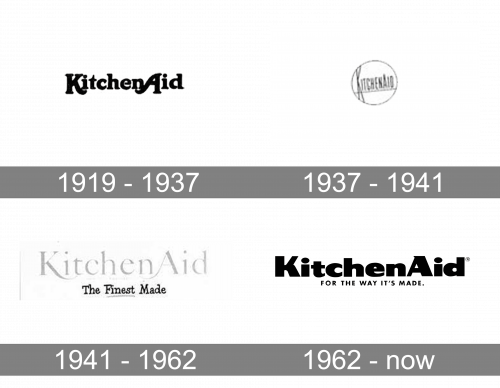
Taking into consideration that the US home appliance brand KitchenAid has a hundred-year history, it’s hardly a surprise that the company has gone through several logotypes.
Meaning and history
The brand was officially founded in 1919, the same year that its iconic stand mixer was introduced. The idea of the device belonged to Hobart Corporation’s engineer Herbert Johnston. The ten-quart C-10 model of the Stand Mixer was the first machine to bear the KitchenAid logo. Today, the brand is the property of Whirlpool Corporation.
1919 – 1937

Originally, the logo was the name wordmark with a soft typographic font – the letters are basically illustrations on this one. The usual coloring was black.
1937 – 1941

The next logo featured a black circle with the word ‘KitchenAid’ running horizontally through its middle. The word consisted of tall, narrow letters. The first one in particular stretches the whole height of the circle.
1941 – 1962

The third evolution also uses two artistic fonts: one for the big ‘KitchenAid’ inscription, and one for a smaller ‘The Finest Made’ part below. The former uses grey coloring, while the latter is completely black.
1962 – Today

In 1962, they made the letters bulkier and wider. The main wordmark started using an unstable sort of sans-serif with a lot of different proportions and shapes. The motto below – ‘for the way it’s made’ – uses a more practical, usual sans-serif font in all capital letters. The coloring for these is usually black, but could be red or other colors.
Font
The bold sans serif typeface is a custom artwork. The letters are perfectly legible.


