![]() Whirlpool Logo PNG
Whirlpool Logo PNG
Today, the Whirlpool logo is recognized in all continents, as the company has affiliates in scores, if not hundreds of countries. The Whirlpool ideology refers to high speed and unflaggingly high quality of household work done with the help of tools and techniques, which give time and energy for creative activity and comfortable living.
What is the symbol of Whirlpool Corporation?
The symbol of Whirlpool Corporation is a bright yellow diagonally oriented orbit, drawn around the central part of the wordmark, and representing the whirling motion, supporting the name of the brand. Until 2016 the company used a more detailed whirl emblem in its badge — it was drawn in black above the uppercase “W”.
Meaning and history
![]()
Officially, the Whirlpool brand appeared in 1950, although the company actually started working as far back as in 1911. It specializes in kitchen appliances. In fact, it was in the second half of the 20th century that the current logo, which reflects the Whirlpool philosophy (turbulent rotary movement), appeared.
Throughout its history, the company has conquered lots of markets also through purchasing local manufacturers’ securities and stocks and by merging with promising projects. Also, Whirlpool owns scores of regional brands. The Whirlpool logo was quick and eager to crown the conquered markets.
1949 — 1955
![]()
The earliest Whirlpool logo showcased the name of the brand in a cursive script. It added personal touch. We can remember that this was the era, when women would often give each other recipes written by hand, and the cursive wordmark conjured up the warmth of such a “recommendation.” The lettering was red, which made it stand out.
1955 — 1962
![]()
The name of the brand became white and was placed inside a red rectangle. To the left, there was now an “RCA” emblem inside a thin circle.
1962 — 1967
![]()
A huge swirl appeared above the initial “W.” The letter now looked like part of the whirl. The shape of the glyphs forming the wordmark also changed and now slightly resembled the ripple on the water surface. Although this design was meaningful and highly symbolic, the name of the brand wasn’t perfectly legible here. This meant that the logo didn’t do its job properly.
1967 — 1985
![]()
As a result, the company adopted a simpler typeface. It was a classic serif given in black.
The whirl was still there, although it was now by far smaller and didn’t dominate the design.
1985 — 2010
![]()
A new, bright element appeared – a gold oval going diagonally around the wordmark. It represented fast circular motion, a “whirl” or “orbit” theme. This impression was created by the change in the widths of the line (there was a bolder part in it).
2010 — 2016
![]()
Both the wordmark and the whirl grew cleaner. The serifs disappeared, while the number of the elements forming the whirl diminished.
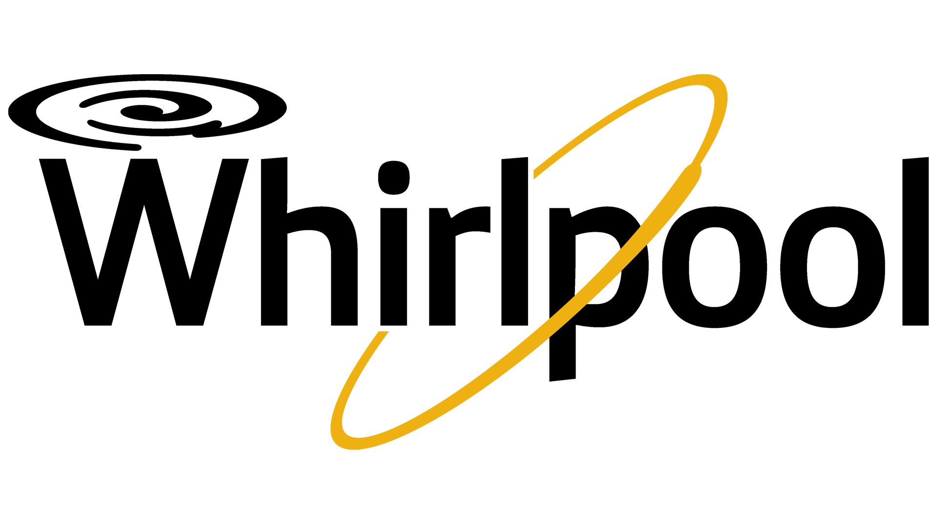
2016 — Today
![]()
Once again, the Whirlpool logo became cleaner. This time, the result was achieved by removing the more intricate black whirl above the “W.”
The current logo keeps pace with the worldwide trend and therefore it drops all complex color combinations. The typography implies the use of dark blue or black color, as does the ‘whirlpool-style’ combination of three ovals; the diagonal oval comes in yellow or orange. The classically confident black is counterweighted by the subtler yet highly dynamic yellow – a combination, which symbolizes never-ending improvement and progress.
Undoubtedly, the brand Whirlpool stands for the company’s power to engulf whatever comes its way, but in a positive sense: it eliminates unneeded junk and debris. Particularly, it frees you from having to do routine, dull and boring household work. Whirlpool kitchen appliances’ mission is to free us from kitchen slavery and give us time and energy to use a creative and hedonistic approach instead of doing routine stuff.