Kenzo is one of the fashion brands of the LVMH Group, which was established in 1970, and named after its founder, Kenzo Takada. Being one of the first Japanese designers on the international scene, Kenzo is a trendsetting brand with its unique philosophy, and its logo reflects the individuality and elegance where East meets West.
Meaning and history
Kenzo is the brand, to which legacy and roots mean a lot, and this is why the labor used the same logo during fifty years of its existence, and only decided to redesign it in 2020, keeping the original idea and concept, but showing it in a new contemporary way.
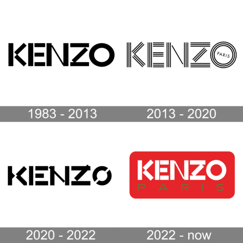
1983 – 2013
The original Kenzo logo, which was used by the brand for almost its whole history, was composed of a bold stylized logotype, where the thick geometric capital letters were formed from straight rectangles, placed horizontally, vertically, and diagonally. The rectangles could be executed in solid colors, such as black, purple, or fuchsia, of a striped pattern, where thin black stripes, repeating the shapes of the rectangles, were placed on a white background.
2013 – 2020
2020 – 2022
The iconic logo was redesigned just once, in 2020, to celebrate the new creative director of the Madison Kenzo, Felipe Oliveira Baptista. The logotype was redrawn in a sleek and more modern way, where the letter “K” featured two segments, placed with a small space between them, with the left part having its shortened horizontal line with a triangular cut, resembling an arrow, pointing to the right.
The contours of all the letters were refined and softened, and now the lines, which compose the logotype, feature different thicknesses, which adds lightness and individuality to the Kenzo visual identity.
2022 – now
Symbol
Though Kenzo’s visual identity officially consists of only its logotype, since the 2010s the brand is strongly associated with a wild cat mascot, which appeared on its clothing and accessories collection, and stayed.
The Kenzo Tiger is executed in thin lines and usually placed on a dark background, with its contours colored depending on the style and fabric. The brand’s nameplate is written across the tiger’s head in bold lines, and the “Paris” tagline has its letters spread under the image, around its perimeter.
The Kenzo Tiger, introduced in 2013, is one of the most famous fashion symbols of the XXI century, loved by many international celebrities, and even former First Lady of the USA, Michelle Obama.
Font and color
Though the Kenzo logotype is hand-drawn and features a typeface that does not look like anything else, its straight geometric contours resemble a modern square sans-serif typeface, which is solid, confident, and bold. The closes font to the brand’s unique wordmark is Gothica.
As for the color palette of the Kenzo visual identity, the official version boasts a strong and elegant black-and-white palette, but when placed on the fashion items and advertising campaigns, the lines of the letters can be drawn in any solid color, depending on the background and needs.


