Kawasaki is one of the iconic brands of the motorcycle industry. The company was established in 1896 and released its first motorbike in 1962. Today it is one of the most popular and reliable motorcycle labels across the globe.
Meaning and history
The Kawasaki company, named after its founder, Shōzō Kawasaki, has a long history, while its motorcycle branch was only born in the 1960s, combining all the company’s previous rich experience with technological progress and innovative approach.
The Kawasaki Motorcycles’ visual identity has only two major redesigns throughout the brand’s history, which shows the company as stable and confident. The minimalist text-based approach to the Kawasaki logo also reflects the brand’s power and authority, its fundamental approach, and its quality-centered value system.
1961 – 1967
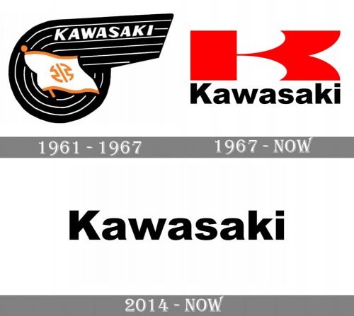
The first Kawasaki logo was designed in 1961 right before the debut motorcycle was released. The logo was composed of a graphical emblem with a wordmark and a flag on it.
The monochrome palette of the background was balanced by orange and red details of the flag, depicting a Japanese symbol on it, which was a celebration of the brand’s heritage and legacy.
The Kawasaki wordmark in a handwritten sans-serif typeface was executed in white color and used only capital letters. The lettering was placed in the upper part of the emblem, between the thin white lines.
It was an interesting and elegant logo, which was a good representation of the company’s profile and roots. The stylized wing-like shape of the emblem was modern and strong, it looked like nothing else and made the brand’s visual identity unique and remarkable.
1967 – Today
The logo that is still in use today was created for Kawasaki in 1967. The brand decided to switch to a more laconic and wordmark-based logo. The main element of the new logo is a massive letter “K”, executed in a scarlet red color, which is the first color associated with Japan.
The wordmark is placed under the “K” and features a bold sans-serif typeface which is simple and traditional, yet strong and powerful.
The black and red colors are accompanied by a white background, which makes a classic tricolor palette. The color scheme of the Kawasaki logo is a representation of a strong reputable brand, which is passionate and progressive, loyal and trustworthy.
These three colors are also a celebration of the brand’s background and Japanese heritage.
2014 – Today
The current Kawasaki logo is the most laconic of all the versions. It was designed in 2014 and now is the most commonly used one, though the previous version is also can be seen on some of the models.
The logo features a wordmark executed in a traditional sans-serif Helvetica font, which is clean and bold. It is placed in a rectangular and has no extra details.
The color palette of the Kawasaki logo varies. The wordmark uses black or white, depending on the background, which can be green, black, red or while.
The brand uses a simple trick — the use of the right colors makes even the simplistic logo look unique and memorable.


