

![]() Kabul University Logo PNG
Kabul University Logo PNG
The Kabul University is based in Kabul, Afghanistan’s largest city and capital.
Performed in a unique eastern style, the Kabul University logo comprises several symbols connected with education.
Meaning and history
The history of the university started in 1931. The two most important political figures connected with the beginning of the Kabul University were Mohammed Nadir Shah and Prime Minister Mohammad Hashim Khan. It was established during their reign.
In the 1960s, the school put an emphasis on scientific and educational cooperation with the governments of several foreign countries. As a result, a number of scholars from abroad taught at Kabul University introducing a variety of Western concepts and phenomena to local students.
During the period from 1992 to 1996, the campus became part of a major battleground in the Afghan Civil War. Due to it, the university lost much of its treasures, including the legendary library, which served as the country’s National Library.
It wasn’t that easy to recover after the catastrophe. By early 2004, the university had as little as 25 computers. Over the following years, however, the school managed to return much of its former glory. Today, its library is considered the best-equipped one in the country.
As a result of the evolution, the university has grown more popular. Now, the number of students reaches 25,500. Almost half of them are female students.
Symbol

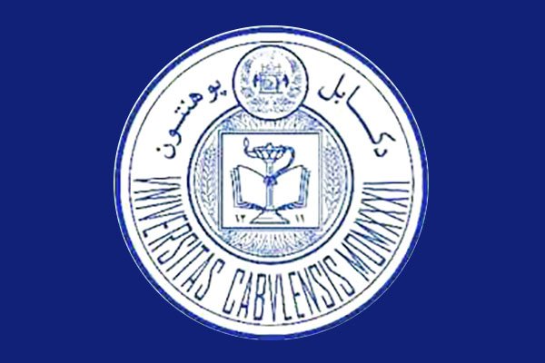
The Kabul University logo is built on a circle shape. It comprises four circles varying by size. The largest two form the outline on of the emblem. The area between the largest and the middle rings is occupied by the lettering. Inside the middle ring, the core pictorial part is placed. You can see an open book, one of the oldest symbols of education, knowledge, and wisdom. Above the book, there’s the smallest roundel including another symbolic message.
You can come across an old version. Its most notable difference from the new one is the way the book is depicted.
Faculty of Engineering Emblem

While the logo of the faculty comprises a couple of elements inspired by the primary logo of the university, its overall look and style are entirely different. The central part includes several symbols that have to do with learning and engineering: and open book and the sun, a hammer and a dish antenna, a crane and a wall. The top half of the outline has the shape of a rotary wheel, which gives one more symbolic clue to the type of institution the emblem belongs to.
You can also see the text “Kabul University” and “Faculty of Engineering,” as well as the year when it was founded – 1956. The information is given in the Latin alphabet and Arabic script.
Font
The typography is probably the most noticeable drawback of this logo. While we can’t comment on the upper part of the emblem, the text below undoubtedly lacks legibility. You can hardly make out what the lettering is saying. Such elongated glyphs would have been more appropriate in a historical document waiting for its meaning to be deciphered. Here, they make the already cluttered design even heavier and harder to understand.
And yet, the overall effect is rather balanced – the odd letters fit well the intricate eastern style of the emblem.
Anyway, next to the roundel emblem, the university has placed its full name in a completely different type, which is perfectly legible. So, while the circular emblem fails to provide legibility, you can find the explanation next to it.
Colors
While the list of official university colors includes black, red, and green, the logo itself, as shown on the school’s website, features a completely different palette. It is dominated by a light and muted shade of blue. The main shade is paired with a slightly darker tone of blue used for the text and outlines. You can notice greyish nuances. White also occupies enough space.
The dominant color, blue, is often used to symbolize intelligence and wisdom. We suppose that here, it’s been used to the same purpose. In addition to the intellectual symbolism, this color is often associated with such concepts as loyalty, trust, depth, and stability. It is believed to soothe one’s mind and relax one’s body, bring about feelings of coolness and peace. Most of these connotations are beneficial for an educational organization, so it’s only natural for the Kabul University to have built its palette on blue.
In addition to the primary color scheme described above, the Kabul University logo can be given simply in black and white with grey nuances.


