Justin Bieber is the name of one of the most famous rap singers in the world, who was born in Canada in 1994 and became famous in 2008 after signing a contract with RBMG Records Studio. By today Bieber has released five albums and participated in ten movies.
Meaning and history
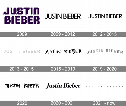
The Justin Bieber logos have always been executed in a monochrome color palette, except for the very first one, introduced in 2009, after the singer was discovered by a scout from a world’s famous music label.
2009
The logo created for Justin Bieber in 2009 only stayed official for several months and got replaced by a clean and modern emblem at the end of the year. The initial badge featured the name of the musician set in two levels in purple color on a white background. It was a bold shadowed sans-serif typeface with each letter stable and brutal, but due to the use of bright color, the insignia looked vivid and positive. The lettering was well-spaced and balanced, but still looked a bit amateur and was lacking style and chic.
2009 — 2012
The logo from the first Bieber’s single was composed of ExtraBold lettering in purple with a white outline. The two parts of the inscription were set in two levels and drawn in a square architectural style, with distinct straight cuts and thick lines. The purple and white color palette was a reflection of art and creativity, but the logo stayed with the singer for only a few months, and by today it is the only colorful version of Justin Bieber’s visual identity.
A bit later, in 2015, the new version of the logotype was created. The black inscription in a narrowed sans-serif typeface had its letters placed very close to each other, and “S” in “Justin” was glued to “U” and “T” with was connected to the “I” with its horizontal line. It was simple, yet stylish, and evokes a sense of youthfulness and energy.
Three years later, in 2012 the logotype was redrawn with more space between the letters. The typeface was slightly modified but it was still a clean and neat sans-serif with solid and confident letters, and still executed in black-and-white.
In 2013 a very lightweight version of the inscription appeared. The letters for extended and seemed fresh and elegant.
2012 — 2015

The 2012 inscription consisted of generally the same font as previously, but there was a little difference – the gaps between letters became wider.
2013 — 2015
This logotype was introduced after the 2012 ‘Believe’ album. It was the singer’s name in very thin characters, with huge gaps between them.
2015 — 2019
Something new was introduced in 2015 — a handwritten logo in bold rounded lines had all of its letters jumping and uneven, which added a friendly and funny mood to the whole composition. The second letter “B” in “Bieber” had its contour open.
2019 — 2020
A new inscription was adopted in 2019. It was styled the gray chalk-styled letters written in semicircle.
2020
The logo, which appeared on the cover of the “Changes” album in 2020 is also handwritten. It boasts bold letters with sharp, slightly triangular contours, and the bars of the letter “T” form an arrow, pointing up. A modern and powerful logotype symbolizes progress, determination, and growth.
2020 — 2021

The next Justin Bieber inscription had a grainy sans-serif typeface in an italic style.
2021 — Today
The 2021 inscription was made of small, thin letters with huge gaps between them. All of them were capital.


