The Japan Times is the largest and oldest English-language daily newspaper in Japan. Its headquarters are located in the Kioicho Building in Tokyo.
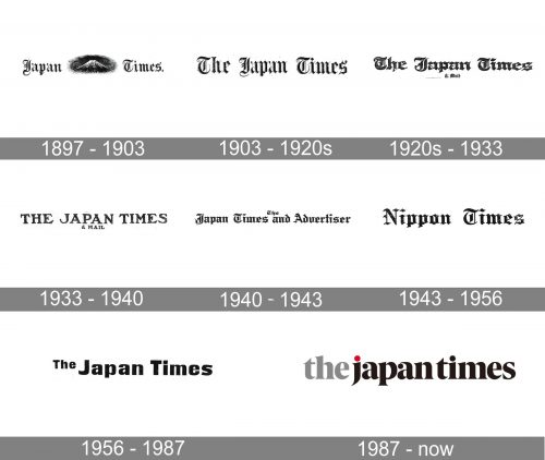
Since 1987, when the company was founded, the JT logo has gone a long way to get the sleek look it has now. At any given time, it reflected the design trends of its era.
Meaning and history
JT is the largest and oldest newspaper in Japan, published in a foreign language. The English editorial was founded at the end of the 19th century and today is owned by News2u Holding. The newspaper’s offices are located in the Japan Times Nifco Building in Tokyo, in the Shibaura neighborhood of Tokyo’s Minato Special District.
The newspaper was founded by Zumoto Motosada (1862-1943) in Tokyo in 1897. It was the first and then the only English-language newspaper in Japan with a native Japanese as editor-in-chief. The first issue came out on March 22, 1897.
What is JT?
JT is an abbreviation standing for The Japan Times, the largest Japanese daily newspaper in English. JT was established at the end of the 1890s, which also makes it the oldest editorial of its kind in its country. Today the newspaper has a circulation of about 44 thousand.
1897
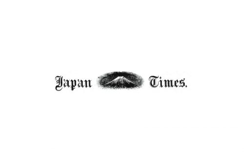
Without any doubt, the original logo was inspired by those of the world’s most popular newspapers. You can clearly see that the first glyph in the word “Times” is very much like the “T” familiar for the New York Times readers since at least 1981, when the first issue of The New York Times was published.
While the second New York Times logo (1857) looks a little different, it still preserves its Gothic script – the style copied by the Japanese Times. A Gothic script was used by other newspapers of that era, The Times of London, for instance.
The reason why the Japanese newspaper used this approach was pretty simple. Its original aim was to make Japan part of the international community. It was supposed to appeal to English readers who were familiar with The New York Times and The Times of London. So, it was only natural to capitalize on the recognizable visual brand identities of the already popular newspapers.
What made the design unique was the depiction of Mount Fuji.
1903
The Mount Fuji disappeared, while the article “The” was added to the wordmark. The already recognizable Gothic script remained.
1920s
In 1918, the word “& Mail” was added both to the name of the newspaper and its logo. Also, over the 1920s, the type was growing heavier.
1933
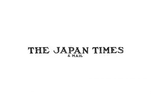
The blackletter was replaced by a bold slab-serif with all capital letters. The change was somehow related to the rise of the nationalist moods in the country.
1940
The lettering “& Mail” was replaced by “and Advertiser.” The Gothic type returned. This time, it looked more Germanic, which possibly reflected the type styles of Japan’s Nazi allies.
1943
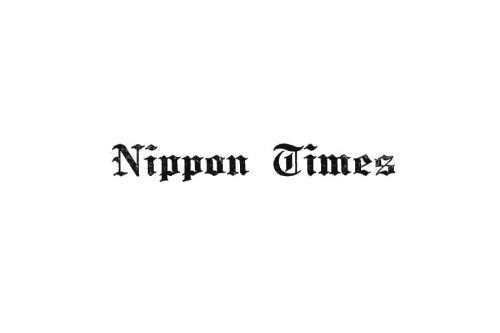
The name was changed to “Nippon Times” because the word “Japan” was forbidden (due to its English origin).
1956
The old name returned, while the Gothic font was replaced by a modern one. The geometric sans-serif hinted at the youthful energy of the late-1950s.
1987
The Times New Roman font was chosen as it was a popular corporate font. Also, it was the default type for the new generation of people who were accustomed to working with PCs.
Current version
The JT logo seen on the website looks modern without sacrificing elegance and refinement.
Font and Color
The smooth and bold lowercase lettering from the primary badge of The Japan Times is set in a sleek and heavy serif font with slightly curved lines and a thick board of the characters. The closest fonts to the one, used in this insignia, are, probably, Blacker Pro Display Condensed ExtraBold, or Nicholas Extra Bold, but with some minor modifications of the characters’ contours.
As for the color palette of The Japan Times’ visual identity, it is extremely elegant and sleek, composed of light gray, solid black, and red, used for the dot above the “J” and symbolizing Japan and its national flag. The timeless color palette of the badge makes it look sophisticated and fine, evoking a sense of professionalism and excellence.


