John Cena is an American tv-presenter, who became famous at the end of the 1990s as a wrestle. Today his career as a wrestler still continues, but he is more involved in cinematography and television activities. John was born in 1977 in Massachusetts.
Meaning and history
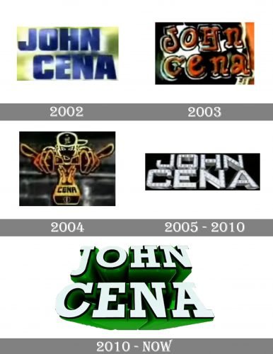
One of the most famous wrestlers in history, John Cena, has always paid a lot of attention to his logo designs, this is why there have been at least five major redesigns of the celebrity’s emblems throughout his career. They all were pretty simple in their composition but always executed in a bright and memorable color palette, evoking a sense of power and brutality, yet with a touch of style and energy.
2002
The initial logo was composed of a blue wordmark placed on a green background, featuring several shades, from light to dark. The lettering was set in two levels, and the upper one was located a bit more left.
The “John Cena” logotype was executed in all capitals of the ExtraBold sans-serif typeface, with pretty traditional contours and straight lines. It was a representation of stability and strength, along with professionalism and reliability.
2003
In 2003 the wrestler decides to go for a completely new style — the color palette and typeface of the logo are being changed dramatically. Now it is an orange, black, and white background where the mixed capital and lowercase lettering is placed. The color of the inscription is switched to dark orange and it now features a thin black outline, which adds volume and dynamics.
2004
The logo version from 2004 in something completely different. The logotype is replaced by the cartoonish wrestler’s image, executed with golden-yellow thick contouring.
The “Cena” wordmark in all capitals of a bold sans-serif typeface is placed on a wide yellow rectangular pendant of the wrestler’s massive chain. It was a very fun and recognizable visual identity design, which only stayed for a year but is considered to be one of John Cena’s most memorable logos.
2005 – 2010
In 2005 John Cena comes back to a simple logotype, but now it is a three-dimensional inscription in silver, embedded with crystals. This is a posh and fancy emblem, which suits perfectly the celebrity’s image. Placed on a black background, which makes the sparkling and blinking wordmark balanced and calm, it looks remarkable and sleek.
2011 – Today
After five years of luxury and chic, John Cena decides to go more brutal and simple, so the logotype changes its style again. The white letters in a black outline feature a traditional bold serif font with clean and distinct lines and edges. The main bright element of the new emblem is the three-dimensional green shadow of the lettering, which adds a sense of growth, progress, and energy of the famous tv-presenter.


