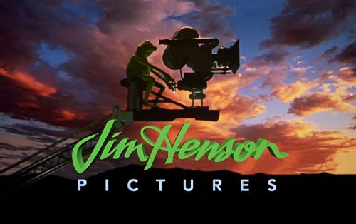
Jim Henson Pictures was a US film studio that belonged to Brian and Lisa Henson. They also were its chief executives. The company had the status of a subsidiary and was the result of collaboration between the Jim Henson Company and Sony Pictures Entertainment. The list of films released included Buddy (1997) and Five Children and It (2004).
Meaning and history
The basic version of the Jim Henson Pictures logo used throughout this period contained two elements: the name of the founder in a cursive time and the word “Pictures” in capital letters separated by a horizontal bar. Only details varied, for instance, the thickness of the typeface.
We should also mention that there were different special effects applied and the palette could vary. As a result, the logo didn’t look exactly the same.
1995 – 2001
In the original version, the lettering “Pictures” was pretty bold. The proportions of the glyphs had been chosen in such a way that their boldness slightly damaged legibility. For instance, the “E” was little short of a simple rectangle, especially when the logo came in smaller sizes.
Additionally, there was a version where the wordmark was paired with an emblem. It featured an anthropomorphized figure and an old-fashioned camera. The figure looked pretty unusual and wore a top hat. Both the cameramen and the camera were positioned to the left of the typographic part of the logo.
1997
An updated version was introduced, where the pictorial part was moved above the wordmark. A thin black ring encircled the emblem now.
The ring performed at least two important functions. To begin with, it joined the two parts of the logo to make them look like a single whole. In the previous version, conversely, the image didn’t merge into the design very well as its lines and style were different from those used in the wordmark. Also, the ring might have been a symbol of a source of light, which is essential in film production.
Another alteration concerned the word “Pictures.” It was made lighter and, as a result, better legible. Then again, the overall shape of the letters didn’t change much – they still belonged to a simple and utilitarian sans serif typeface.
Last but not least, the designers who worked on the logo added a piece of equipment used by cameramen to shot video from the top.
What is Jim Henson Pictures
The Jim Henson Company established Jim Henson Pictures in 1995 as a joint venture with Sony Pictures Entertainment. Unfortunately, the film studio only worked for nine years.
The ring was used only when the logo was featured separately. More often, though, the logo was placed over a realistic background featuring the sky before the sunset. The sun was either visible or not, but the multiple clouds were always there. What was below looked like hills with gentle slopes.
In 1997, the green color was already often added to the Jim Henson Pictures logo when it was used on the sky background. The color was typically applied to the name of the founder. The word “Pictures” was white, but it still stood out against the black hills.
1997 – 2001
The lettering “Jim Henson” was 3D and green, the word “Pictures” was bold. The sky in the background looked almost the same in all the versions.
Colors and font
The brightest color in the Jim Henson Pictures logo was the light shade of green. It was very vivid, short of neon. Due to this subtle artificial quality, it captured your attention when placed over the realistic depiction of the sky.
The cursive script used for the words “Jim Henson” was what made the design look unique. The word “Pictures,” conversely, featured a type that could be called pedestrian. However, it was wise to use such a type, in this case, lest it overshadows the signature.


