International Paper is the name of the world’s largest paper products manufacturer, which was established by Hugh Chisholm in 1898 in the United States. The International Paper today operates across the globe and has a yearly revenue of about 22 billion USD.
Meaning and history
The visual identity of the International Paper Company is minimalist and contemporary. The strong monochrome wordmark and a geometric emblem in its middle — this is how the logo of the world’s largest paper and pulp company looks like.
The International Paper wordmark in all capitals is executed in a clean geometric sans-serif typeface, which is very similar to Gill Sans Bold font. The letters of the inscription have a lot of space between each other, and it makes the solid and thick letters look light and balanced.
1950s – 1960
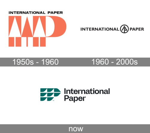
The very first badge of the International Paper organization was designed in the early 1950s and featured a pink and white composition, with the stylized “IP” monogram accompanied by the black uppercase “International Paper” inscription set in a geometric sans-serif font above the monogram. The main part of the logo boasted a pink vertically-oriented rectangle (the letter “I”) with a white tree, stylized as a muse cursive with the triangular top, and the pink “P” with the same white tree on its vertical bar. The two characters were separated by the pink tree, placed against a white background.
1960 – 2000s
The emblem is placed between the two words of the company’s name and features a circular frame with a triangular symbol inside. The symbol looks like a stylized tree and an arrow, pointing up. The tree here stands for the paper, while the arrow sows the company’s progress and development.
The monochrome color palette of the logo makes the visual identity of the company look professional and confident, showing the serious business and manufacturing approach, and being timeless and actual in terms of design and style.
The International Paper visual identity is modern and classy. It is perfectly balanced in terms of shapes and spaces, as well as in the thickness of the lines and the height of the letters. A truly remarkable example of minimalist design, reflecting quality and expertise.
Today
Another redesign has replaced the emblem of International Paper with a stylized monogram, composed of green elements forming the two letters. Each of the elements features a straight top line and a rounded bottom. The dark green emblem is placed on the left from the two-leveled title case inscription in a modern sans-serif typeface, in black.


