Inanimate Insanity is an online animated series made by Adamation, Inc. It can be viewed on the AnimationEpic YouTube Channel.
Meaning and history
The Inanimate Insanity logos appearing in Season 1 and Season 2 are dramatically different.
Season 1
There is only the name of the series given in a bright, almost neon shade of green. The letters look pretty irregular – they do not obey the line either below or above, and the strokes go from wider to thinner unpredictably.
Yet, you may notice that the letters that repeat (the “A,” the “T,” the “N,” for instance) have the same shape, which makes them look like part of a single font. Also, what makes the glyphs beautifully merge is that many of them have their top “cut” a bit lower than usual (look at the “M” and “A”).
The green glyphs have black trim and shades, which add the 3D effect.
Season 2
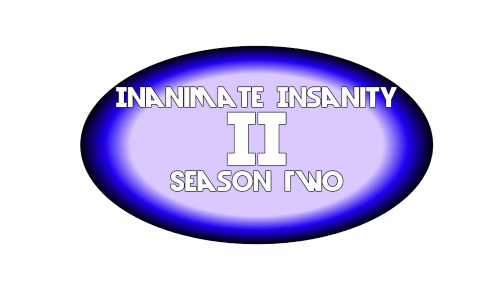
There is a Roman numeral “2” in the middle (referring to the number of the season). It is placed inside a light blue ring housing the name of the series and the words “Season two.”
We can say that there are several versions of this emblem appearing in various episodes. For instance, the Roman “2” in the Inanimate Insanity logo can be blue or white with blue trim. It can be divided into two identical halves or presented as a single glyph. Various types of gradient and various shades have been used. Also, the designers have experimented with the fonts.


