The meaning behind the logo of the radio network iHeartRadio is totally transparent – it perfectly represents the name of the brand. This is probably one of the reasons why the company hasn’t dared dramatically change it so far.
Meaning and history
In the fall of 2008, the first version of iHeartRadio went live. It was available to owners of the Apple iPhone and iPod Touch through the App Store. The project was introduced by Clear Channel Radio (which was later renamed iHeartMedia). Within the following couple of years it became available through BlackBerry, Android, and then Sonos.
What is iHeartRadio
iHeartRadio is a US-based free radio platform that belongs to iHeartMedia. It is an umbrella mark for iHeartMedia’s radio network, which is often named the country’s most prominent radio broadcaster.
2008 – 2012
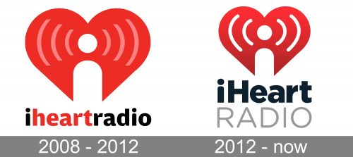
The original iHeartRadio logo already looked pretty much like the current one. It was dominated by a heart emblem. In its center, there was a stylized white antenna or microphone with a white dot above. From both sides, there were pink curves representing radio waves.
In addition to symbolizing an antenna, the negative image also represented the initial letter of the company’s name. Also, you could perceive a subliminal sexual message, like in many other popular logotypes.
The wordmark, which was typically placed below the emblem, was presented in a type that had an unusual touch, yet generally had classic proportions providing great readability. The fact that the “i’s” looked exactly like the antenna above shouldn’t come as a surprise. Other letters were apparently shaped to echo the emblem, too. They looked slightly plumper than average, and also they had lots of soft curves and other heart-inspired elements. Note, for instance, the top of the “r,” which resembles the lower part of the heart.
2012 – present
The two main results of the update are that the logo has grown simpler, while the wordmark became more prominent, with the emphasis on the word “iHeart.”
The red color of the heart is more saturated. The pink waves are white instead of pink. These two moves have created a better contrast in comparison with the previous version. Also, the number of waves has been reduced to two on each side. All these modifications resulted in a logo that is easier to grasp and that better works even in a smaller size.
The wordmark is given in two lines now, with the lettering “iHeart” set in black, in a bold sans, while the word “Radio” is light gray. The updated iHeartRadio logo does a better job in introducing the name of the brand (the initial “i” isn’t torn away from “heart,” like in the previous version).
Colors and font
The red-based palette perfectly fits the heart theme, while the black letters provide the best possible contrast with the white background. The designers used light gray for the second word so that it doesn’t steal the limelight.
While the type on the iHeartRadio logo is pretty simple, it does “rhyme” with the emblem due to the plump and curvy letters.


