IGN is a video game and entertainment media website. It is headquartered in San Francisco, California. The website belongs to IGN Entertainment Inc., which belongs to j2 Global through the US digital media and internet company Ziff Davis.
Meaning and history
The abbreviation “IGN” stands for the company’s original name, Imagine Games Network. It started in 1996 from the first gaming website: N64.com. Soon, a network of five websites was developed, each with a different palette and a different logo.
In March 1997, the network was tied together and got a consistent visual brand identity.
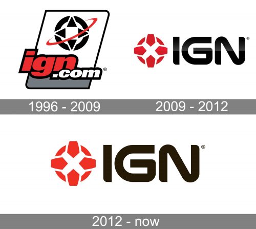
1996 – 2009
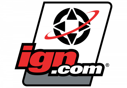
While the original logo looks different from the following ones, it already features an emblem looking very familiar. If you take a single look at a typical joystick, you’ll immediately see what the inspiration behind the emblem was. Here, the symbol is given in black and white and has a stylized red orbit going around it. It resembles a satellite going around a planet.
Right below, the lettering “IGN.com” can be seen. The first part of the website’s name is large and features red letters, which makes it the most prominent part of the design. The logo is placed inside a parallelepiped with two rounded corners. It makes the logo resemble a badge.
2009 – 2012
The design has grown by far cleaner and easier-to-grasp. There is nothing but the joystick-inspired emblem (it is now red) and the lettering “IGN.” The emblem has been redrawn without changing its overall look. The lettering features a different type – an all-caps sans.
The subtle gradient adds some depth.
2012 – Today
The gradient has been gone, which makes the IGN logo flat. Other than that, the design has remained the same.
On social media, an alternative logo is often used. Here, there is only the emblem, which is given in a reverse color scheme.
We should also mention the corporate logo, which is basically a rectangle with rounded corners broken down into two fields. Here, the word “IGN” is placed in the upper field, which is red and large. The lower field is black. It houses the word “Entertainment” in smaller letters.
Font
The type looks unique without sacrificing the tiniest bit of its legibility. The combination of right angles and softly rounded angles makes the glyphs echo the emblem. As a result, the two parts of the IGN logo perfectly merge together.
Colors
The combination of red and black with a white background is one of the most popular palettes in logo design. This consideration doesn’t make this combination work worse, though.


