The Hypebeast platform is a point of attraction for all modern fashionistas who follow the latest drops, and trending items, and are interested in the stories behind brand collections. In addition to fashion, the site’s editorial team also covers topics such as music, cinema, art, and much more. Hypebeast, once a 5-post-a-day blog, now produces 40-50 articles in that same time frame, bringing it over 5 million unique visitors and about 47 million page views per month. It also has an associated webstore as well as pop-up stores in Hong Kong that sell designer products that can be paired with streetwear.
Meaning and history
It all started in 2005 when Kevin Ma decided to create a blog dedicated to sneakers as he was fond of this topic. The blog also covered topics such as news about clothing and fashion. At the time, the term “hypebeast” was used in a negative sense. It meant that you just go for the hype. The founder did not think for too long and decided that it would be fun to use such a name for his company. The blog gained recognition and began to bring income, so Ma quit the job and focused on the blog. In 2012, the company launched the HBX online store. Today, the online store HBX specializes in men’s fashion and streetwear and has more than 200 brands in its assortment. Along with the launch of HBX in 2012, Kevin Ma also introduced printed Hypebeast Magazine.
What is Hypebeast?
Hypebeast is an influential online platform and retail company that focuses on men’s streetwear, sneakers, fashion, and lifestyle culture. Hypebeast also includes an online and printed publication about contemporary fashion and streetwear.
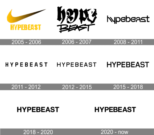
2005 – 2006
The original logo features the brand name printed underneath a large Nike Swoosh. The founder had the swoosh symbol drawn in a yellow and black gradient and with uneven edges to give it a unique and slightly altered look. However, the recognizable symbol did a great job of attracting the audience interested in sports fashion. The name is printed in yellow using a bold, sans-serif font. The letters have a very rough edge and appear to be melting.
2006 – 2008
The updated logo is done in a bold, graffiti style, which is closely linked to streetwear. The word “Hype” is printed on the top line using a calligraphic font that reminds of Asian calligraphy and the home of the founder. One of its unique details is the letter “e”, which is done in contrasting white against a funky, black backdrop. The strokes are bold and have a slightly uneven edge, which gives them a handwritten look. The second line, Beast, features a finer, dynamic font that has all the characters interconnected. Overall, the logo design appears to be professionally done to reflect the essence, individuality, and energy of the brand.
2008 – 2011
The updated logo is just as edgy and artistic. The company preserved a rather handwritten stroke style with some imperfections. It is well suited for street-style fashion that does not entail a formal black suit and a tie. The characters themselves combine curves and sharp, square or diagonal elements. The spacing is very close, which creates a strong and confident image despite the fact that all the letters are lowercase.
2011 – 2012
A new design was introduced in 2011, presenting the brand name in all caps but still using a solid black color. The typeface has the same bold feel thanks to geometric lines. Just like in the previous case, the designer blended sharp cuts with smooth curves. It was a nod to the blend of street fashion with high fashion. Besides using all caps, the logo features wide spacing between the letters. It reflects the growing authority of the brand.
2012 – 2015
The updated logo features a bold font with smooth strokes. The characters are still uppercase but they are notably wider compared to the previous logo. The spacing between the letters also appears to have gotten smaller.
2015 – 2018
There were minimal modifications to the logo. One of the most noticeable changes is thicker strokes. This version looks more balanced and assertive. Its minimalistic design allowed the brand to expand into other spheres besides men’s fashion, such as music and art.
2018 – 2020
The company continued to use a strong, sans-serif font that creates a striking impression. A few minor modifications made the logo a better fit for the digital space. The letters appear slightly shorter and bolder.
2020 – Today
Just like a few previous versions, this logo has a modern and influential style. The company did not make any major changes to the logo as it became easily recognizable. Instead, the designer simply made the strokes even bolder and further reduced the space between the characters.
Font and Color
The original logo is done in bold, sans-serif font with an uneven edge that makes it hard to read. The characters appear to be melting, hinting at the hot topics discussed in the blog. For a brief period, it used two different bold graffiti fonts. The font introduced in 2008 is a custom, bold, sans-serif font where several letters are mirror images of other characters, such as “h” and “y” and “p” and “d”. Next, it used a bold, geometric font similar to a modified version of Foundry Gridnik Bold font or Estricta Black font. The logo designed in 2012 uses a font that looks like Stawix’s Crique Grotesk Medium or Labrador A Bold from Typesketchbook. After that, the typeface underwent multiple small modifications to better fit the brand image.
Originally, the logo was predominantly yellow. It instantly caught the attention and reflected the energy of the brand. In 2006, the company moved to a black logo. The black color is widely used by fashion brands and high-end products to create a sophisticated and luxurious brand image. Besides, the black is a timeless color that never goes out of style. It also presents the brand as a confident and strong company.


