Hungry Jack’s is the name of a Burger King chain of restaurants in Australia, owned by Jack Cowin. The franchise appeared in Australia in 1971 and stayed active even after the American company has left the local market.
Meaning and history
Although the menu and the visual identity of Hungry Jack’s fast food restaurant chain is a complete copy of the famous American Burger King, it is owned by a completely different company, Competitive Foods Australia.
The chain entered the Australian market at the very beginning of the 1970s, with the first restaurant opening in 1972. As for the name of the fast-food chain, it was given to the brand after the founder of Competitive Foods Australia, Jack Cowin.
What is Hungry Jack’s?
Hungry Jack’s is the name of an Australian fast food chain, fully based on the Burger King franchise. The brand is owned by Competitive Foods Australia, which used to also have a KFC franchise. The company was founded by Jack Cowin, hence the name of the chain.
In terms of visual identity, the Australian franchise of Burger King, fully repeats the logo of its mother brand, but in a simplified version and with fewer redesigns throughout the years.
1971 – 1995
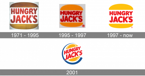
The very first Hungry Jack’s badge was introduced in 1971 and has stayed untouched for two decades. It was exactly the same badge, which was used by the Burger King brand during those years — two brownish buns enclosing two-leveled lettering in bold red characters, executed in a rounded sans-serif typeface, with the “Jack’s” enlarged.
1995 – 1997
The redesign of 1995 has refined the color palette of the Hungry Jack’s logo, making it flatter, yet brighter and cleaner. The brown burns gained a vivid orange shade, while the inscription got its typeface more modern, with the contours of the letters balanced and gaining stricter shapes, although the rounded corners of the bars made the wordmark look very friendly and welcoming.
1997 – Today
In 1997 the Hungry Jack’s badge was redesigned again, according to the redesign of the Burger King visual identity. With all colors and shapes refined and cleaned up. The shade of the buns got more yellow and even, while the lettering got a bit thicker and gained a more classic shade of red. There was also an additional version of the badge introduced in the same year — the outlined emblem set on a solid red background.
2001
Another version of the logo for the Hungry Jack’s fast-food chain was created in 2001 but has never been used, as the chain left Australia a few months after. It was a diagonally placed and enlarged red lettering, enclosed between two small orange buns and outlined in a thick blue frame with an open-ring contour.
Font and color
The bold red lettering, from the Hungry Jack’s badge, designed in 1997, was set in a smooth modern sans-serif typeface with rounded angles of the thick bars, and balanced contours of the glyphs. The closest fonts to the one, used in the Hungry Jack’s insignia, are, probably, Corkboard JNL and Volkswagen Serial Black, but with minor modifications.
As for the color palette of Hungry Jack’s visual identity, it is based on a bright and warm combination of orange and red, which looks passionate, powerful, and very welcoming, perfectly reflecting the essence of the company and its values.


