HTV9 is the name of the most famous Vietnamese TV channels, which was established in the middle of the 1990s by Ho Chi Min Television, and today exists along other channels of the company, such as HTV7 and HTV2.
Meaning and history
The visual identity of the Vietnamese TV channel is strict yet bright and recognizable. HTV9 uses exactly the same design for its logo, as other channels of the group — HTV2 and HTV7, which shows its affiliation to Ho Chi Min TV company.
1995 – 2000
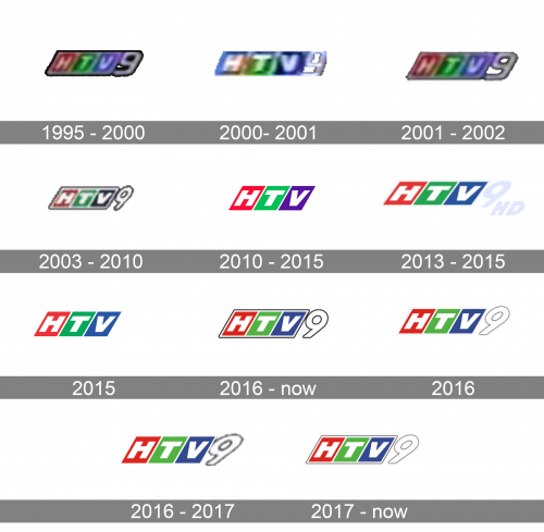
The very first HTV9 logo was composed of three slanted white letters placed on a parallelogram, separated into three equal elements — red, green, and purple. The banner was outlined in white and black and had a large number “9” glued to its right part. The digit was also slanted and drawn in white with a thick black outline.
2000 – 2001

In 2000, they decided to update the color scheme by supplanting the red block with one colored in blue.
2001 – 2002
A year later, they returned the color choice to what it was prior to 2000.
2003 – 2010
The lines of the logo were cleaned and refined in 2003. The framing was gone from the HTV9 logo and now three separate parallelograms were placed at a small distance from each other directly on a white background. The “9” was only slightly visible, as got its outline removed too. The whole letters became bolder and neater, looking more modern and progressive than on the previous version of the logo.
2010 – 2015
In 2010, they came up with a more streamlined logo. It was the same concept: three blocks of red, green and purple, followed by a white number ‘9’. The difference was that there were no outlines in this version.
2013 – 2015
The HD channel was launched by the company in 2013, so the new logo appeared. It was pretty much the same as the one created in 2003, but with the geometric elements slightly extended horizontally and the “HD” lettering added to the bottom right part of the logo. The letters were written in white but had a delicate blurred gray outline, which made them visible even on a white background.
2015
For some time, they used this version – it was mostly like the one they used since 2010, except the color of the third block switched from purple to blue.
2016 – Today
In 2016 both emblems, for HTV9 and HTV9 HD, were refined and strengthened by adding a dark gray framing with a shadow to it. Inside the frames everything remained the same, three colorful rectangular with white letters in them are placed on a small white distance from each other, and it is balanced by a white outline of the badge, making it fresh and airy.
January 1 – February 2, 2016
This time, they decided to remove the grey outlining around the colored blocks, and that’s it.
2016 – 2017
That same year, they tried on a thicker frame for the number ‘9’, but it didn’t work out.
2017 – Today
In 2017, they returned to the old design of the number ‘9’, while also reintroducing the grey frame surrounding the blocks.


