Horch is the name of a former German car manufacturing company, which was opened in 1904 and closed in 1932. Named after its founder, the company merged with Wanderer and Audi in 1932.
Meaning and history
Horch was one of the first German automaking companies, which was founded by August Horch, who worked as an engineer for Mercedes-Benz. The first car produced by this company was the 18/22 PS. It was equipped with a four-cylinder engine.
Horch was an innovator in the industry. And all innovations were tested in the company’s first model. It was Horch who developed the constant mesh gearbox, which was completely silent. The clutch was cased and placed between the gearbox and the engine. A driveshaft was first installed between the rear drive axle and the gearbox.
At the beginning of June 1909, Horch left the company. After that, he set up a new factory in Zwickau. This plant was named Audi. The former Horch company, after its founder left, began to specialize in expensive custom-made cars.
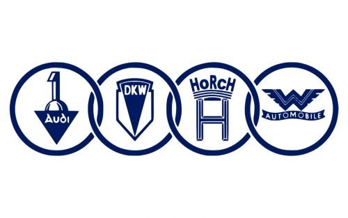
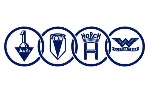
In 1932, Horch launches its most successful car, the model 600. In the same year, the concern Auto Union AG appeared. It had an emblem in the form of four circles connected together. This symbolized the union of all types of cars – the Horch luxury car, the large and representative Audi, the Wanderermedium-sized cars, and the very small DKW vehicles.
What is Horch?
Horch is the name of one of the historical automakers, which played a really big role in the European car industry history. The brand was one of four companies, which formed the iconic Audi marque, which aims consecrated to be the representation of high class and super quality.
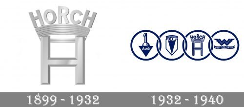
1899 – 1932
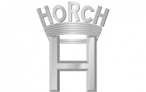
The visual identity of the German carmaker of the 1900s — 1930s looks elegant and sleek. It has a very special art-deco mood, which makes the logo unique and memorable. Executed in monochrome, the emblem turned into silver when placed on the brand’s cars, and in the metallic shade, it looked stricter, yet even more modern and sophisticated.
The Horch logo is composed of a bold letter “H” with a pattern of thin straight lines, which added structure and volume. In the letter, there was a thick black arch with the same white striped pattern. The monochrome palette of the emblem made the logo timeless and powerful, reflecting the professionalism of the company and its value of style and quality.
Above the black arch, the wordmark was placed, repeating the architectural shape of the emblem. It was executed in all capitals of sans-serif typeface with letters “H”, “R” and “H” enlarged, making the logo playful and recognizable.
When placed on the cars, the emblem was enclosed in a thin circular frame, featuring silver color. It made the badge crispy and fresh due to a lot of space inside the circle and around the emblem.
1932 – 1940

Since 1932 the company started using the Auto Union badge, as well as three other Gemma brands, that merged to form a new loud name in the automaking industry. The new logo was executed in a blue and white color palette and was formed by four rings, where each ring contained a logo of Audi, DKW, Horch, and Wanderer respectively.
Font and Color
The bold stylized lettering from the historical Horch badge was set in the uppercase of a massive geometric sans-serif typeface with capital letters featuring different sizes. This height difference made the logo look more dynamic and cool. The closest fonts to the one, used in the Horch insignia, are, probably, Heyday Sans, or Type Vendor JNL.
As for the color palette of the Horch visual identity, there were two options: the glossy silver badge, when it was an independent marque, or dark blue when the company became a part of Auto Union. Both shades evoke a sense of professionalism and reliability, looking actual even today.


